Paper Love, or shall I say “paper-philia?”
Printmaking, Asian papers, watercolor, pastel and handmade papers… I do love good paper.
Gorgeous Papers
Watercolor Loose and Easy began its first session yesterday at Atwell Gallery, Perth.
It was fabulous.
Discussing watercolor basic materials,
and the many types of Watercolor papers, those most beneficial to beginners, was a priority.

Selecting 100% Cotton paper
With pure cotton, your results are smooth. Lovely transitions and merging of beautiful colors.
The added bonus: 100% cotton papers are a dream when you make a mistake and need to rinse/lift it off.
Student grade papers
(made from cellulose ingredients not cotton) are very difficult, not beginner friendly in this regard.
Yes, they are cheaper!
But, I’d rather not pull my hair out in frustration with that cheap paper.
I’ve recommended Saunders Cold Press 100 % Cotton Rag.
With the proviso, if they so chose to go the luxury route, Arches CP or Rough was a very, very good paper.
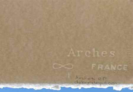
I’m also personally fond of using: Masa, Fabriano Soft Press, Fabriano Rough, Fabriano Esportarzione, Twinrocker Feather Deckle and Yupo.
Usually, it is anything that is going to provide lots of texture with a lovely soft cotton ‘feel’ to it.
Though the Yupo is quite slick and plastic like in its feel and handling.
But, I like it and so do many of my students!
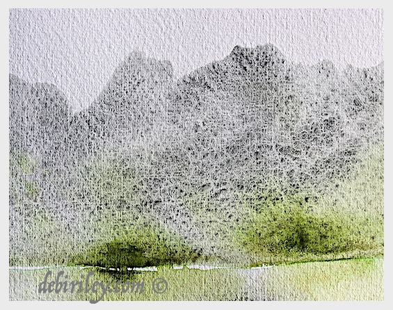
Close up of Saunders
When you look at this watercolor study close up, you can see the exquisite textures within the Saunders paper.
I’d like to point out, for beginners, that it is the combination of:
- Plenty ie surplus…. of Water and
- the good paper and
- the granulating paint pigment
- that will allow this perfection of textural effects to shine through.
I have used Daniel Smith (green) watercolors in this impressionist mountain study:
zoisite, green apatite and serpentine.
Zen. They blend harmoniously.
And the textural qualities these pigments lend to the painting are sensational.
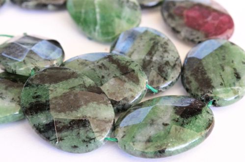
Zoisite, the gemstone
Its so lovely to get to see, what the pigment originally was.
Before it was ground fine as dust, mixed with gum arabic and squeezed into a paint tube.


superb…gorgeous..
LikeLiked by 1 person
thank you so much, that was lovely to read! glad that you enjoyed this! 🙂 cheers, Debi
LikeLike
The texture of the paper is a big part of the creation.
LikeLike
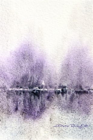
A lovely post Debi – I love the Winter’s Glow painting, Daniel Smith’s Amethyst is such a gorgeous colour – I will be buying one… ! And what you say about watercolour paper is so true – I found out the hard way – watercolour paint goes on 100% cotton paper so much more beautifully…
LikeLiked by 1 person
thanks! Amethyst is one of the colors, I will, spend the extra on. You just can’t replicate this one, by scratch.
LikeLiked by 1 person
I’m with you Debi – Arches all the way 🙂
LikeLiked by 1 person
yes, and now… to get the OZ distributor here to stop being outrageously, grasping for more profit.
LikeLiked by 1 person
Thanks for giving me the push I needed to spend the $s for 100% cotton. It really is much easier to lift the mistake off. Loving your class and lessons
LikeLiked by 1 person
Jay, that is awesome!! thank you for letting me know too, I appreciate the feedback 🙂 cheers, Debi
LikeLike