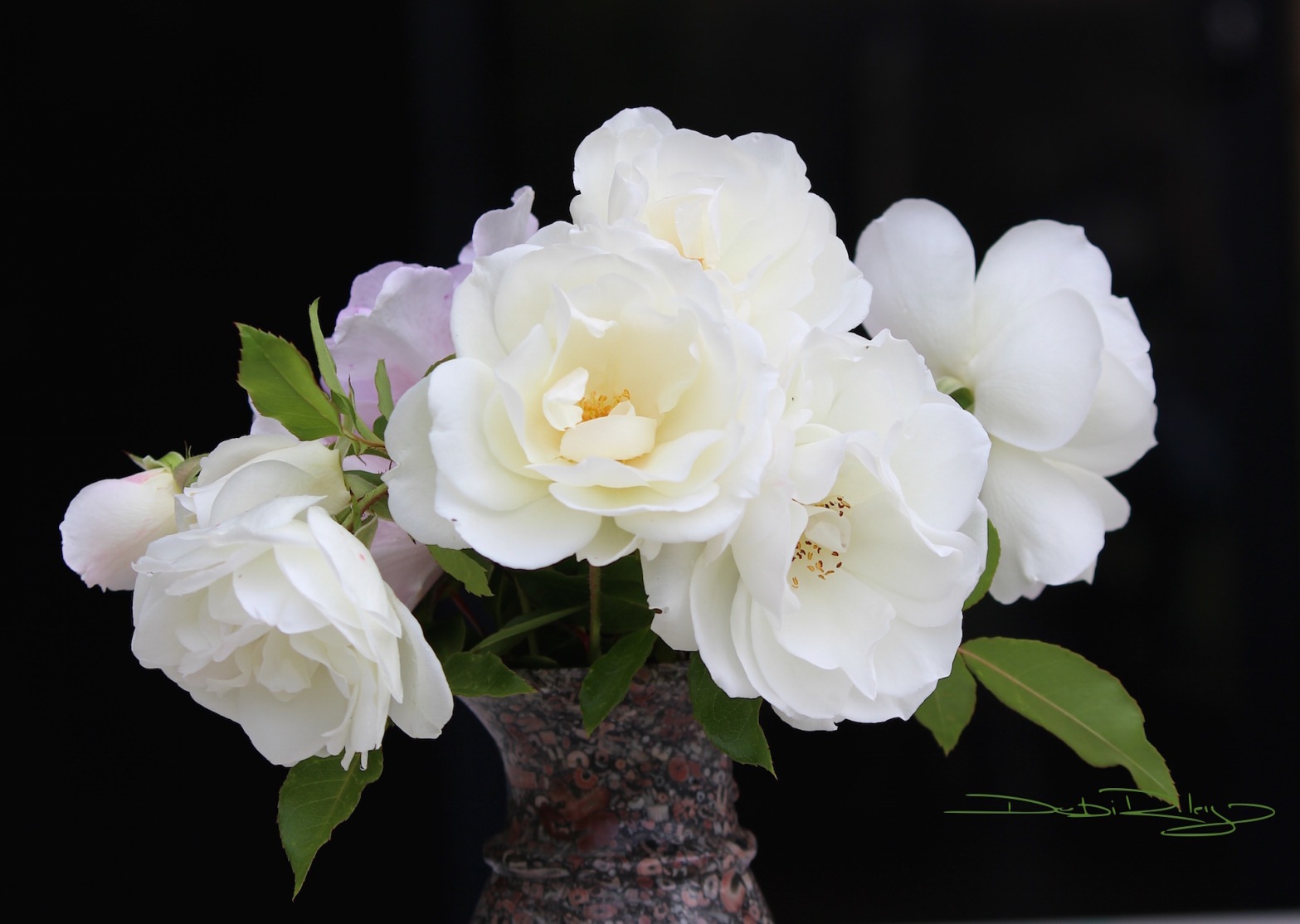

A Simple Post: with an invitation!
With no long discourse or Art Basic tips on tone, edges, depth, colour, design, etc. I’m inviting you to post in comments on your reactions to this photographic image.
Is it too centered for you? Adequate depth? Some may dislike the location of the green signature, and wonder WHY I placed it right there! ……… and some may enjoy those very same things.
Having ‘comments and discussion’ is a fantastic chance to learn and hear different art viewpoints. A sequel post will be forthcoming with my explanations on the title, the mood, the basics.
Thank you everyone for your comments and participating, great response so far!
Keep those comments and thoughts coming in! 🙂


Hi Debi, I really like this photo…. and the title, which I see so closely related to what I see in the photo. As for a critique in terms of the structure of the piece, I don’t think I am likely the best person to comment, but what I can say is that it certainly seems to speak to me in terms of being a beautiful photo that has some imagery that makes me think of the multi-faceted soul of the artist. ~Rita
LikeLiked by 1 person
Thank You Rita! and you do have great design skills that show through so well in your work 🙂 Your sense of placement, edges, tonal values is wonderful. I love how you picked up on ‘multi faceted’ aspect. You’ll see more in my sequel post how that plays a role. I like interactive discussions like these… I think everyone tends to learn something. Rita, thanks for putting in your feedback 🙂
LikeLiked by 1 person
I love it, Debi. Love the stark crispness, the colors I see in “white”, and that I can feel the velvety texture of the petals. Love the contrast, the background, the composition. It’s a great photo! Not too surprising, since you took it. 💜
LikeLiked by 1 person
great thoughts and feedback! thank you very Much, for doing so 🙂 I like that you noted the Contrast. This image really has major contrast! also, crispness and that the white has variations of colours within it! Very good assessments you noted Laura. and did you know…. the more of these ‘Other Peoples’ assessments you do, the better your own paintings/art will become!?
LikeLiked by 1 person
purity, delicate, beauty, fragrant
LikeLiked by 1 person
Hi Jodi, much appreciation for your ‘viewer participation’ as well!! You just provided me with a new insight 🙂 I hadn’t thought of the purity, delicate aspect of the image before, but now – I can see how those elements would be a part of this. Thanks for that! I had initially thought, that perhaps with the deep velvet near black background being so solid – it would or could take away from the ‘lightness’ of the piece. But apparently from your thoughts, not so. They did have a lovely fragrance and beauty 🙂
LikeLike
Stunning blooms, beautifully captured with good contrast, we get the delicate nature of the flowers…and all that negative space only serves to enhance this. Nice one!
LikeLiked by 1 person
Sue, thank you! you noticed the contrast, with the delicacy of the flowers, it is an interesting pairing, this strong intensity with fragility. I had not thought about those negative spaces though – Good One!! again, I appreciate your time in sitting down and sending your response. thank you 🙂 Debi
LikeLiked by 1 person
Well, I think blogging is all about commenting – I love to get comments myself!
LikeLiked by 1 person
Sue, you and me both! I think by ‘daring to comment’ we learn a lot of new things, see from other’s viewpoints, and just get surrounded by more ideas from “like minded people”. Artists have been swimming in the crowd of Non Artists – for all their life. To share, dialogue and network with fellow artists is a drink to the soul. Well…. in my opinion. lol Thanks so much Sue, for a nice cool sip! debi
LikeLiked by 1 person
A drink to the soul….I like that!
LikeLike
I really like this photo as I said before. Maybe I would have put the signature a bit more down.
LikeLiked by 1 person
yes, I agree with that!! and I would have,… except for that very Pesky sharp pointed leaf drawing the viewer’s eye down and out to the right of the picture. I couldn’t figure out any other way How To … resolve that. in a painting, I’d merely ‘soften blur that edge, Voila! But, its a photo… so I was stuck. I have Lightroom. but have not come close to getting all creative with it- there’s probably a way to soften the edge with it. I just don’t know it…yet. Anyone out there a good Beginner Teach with Lightroom!!? — But, I agree with you Mitza, the signature generally would look better if it was lower.
LikeLiked by 1 person
I don’t know Lightroom, I always use GIMP which is similar. I think you can also blur things in this program, and it’s free of charge. 🙂
LikeLiked by 1 person
will look for GIMP, but, as I have Lightroom, probably “should” stick with it and practice it til I have it! thank you Mitza 🙂
LikeLiked by 1 person
Love this photo Debi. I looked at this in close up, focusing on the upper left where the green leaf is sharp against the black and pink – there’s a wonderful abstract quality of shapes and colors which is less obvious in the full picture. I always like to take sections of photos and discover new images and viewpoints that can often stand alone.
LikeLiked by 1 person
Thanks Andrew. A lot of people sort of ‘by pass’ the upper left quadrant of a image/painting for some reason, so Good Call on this!! What you do is a wonderful technique to create strong dynamic designs that you may not otherwise have found. Plus, its just plain Relaxing and Fun to do 🙂 Again, much appreciation for your feedback; its a great way to learn new ideas and see in new ways! cheers, Debi
LikeLiked by 1 person