
What a contrast! The calm, contemplative quietness of previous paintings in comparison to today’s image.
With an almost aggressive stance the bouquet leaps in front, jumps ahead of the line.
Demanding.
Its seems strange to think that paintings can soothe us, or can provoke us. That they can create mood, feeling, ambience, atmosphere.
That they can alter us.
But they do.
Well, they can. And I think they should.
Should make the viewer react, in some way.

Floral Watercolors
“A Flower bouquet.… so pretty; and in watercolors!
Oh they will be so delicate and soft,” we think to ourselves.
Do we expect them to be so strident?
Demanding?
High Maintenance?
No. Not the first thing that comes to mind is it!?
We can make (construct) our paintings to emit any vibe, any response, that we want them to. How?
5 Art Techniques That Elicit an Emotional Response
Each of these 5 techniques, cause the Viewers to have a quick, gut reaction to a painting.
Color plays a role.
Choices.
Warm colors or Cool colors.
Warm reds, oranges, yellows will be more upbeat. Cool blues, lavenders, greens create a sense of space, coolness.
Wintery? or Sunny and cheerful? Soft or harsh… Intensely saturated and bright or greyed off, neutral and gentled?
You… are in charge with the colors you choose.
Your choice of Colors can have a sharp “bang” to them or provide a smooth, relaxing serenity.


Key is another factor.
“Key” is another term, for tonal values; assessing the Overall image for tone dominance.
Is the majority of the painting on the darker side ie low key… or is the majority on the lighter side ie high key?
High key under normal conditions will convey a lighter, more cheerful, happier, brighter mood and emotion.
Low key often denotes a more somber, darker, ambience.

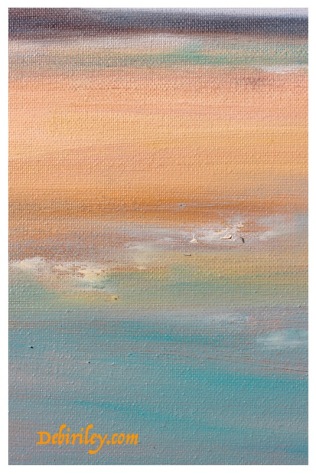
If I had to assess my Featured, floral watercolor palette knife image, I’d call it High Key.
The break down of tone percentages would be roughly… 55% Light tones 35% Mid tones 10% Dark tones.
Edges are an underestimated player.
Edges. I love to use Edges in my art work.
They just tell the story better, create better depth, more interest to the paintings.
Soft edges that blur off provide the viewer with a sense of calm, serenity, welcome, gentleness.
These edges “invite” us in.
Hard, crisp, sharp edges act as barriers and walls. Keeping us rigidly ‘out.’
Keeping us restrained and in place. Defined…. and in the box.
Use your Edges well. Place them as if they were in your home; and you want your visitors in the allowed rooms, to feel welcome.
Direction, line movement another.
Horizontal line directionals convey calm ‘restfulness.’

Vertical movement in the painting will express a more energetic, assertive vibe.

The diagonal line is the most active. This expresses the most ‘wildness’ of the three.
A jagged diagonal conveys dynamic energy, unrestrained.
Typically a balance of the 3 is a great design technique.
There is also a circular directional movement you can employ, it is trickier. But it can certainly impact the viewers’ responses. Taking them around and inward, probing in, and leading into the image. Its another tool for the artist to think about!

Materials and Tools used also play a role.
The Palette Knife, as I used it in the Feature floral bouquet image, has created quite an abrupt sharpness to the painting.
Staccato.
Brisk. Now! A Demand is being placed upon the viewers’ eyes with each stroke of the knife.
Finally
What do we want our Audience, our Viewers to…. feel ?
That’s the question we need to ask before we begin our paintings.

A similar floral bouquet to the featured painting; this is also high key.
But the shouting and stridency of the featured painting is not in this last one.
Here we have a gentler feel to the floral image.
Its softer, “homier” and more relaxing.
I prefer, this last image, personally.


Shapes and especially colours, can certainly set the mood. Something to consider if you’re putting paintings in an office.
LikeLiked by 2 people
All soothing to me!
LikeLiked by 1 person
Wonderful. I love this bouquet that just jumps off the screen: the colors, the abstraction, the impressionism, the blank spaces, the balance – it has it all – bravo 🙂
LikeLiked by 1 person
thank you, I appreciate that Andrew!
even thought this isn’t my personal fav painting I’ve done, I still like the white spaces and the abstract quality of it. For me, that ‘saves’ it 🙂
LikeLiked by 1 person
I love them all, Shouting Out and Abstract Grteen are my favorites. I like hearing about your techniques.
LikeLiked by 1 person
thank you Sharon, it is really interesting to hear people’s favorites. Shouting Out is a bold dynamic still life, that I did enjoy the process. Fun….
and Thanks!
LikeLiked by 1 person
A superb selection of art Debi – my favourite is the vertical Forest Painting, I love tne colours, textures and lines. It’s interesting that there are so many things we have to give careful thought to before we begin any art work so that we can create art that has mood, atmosphere and emotion….
LikeLiked by 1 person
thanks! ahh…. the Forest, serenity!!
all but the featured image, were from prior posts. but they served as great visual aids, so I merrily use them anyway LOL I think alot of readers at this point, haven’t seen them anyway….
LikeLiked by 1 person
Brilliant artwork, as always, dear Debi… I like ho you write as well.
I agree with you… Paintings an soothe us, or can provoke us. And…. Yes!… This bouquet could be defined as “demanding” (great word, you have chosen, by the way!).
The fact that art attempts to make us react is valuable. Undoubtedly: Art is (among other things) a sort of stimulii and it has to do with feelings. And the most genuine and spontaneous ones are precisely our reactions. 🙂 Sending love & best wishes!. Happy week ahead! ❤
LikeLiked by 1 person
many many thanks! I always,
value your comments Aquileana 🙂
Music, paintings, poems/writing, etc…. all are meant to make us feel some Thing.
We, just might fail – but Pandora has left us with Hope; that we might succeed the next time. (loved your article…. )
LikeLiked by 1 person
Nice 👍😘
LikeLiked by 2 people