Change. Change is good! So, I’m trying 3 new things out and testing to if they work or not. And if they don’t, well, I sure had fun experimenting with the processes!

3 Fun Flowers : Digital, Watercolours and Monoprint
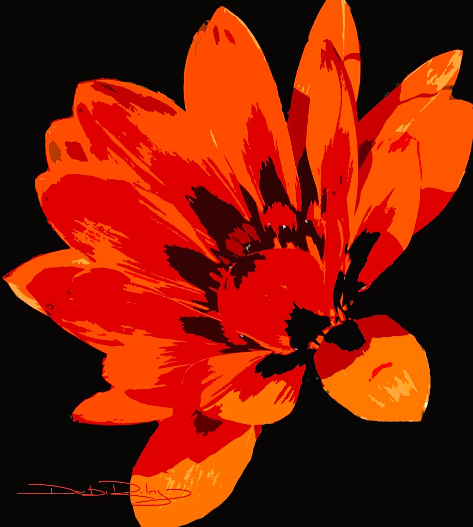
Digital Painting
The top image Bright Eyes, is a digital painting from a photo I’d taken of one of my less than stellar flower paintings in acrylics. The acrylic painting was not so nice. Appalling is more appropriate. In fact, so bad it made me wonder how I could consider myself an artist. No one will never see it, I had to toss it in the bin!
But, I wondered how I might alter and fix up the image using some of my new software programs.
I separated the one flower from all the rest and darkened the background to black. I liked the contrast. Then totally changed the colour scheme from a dishwashy beige that was too bland, into a vibrant scarlet red orange. Again, I liked it. Then I went to the filter cutout and did a tweak with that.
Finally, I gave it a nice square crop.
Watercolour Painting

The challenge on this image: the watercolour paper had gone south. Well, what happened is that the sizing they put into the paper, it dissipated. Left.
Turning my very expensive Fabriano Roma paper into something more like blotting paper. But, I was not going to be deterred. I’ve used rice papers often enough, so I thought I’d give this a go too. I know that there will be no super sharp hard crisp defining lines. All edges will be softly diffusing. Gentle.
And with that in mind, I chose to carefully tear the four edges in a random organic fashion to enhance and work with that feeling.
My thoughts were to come up with a soft warm sunlit type of flower scene that hinted of a lazy summer’s afternoon.
The watercolour paints I used were winsor lemon py175, permanent rose pv19 and prussian blue pb27.
Monoprint in Prussian Blue Pb27

For the final image, I chose to try a mono print in blue. I love Prussian Blue Pb27 – it has a lovely range of tonal nuances from the palest tint to the deepest near black. Acrylics work fine for me in mono prints, and they are handy. Easy to clean. Fast to dry.
I was thinking along the lines of Matisse and his flowers, his style when I started this, being quite partial to his mark making approach. My mind shifted back to seeing some of Matisse’s works at an exhibition at the New South Wales Art Gallery NSWAG in Sydney some years ago, and I was ready to go.
I taped glad wrap to a flat board. Then applied the prussian blue with a brayer. Next I used cotton buds, cotton balls, erasers to draw the flower shapes and vase shapes fairly quickly.
Acrylics will dry fast, so I needed to ‘draw’ fast before the paint dried – or it won’t print. It will stick to the paper.
I pressed my paper down onto the ‘plate,’ rubbed the print, lifted and voila. Mono print was done.
If I decide to later, I can return to this and glaze over it with other colours. Or put pastels over top. I’ve had a look, assessed the image and will come back to soften some perimeter edges that I feel are too sharp.
Just a smudge, here and there is all it needs.


The digital flower looks cool!
LikeLiked by 1 person
thank you! first real go at these, so I’m glad you like 🙂
LikeLike
They’re all beautiful, but that monoprint is stunning! Way to go, Debi!
LikeLiked by 1 person
hi Laura, thank you for cheering me on! 🙂
LikeLiked by 1 person
I think you’ve succeeded with your experiment, beautiful and exciting art.
LikeLiked by 1 person
thank you Sharon very much !!
LikeLiked by 1 person
This was fun to see your process and i love your monoprint with the prussian blue, one of my favorites too. i think it’s a gorgeous watercolor, much like payne’s gray, another favorite of mine lately…. i’ve been venturing into the dark side… thank you for explaining this simple way to make the print… i hope you share it if you add more color to it but it’s lovely the way it is. 😉
LikeLiked by 1 person
Thank you L’Adelaide ! I’m glad I was able to explain it and hopefully make it sound as fun as it was. If I do glaze the mono print, I’ll post the aftereffects. For awhile, I’ll let it incubate a bit 🙂
LikeLiked by 1 person
Inspiring as always Debi. Just catching up after our trip away. The prussian blue mono print inspired by Matisse is wonderfully free and loose. His work inspires me every day in the studio with my print of one of his Vence Chapel stained glass windows facing me on the studio wall. 🙂
LikeLiked by 1 person
that sounds lovely to have in the studio Andrew, very inspiring indeed 🙂
LikeLike