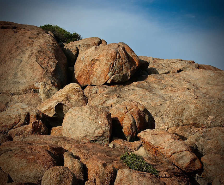
Beautifully wild and rocky. The terrain of Cape Le Grande National Park, Western Australia is filled with bright colours, bold skies and gorgeous natural rock formations. I loved it and will go again. Georgia O’Keefe would have loved it!

Yesterday’s post “Its A Climb,” I mentioned plans to paint based on my Cape Le Grand trip. I don’t want to rush the process, just to have something to show. Its actually going to be some weeks before I get a real chance to ‘let loose’ and fully investigate these ideas.
In the meantime, I will continue to have a look through my diary of photographs I’ve compiled. And let the ideas, colours, textures, flavours and feelings “simmer.”
This is going to be a slow and steady climb.
When all is readied, then it should come together without trying to force it to ‘hurry up’ with thoughts of a Timeline…which will only result in me wrestling and struggling with the Processes in order to try to get a Product.
Watercolour Techniques
So I was thinking, what watercolour techniques would I most likely use? Probably wet in wet technique for the sky for the nice soft edges. The textural techniques might be dry brush or splatter, or even both. But only for the close up areas.
I might go for my molding paste and texturize a 640gram paper where the nearest boulders and rocks would be placed. No, molding paste is not a normal watercolour technique or medium. It is used for acrylics, generally. But, I quite like it as a base support to pour and drip watercolours on, once the paste is dry.
An example for you to view is in a prior post Watercolour With a Twist, this shows close up the beautiful sculptural textures made possible.

Watercolour Paints
Another process I go through is the paint pigment selection. How do I choose the watercolour paint colours that I will use?
The subject plays a major role, so too: the atmosphere, my personal interpretation and my knowledge of individual paints’ characteristics and traits.
At this point in the process, I’ve culled many watercolour paint colours out.
Leaving in for further internal debate: burnt umber, black, naples yellow, quinacridone gold, light red, buff titanium, burnt sienna, raw sienna, quinacridone rose, quinacridone burnt orange, cobalt, cerulean, white.
Generally, I will do a number of practice colour mixes. I’ve done several test strips to mix blends of siennas, browns and blacks; trying to get a sense of which blends ‘feel’ right for The Cape Le Grande images. This blend of black/sienna has possibilities.

A wise artist teacher once told me, “A good painting is 80% thinking and only 20% painting.”
When you plan to climb a mountain, First plot the course you will take. Then, steadily follow that course to the top. Pursue the seemingly imPossible.


wow, what a beautiful place, Debi and wonderful watercolor mix, have a wonderful Sunday, cheers Mitza
LikeLiked by 1 person
thanks Mitza, its a very cool blend, thats quite handy for landscape elements
LikeLiked by 1 person
Good advice. Thanks, Debi. Beautiful photos!!
LikeLiked by 1 person
Gorgeous Debit – love the photos and your work. Wonderful quote – I find the more painting I do, it’s become exactly that 80% thinking.
LikeLiked by 1 person
and I believe that is exactly, where most of us come undone. Taking – The Time – to plan it out. Whereas, we would much rather, “Get stuck into Painting, Right NOW!!” one instructor said, “alas, much goes awry, if you’re so unwilling to preplan for an moment or two.” how true. I may not have enjoyed the comment at the time 🙂
LikeLiked by 2 people
Fabulous photos! Looking forward to seeing what you do with them!
LikeLiked by 2 people
it will be a surprise… for me too LOL
LikeLike
Very beautiful, inspiring nature.
LikeLiked by 1 person
thank you Maria for stopping in 🙂 and for your lovely feedback!
LikeLike
Beautiful photo and great post! ~Rita
LikeLiked by 1 person
🙂
LikeLike