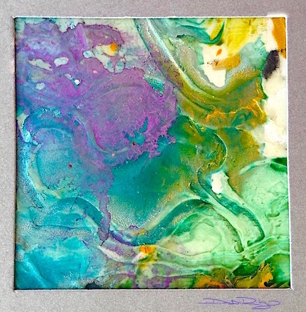
Lovely cool lavenders merge with turquoise blue on a sculptured, impasto textured Hot Press paper. The whole process, from start to finish was a experimental technique that was super fun!

Great for Textures. Fast, fun and playful watercolor technique. Easy.
Here’s how I did it.
- I had some small pieces of watercolor Hot Press paper to use up, so I got out my acrylic impasto gel and slathered it on thickly. Then took a qtip and made random designs into it.
- I could have had a more organized approach and planned something. I didn’t feel like it. But you might want to.
- It had to dry overnight, in order for the watercolor to properly ‘move’ on the surface.
- I thought I’d try 3 colors I don’t normally use together: phalo turquoise, indian yellow and cobalt violet. These combined to create a dominant cool feel to the painting.
- Once I made certain the surface was Dry, I ‘dripped’ in the 3 colours. Randomly. To see what would happen.
- Not wanting to go overboard with too much paint destroying my Light tones and Mid tones I stopped on the ‘sooner’ side rather than later.
I like the purple movement over the blue turquoise. And the deeply grooved patterns cut into the surface from the impasto.
This Inspiring impasto + watercolor technique has lots of potential for larger pieces, as well as for more representational images too. I’d love to do a profile using this technique! I can see ‘Matisse influenced’ work using this approach would work quite well.


O m g 💜💙💛 madly in love with this!!
LikeLiked by 1 person
should get my store up soon then shouldn’t I?! 🙂 rofl I can email you the full res. if you like.
LikeLiked by 1 person
YES! Would love love love to see!
LikeLike
Hi Debi, I want to touch this artwork. I enjoy working with texture. I like the spontiniety and playful color flow of the paint. I can tell you were having fun. Thanks for sharing the process.
LikeLiked by 1 person
good morning! Thank you very mush Sharon! wish you were here to touch and feel the sculptural feel and then do some for yourself!! 🙂 it is … probably what I’m really meant to be doing More of I think.
LikeLiked by 1 person
I hope you do more, too. I’m just getting ready for dinner. 🍲
LikeLike
Wooooooooooot! If this is what not planning does, I say more more more! So so gorgeous, Debi. Thank you! 💜
LikeLiked by 1 person
random… roll the dice! lol thank you so much Laura, that was lovely to hear!! CHEERS and a hug, debi
LikeLiked by 1 person
that’s really beautiful, Debi, kind regards Mitza
LikeLiked by 1 person
hi Mitza, thank you for saying so; it was just a quick little experiment I’d wanted to try! cheers, Debi
LikeLiked by 1 person
your little experiments are always wonderful, Debi 🙂
LikeLiked by 1 person
thanks Mitza !
LikeLike
Like how the color transitions create a circulating composition for the eye to follow: purple to blues to greens, to the yellow in the upper right corner… and by a “commodious vicus of recirculation,” back to Howth’s purple castle!
LikeLike
Gorgeous color combination, I love the go with the flow approach, sometimes produces amazing patterns and this one is no exception, I especially like the over flowing colors part. Very dynamic and beautiful!
LikeLiked by 2 people
thanks so much for that Eva! I have so much fun learning from experiments, even if half of them bomb out! 🙂
LikeLiked by 1 person
Awesome colors blended! Reminds me of spring, and also the ocean.
LikeLiked by 1 person
Beautiful loose, just letting go with this Debi. Wonderful painting, with lots of energy. Happy New Year!
LikeLiked by 1 person
many appreciative thanks Mary! I’m thinking I should be doing more of these types of paintings, than the tighter work for this new year. again, thank you for your thoughtful comments Mary, cheers, Debi
LikeLiked by 1 person
LoVe your colors and how they mix together, Debi! 😃 Is impasto like a molding paste? I love experimenting!!! 👍❤️🌟
LikeLiked by 1 person
hi Jill, Good Question!
yes. and no.
impasto dries clear. will not impact the paint clarity.
molding paste often will. both have wonderful uses for textural effects and Can… be used in wc/acrylics/oil/mixed media. but, normally thought of as only an Acrylic medium.
LikeLiked by 1 person
Purple and turquoise – my favourite colours. 🙂
LikeLiked by 1 person
hi Kerry, thanks!! I agree with you, they are great together 🙂 maybe I should do a some posts on Happy Pairings!
LikeLike
Beautiful color combination!!
LikeLiked by 1 person
Hi Lucy! thank you very much for your comment, I appreciate it 🙂 cheers, Debi
LikeLiked by 1 person
Splendid amalgam of colors! These last few days, I see that I have lost many of your works of art Debi!
LikeLiked by 1 person
happy new year Jacint and Thank You! cheers, Debi
LikeLiked by 1 person