Its easy to get carried away with colour – when emerald, amethyst, indigo, scarlet, magenta, cobalt, sunflower yellow lure you in! And then you end up creating either Mud… or a lot of rainbow splashes going everywhere. However much fun this is, in order to achieve a more successful painting you have to force yourself to use less colours. I know its hard to do when those colours are so beautiful and so bright, so ….. Tempting!

There is more power, more impact and more sensitivity when you drastically limit your palette. Monochromatic paintings can be absolutely stunning in their evocative qualities. Perhaps if you chose to go this route, I’d suggest maybe indigo blue, or burnt sienna either would be great choices. Both have a lovely range of tonal values that you can create very subtle nuances of colour to the full maximum, deep dark tones.
Most of the time I generally will limit my colours to 3-4 and then do a bit of mixing within those to create whatever else I’d like. Very easy if I’m using my 3 core basic colours (cobalt pb28; permanent rose pv19; winsor lemon py175)
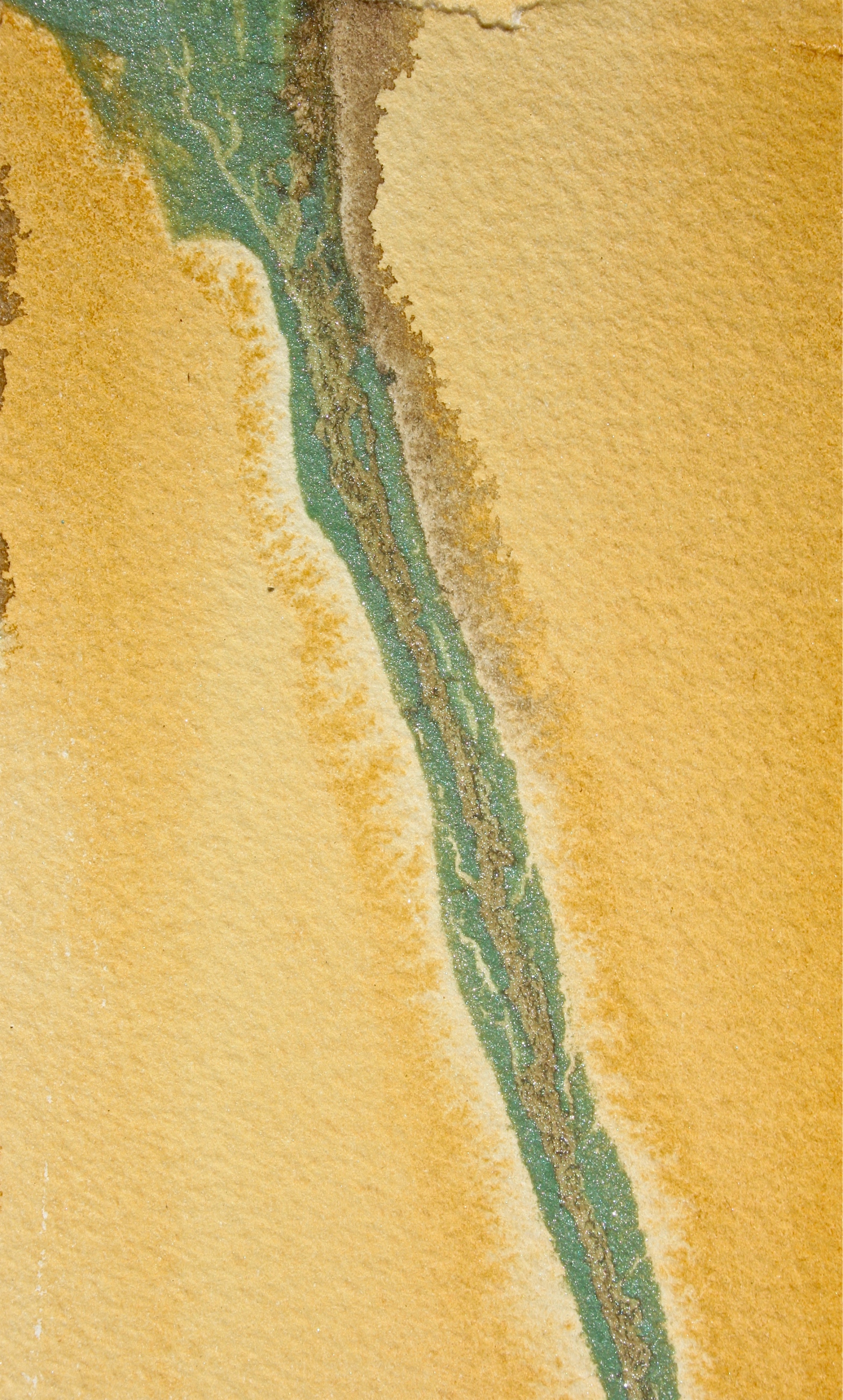
In the painting above, “Near Jim Jim Falls, NT” I used Burnt Sienna, Ultramarine Blue, Prussian Blue, Winsor Lemon. Below, “Like a River” I simply used naples yellow with perylene green. I find that the fewer colours I use, the better the final result is to my eye.


Hi debi! Very helpful that you include the makeup of the paints(py175 etc) names really are not helpful even if you have the maker because you then need to look up the ingredients anyway if you want to use those colors….we use Wilcox book but it’s becoming outdated and I don’t know of anything new like it….
LikeLike
Hi Kathy, and Thanks! Wilcox actually lives in Perth, and I do use his and Hilary Page books for reference at times. Manufacturers of paints can name their paint any pretty name…but if the pigment number is correct it has to be the genuine pigment. So that’s what I go by + alert students to do the same. I haven’t seen any New fresh published books on this subject. Thank you for being a regular follower – much appreciated! At some point, this year I’ll probably ask to see what topics some of you are most interested in seeing and work a bit on those as well. Have a lovely day and happy painting.
LikeLike
Thanks for visiting Debi. I love your work, which is really inspiring. Looking forward to following you in the coming months. With warm regards 🙂
LikeLike
Thank you very much Andrew! thank you for following too, as I progress with the posts I’m aiming to keep improving the site. Right now, I’m just on my 41st post; so still working out the process… learning as I go. 🙂 you’ve done some great art work yourself!
LikeLiked by 1 person
Thanks Debi. The blog looks great 🙂
LikeLike
l love the light you have worked into this top image.
LikeLike
Thank you, your words of encouragement are appreciated! and thank you for following my posts too as I continue to learn as I go 🙂
LikeLike