Four acrylic mixed media abstracts; all with the power of blue.
Harnessed together with opposing forces of tonal values.
Discover how you can effectively use these intriguing differences: high key and low key.
Light and Shade
Light and shade, or as I term it, Tonal Values.
High Key
With a “high key” painting, the prevailing dominant ratio of tones will be on the Lighter end of the scale.
Perhaps, about 75% – 80% Light Tones.
Tips for High Key Watercolor: you would use more water with your paints and, leave a lot more of your paper – White.
High Key Acrylics and Oils: you would increase the amount of white to all the paints you use, and in many places use nearly straight White out of the tube.
Second Tip:
when we are trying to learn and cement a specific skill, we really will learn it faster, if we focus on that skill.
And lessen the pressure to ‘do well’ with the all rest of the skills.
By limiting my colors ie to blue and focusing on the Key, I’ll increase my speed of learning and proficiency.
And thats what we all want to see.
Evidence… of Progress!
A High Key painting creates the feeling of space.
Of Freedom, movement, breath, light, air, action.
It is lighter, breezier, cheerier.
It uplifts, and is much more joyous.
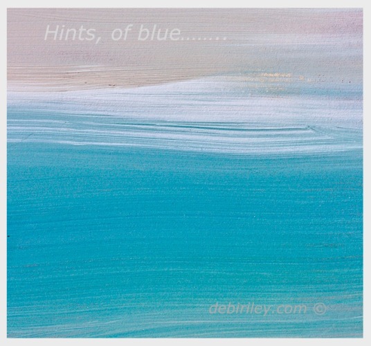
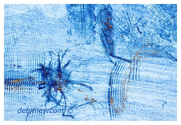
In both of the above images, the Light and Mid tone percentages are greater than the much smaller percentage of Darker tones.
This is what gives the paintings the ‘airier’ lighter feel compared to the paintings below.
Low Key
These paintings below, have a higher percentage of darker and mid tones.
The mid tones and dark tones dominate the image.
Rough estimate 75% or so. Give or take.
The Low Key paintings create a more somber feeling to viewers.
There is a sensation of being more contained, but it also can have nuances of foreboding at times as well.
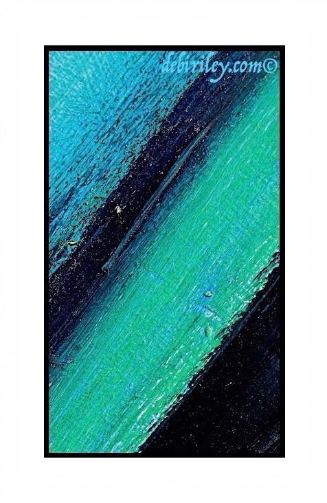
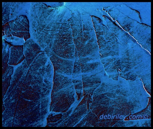
When you wish to convey summer, celebrations, joy, movement, spaciousness, etc. you now have a definite tool to rely on.
Simply ‘High Key.’
Same thing when painting to express the opposite. Use, ‘Low Key.’
Awareness of our options, gives us the strategies and the power to execute them – as the subject and mood dictates.
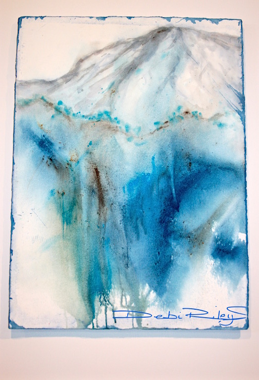
High Key – Watercolor Mountain
This is my rough estimate of the painting’s tonal value ratios….
Light tones 40%
Mid tones 50%
Dark tones 10%
Additionally…. with a Vertical, format rather than a traditional horizontal, it provides us with an increased sensation of movement, of implied action.
Of Space and of Depth.
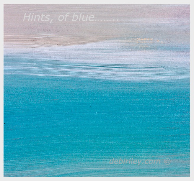
I included this at the last minute, because it illustrates nicely the ‘sensation’ of high key using vertical format.
And to show you how you can ADD Light Tones (white,) by using light white matts to increase the light ratios, if, that is what is required.

Excellent lesson, Debi. Thanks.
LikeLiked by 1 person
thank you! still thinking of your wonderful pretty pussy willow photos….. so lovely…. more???? 🙂 we don’t get them here LOL
LikeLiked by 1 person
They are across the street in our neighbours’ yard. I used the zoom on my camera to take the pictures.
LikeLiked by 1 person
❤️
LikeLiked by 1 person
muy gracias!
LikeLike
All wonderful, inspiring paintings Debi but the watercolour mountain is my favourite – simply stunning….
LikeLiked by 1 person
Thank you, thank you E…. yes, I am 100% with you. it is my fav too. it was the, last minute, inclusion LOL
LikeLiked by 1 person
Your art takes. my breath away!!! And bless you for sharing as you do, Debi!! Thank you! 🌹
LikeLiked by 1 person
thank you Amy! things I never knew.
but discovered. and it makes sharing these tips, so rewarding. ….cause they are so darn Easy!! 🙂
LikeLiked by 1 person
very interesting!
LikeLiked by 1 person
Jodi, thanks!
these are the things… I Never, knew.
And they can really impact the art work. Thats why, these tidbits are so fun to Share!!
LikeLiked by 1 person
I really enjoyed all of the color samples and descriptions of your process. Your students must just love your classes.
LikeLiked by 1 person
thats so great Sharon! thank you! I think most of them, (those that stick around) LOL do enjoy ‘the creative expressive voice’ approach I advocate. And those that need a different style, I try to find them, the right person for them to go to. someone who won’t kill their spirit, or stifle their voice…..
LikeLiked by 1 person
Really beautiful.
LikeLiked by 1 person
thank you Nico, blessings and peace to you 🙂 cheers, debi
LikeLiked by 1 person
Thank you Debi for your explanation and inspiration.
LikeLiked by 1 person
you’re welcome, glad that you enjoyed this! cheers, Debi 🙂 and thank you!
LikeLike
Looks beautiful 🌈
LikeLiked by 1 person
thank you Karen 🙂
LikeLiked by 1 person
Uplifting in every way Debi. Looks like we are in sync across the blogosphere 🙂
LikeLiked by 1 person
thank you Andrew, and, now must dash over to ‘your place’ to see ! 🙂
LikeLiked by 1 person
Great post Deb! Reflections in Amethyst is so perfect! Love it!
LikeLiked by 1 person
thank You! I appreciate your time, and feedback 🙂 cheers, Debi
LikeLike