
Part of the fascination with paint, is how it reacts.
Its innermost response.
Inside The Pigments
Paints, do things.
Very interesting and lovely effects are created when 2 paint pigments – meet. Some hit it off and are an immediate winning pair. Some, you just don’t ever put in the same space together again.
“Each paint pigment has differing compounds, different ingredients.”
Just as sugar, flour, salt, vinegar are different cooking ingredients and cause uniquely Different Consequences; so too, paints are different.
With unique and interesting results when paired in specific combinations.
It is endlessly fascinating and creative.
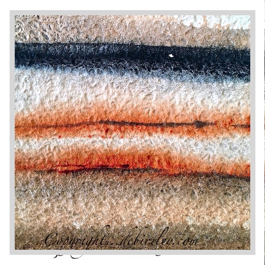
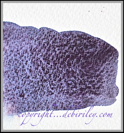
To see how the different pigments respond to each other; edging inwards, layering and blooming.
Looking like painted bands of sediment from deep within the earth’s hills and cliffs.
Or speckles, or rivulets….
For me, its as if each time, is a surprise.
A mini Christmas unwrapping…. to see what’s IN side.
Granted, while many of you may not be as keenly interested as I am about each paint’s ingredients; you might be, quite intrigued with What effects these paints create.
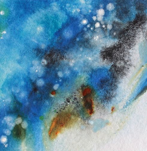
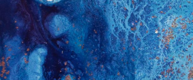
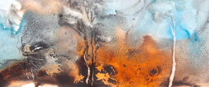
Peek In: Snippets of Colors
A few samples, test strips and snippets of the intriguing realm of pigments –
A look, Inside.
Possibilities
I never tire of the seemingly endless possibilities of unique mixes that they can create.
And – simply by taking a couple minutes to mix 2 odd new colors together. I learn.
(Reminding myself, I don’t have to spend all day. Nor stick to my normal, usual colors)
Then quickly, I jot it down, before I forget!
I do Save the sample, for later.
Remember my ‘Later Box?’
Looking In side that box is fun.
Colors I can suggest:
For those who might have some questions about colors….
Colors I’ve been playing with and learning from most recently:
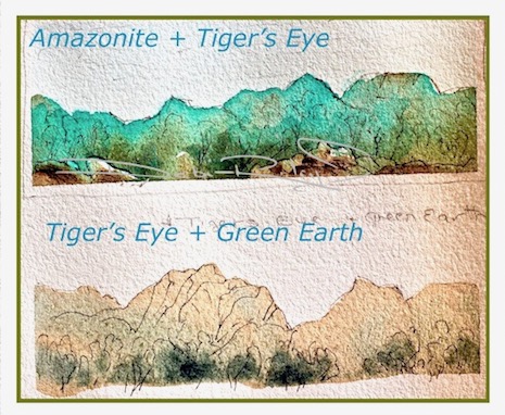
Light Red, Buff Titanium, Lunar Black, Phalo Blue, Raw Umber – yellowish nuance, Permanent Alizarin Crimson, Quinacridone Sienna, Zoisite, Purpurite, Amethyst, Naples Yellow (DS) brand only,
and basically …. all my blues. You know I’m using Prussian!
That Raw Umber, (with the yellowy undertones) wow.
Winsor and Newton’s is a warm yellow based raw umber, btw.
It is so great to mix with your blues to come up with foliage greens that are natural. That belong in the landscape.
I especially like the Raw Umber with prussian, ultramarine, phalo. But, it also is Ideal to tone down, subdue, any of those tube greens you do have… like sap green, hooker’s green, olive green.
Raw Umber is like a magic wand with those greens! Voila. Suddenly, the greens look more natural.
Finally.
I paint often just to see, what happens with the pigments paired together.
I enjoy the mystery, the adventure,
the surprise of what’s IN side.
I’d color mix all day. And have.
With no product painting to show at the end.
Just a phenomenal amount of learning.
Oh…. and Fun!


Brilliant.
LikeLiked by 1 person
thank you very much Mike 🙂 cheers, Debi
LikeLike
Fun indeed! By the way what do you think of Indian Village paper? I also love experimenting with color mixing, never ending fun!
LikeLiked by 1 person
I loved it! its not available anymore, much to my dismay And I can tell you have been putting in a truckload of brush hours Margaret – wow! these recent wc have lit up like nobody’s business. very very lovely work 🙂
LikeLiked by 1 person
Thank you! Oh darn, I think that I was confusing it with Indigo handmade paper. I should order a sheet to test it out. I am a watercolor paper adventurer, though not too many new options out there.
LikeLike
Raw sienna is my favorite yellow and not just for landscape and foliage. I always use it in figure drawing along with small amounts of ultramarine blue and smaller amounts of vermilion plus vandyke brown and sometimes burnt sienna. Raw umber is browner but i keep it right next to my greens and blues for just the reasons you give; it helps to make natural greens.
LikeLike
Thanks for this enthusastic and contagious post! I admire your frankness telling everyone your discoveries!
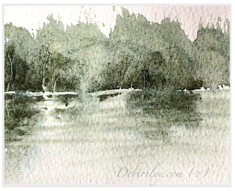
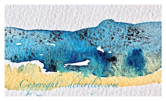
And yes, these are phenomena that excite me, too! And with the colour the chosen paper or other undergrounds play an important role in it, too, as we can see here .
I love your three last images above all! Cheerio, Petra
LikeLike
Very beautiful colours and textures Debi! I love mixing colours – it’s so much fun and, as you say, it’s part of our learning process. I love the amazonite colour…..
LikeLike
Love pigments. Love the texture. You do bring it Debi.
LikeLike
When I first saw your first painting in this post -‘ ‘Painted bands of black and sienna’ – with the title What’s INside? I think my stomach took over my brain and I saw the colour bands as layers in a hamburger! Mmmmm. Anyway then I settled down to read another great post – thanks!
LikeLike
Just beautiful. Thanks for sharing your exploration of color. This post reminds me of Makoto Fujimara’s book Refractions!
LikeLiked by 1 person
boy oh boy, Ally! I’d not heard of him before and I sure do thank you for mentioning Makoto! LOVE his work. just spent 15 minutes looking at his art. What a lovely compliment you gave me, thank you! 🙂
LikeLike
Loving your “experiments” and play with color ~ Which brands of watercolor do you use predominately, or do you employ a variety? And also, which brands would you highly recommend? Thanks, enjoying your posts ~
LikeLiked by 1 person
thank you!! Daniel Smith watercolors, Winsor and Newton, Art Spectrum,
Maimeriblu, but… it really, depends on which color, I am going to use who I pick! thanks 🙂
LikeLike