It is a happy color, Cobalt Teal Blue.
Not in an over the top kind of way, but in the way that just makes you feel ….. content.
I missed it. It was time to get up, get busy, and get out the CTB.
Lets just see what it can do!

Enjoying Cobalt Teal Blue
Enjoyment. A feeling of quiet happiness.
That’s what this CTB seems to always bring out.
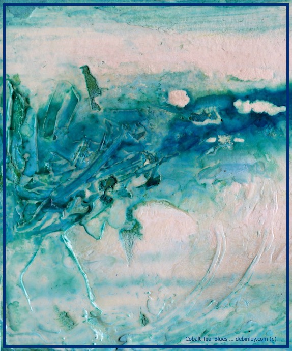
It doesn’t matter if its on regular watercolor paper and I’m creating impressionist landscapes or on a textured up (impasto) paper and I’m creating abstracts; Cobalt Teal Blue never fails to entice and excite.
Even when an artwork really doesn’t work, I still end up admiring the loveliness of the cobalt teal.
That is such a good positive note.
I’ve recently wondered what it is specifically about Cobalt Teal Blue that draws me so.
Is it the cool zen, refreshing quality? Maybe its the hint of tropical waters with the holiday vibe?
Could it be the calm serenity it seems to impart each time I use it?
And why, would any of those things matter?
The artist within is Curious. And thinks, and wonders, and asks why. I was one of “Those” in the classrooms. Sorry!
Materials for the Featured Work
Paints
The chosen materials were 2 watercolor paints – (Daniel Smith) Cobalt Teal Blue and Prussian Blue (Venezia.)
A limited palette goes far, and does much to help with achieving improved tonal values. At least we will most likely get Lights, Mid tones, and the deep Darks. Those 3 that are critical for a 3D look to the work.
Support
For the surface, I chose an old watercolor painting on paper that I gessoed over.
Technique
Then I put impasto gel medium over top the dry gesso with a palette knife.
The palette knife application helped to give it delightful textures for the paints to sink into.
Letting this dry was critical.
My Paint application was simply using a fully saturated brush, my Rekab, to introduce the Prussian blue pb27 and the CTB to the damp paper.
I left large areas alone, as you can see, to keep the lights from being taken over and ruined.
Impasto Gel Technique
This Technique, impasto with watercolor is fun, happy and so exciting. Beginners will like it because at any stage, if you don’t like it, you rinse it off! Mixed media artists will like it as it can be used with watercolors, acrylics, inks and is a great way to create strong texture.
Creative watercolorists will adore it.
Other CTB paintings … you might like
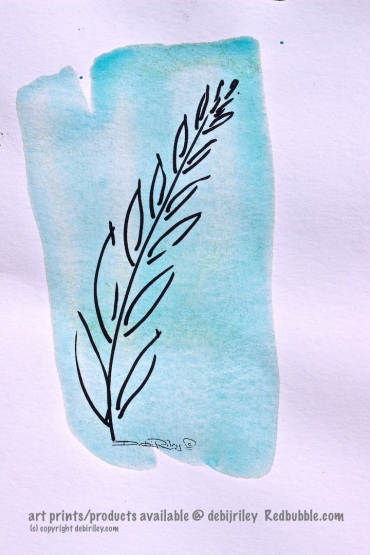
HOW: With a Splash of a Color!
then drawing a loose bold impression of a leaf/fern over top to create a contemporary decorative vibe,
accented with that lovely white space.
You could just as easily, splash orange, red, or purple. And draw trees, cabins, florals, vases, etc.
Whatever suits YOU.
I included this one, to stir your imaginations.
Maybe you can do something in a similar vein. Not to copy the same thing, but use the Technique and create something “You!”
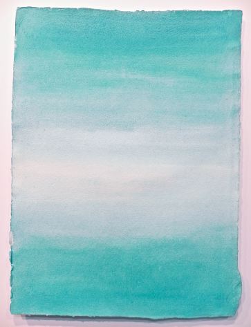
“From the Beach” using CTB only. (image below) and seen previously.
This…. Believe it or not, was a huge challenge to accomplish.
A full sheet 22×30″ on Fabriano Rough paper.
Using a pigment that settles. Granulates ….. so fast, so easy. Wow. If you’ve ever tried to execute smooth even transitions of a Graded Wash using a Granulating paint, you know the quandary.
And you can appreciate also, the larger size magnified the challenge immensely.
At any rate, what I wanted to achieve here was the sensation of being at the beach, standing in a small eddy, at the edge of tropical waters. Just as a small wave comes in. Then looking out, as it recedes further away from shore. In a Rothko approach!
You have seen the Fern and The Beach in the past. But, they had something more to give, more to say. Especially so, on this topic of Cobalt Teal Blue.
1. Granulating Pigments can be a challenge to create smooth, even graded washes.
2. Splashes….. can be turned into creative, decorative designs, if we free our imaginations.
3. Limited Palettes can be extremely powerful and effective.
Partner Posts of Interest:


One of your favorite colors!
LikeLiked by 1 person
🙂
LikeLike
It’s baaaaaaackkkk!
LikeLiked by 1 person
yes! thanks
LikeLike
Beautiful!
LikeLiked by 1 person
thank you!
LikeLiked by 1 person
CBT – a beautiful color indeed!
LikeLiked by 1 person
hi Jodi, thank you!
LikeLike
Beautiful colour but what I always find fascinating is that there are shapes in the paintings. Like hidden pictures.
LikeLiked by 1 person
birds, moons, canyons…. 🙂 lol thank YOU, Anneli!
LikeLiked by 1 person
OHHHHHH! Debi! Your first painting I could look at ALL day! I absolutely love cobalt blue. LOVE what you are creating these days! Thank you so much for sharing! ❤
LikeLiked by 2 people
awesome that is great, thank you! glad you like it amy!!
and whew! its nice to hear you are enjoying the posts – its been so crazy, sporadic the past 2-3 months compared to last year. Thank YOU.
LikeLiked by 1 person
Ditto on my part, Debi. I just don’t seem able to get into a regular rhythm right now cause life is just walloping along and sweeping me along!!! (((HUGS))) ❤
LikeLiked by 1 person
🙂
LikeLiked by 1 person
My favorite colors.
LikeLiked by 1 person
Rothko would have been proud of you and probably asked for some advice at the same time 🙂
LikeLiked by 1 person
and I casually glance to Rothko’s latest piece as he shows me and say, “hmm, perhaps just a bit of a softer edge on the perimeter Mark?”
No, Andrew… can’t see that. LOL
LikeLiked by 1 person
I can. lol 🙂
LikeLiked by 1 person
now, I am Laughing! thanks Andrew 🙂
LikeLiked by 1 person
so wonderful when a color makes one feel content. i think that’s one of the greatest feeling an artist can feel. ❤
LikeLiked by 1 person
you are so right Carrie! thank you ❤
LikeLiked by 1 person
Lovely!
LikeLiked by 1 person
thank you!! cheers, Debi 🙂
LikeLike
That first one is a stunner!! Wow! Thanks for sharing my friend 💙
LikeLike