Color, color, color…. and memories!
My 10 day adventure to The Flinders Ranges, 1993 was long ago, but in my mind – it seems more like just a year or two.

Flinders – Filled with Color!
I can recall the landscape, textures, heat, wind, flies, storms and all those bold, glorious colors instantly. Its been etched in.
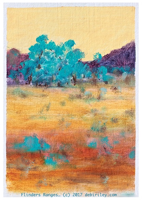
The sunset colors of naples yellow, mountains of lilac, tree foliage of silver and cobalt teal, earth the color of rust and amber.
My word, I was spell bound.
The Trip
The art trip by bus, was organised by a Melbourne group, ‘friends of friends.’ This was a first for me, never having travelled by ‘bus’ before. I learned a lot.
The leader, an older woman had ashes to scatter in the mountains. Her artist/teacher husband always loved to camp and paint the Flinders when he was alive. The ashes were peacefully and beautifully scattered in a lovely natural setting.
The wind captured the dust and carried it up and away.
I thought this was going to be morbid, so I almost chose not to go on the art trip at all. I bucked up and went. Trip of a lifetime and I knew it!
But it wasn’t ‘morbid’, not at all.
Immersed into the Subject
I took hundreds of photos and dozens of fast color studies and sketches. But mostly, all I wanted to do was to immerse myself into the landscape so deeply that I’d always remember it. I walked more than the others, even in the stifling heat. With the crazed hordes of mean flies.
You may ask to see the reference photo for my painting.
I didn’t use one.
I closed my eyes for awhile; and remembered. I know that I didn’t document an exact location ie the corner of Gum road and Sage drive, right next to Dogleg Bluff.
That’s not my thing. I want……. Color.
I want ……. Feeling!
Thats all. Thats really all I need from my work.
The Painting
This is done in artist quality oils, painted on oil paper.
I used naples yellow, white, quinacridone gold, permanent rose, ultramarine, cobalt teal blue.
I wonder if you can tell me where I ‘broke’ the rules…. and why?!
Many of you have been reading my posts for awhile, and will see a couple of things in this painting that does not follow the general guidelines I outline. Can you spot them?
Let it go – and enjoy
I enjoy this color filled impressionist painting of the Flinders Ranges.
I loved being there. I loved painting it.
Its not a masterpiece, a perfect painting. Thats ok.
I enjoy the looking at it.
We don’t need for something to be perfect, or to behave, or to do what we had in mind for it to do – in order to enjoy it as it is. So I have discovered.
*And Readers, Thank You for reading. For following, for sharing & caring. I am grateful.


Another beautiful painting.
LikeLiked by 1 person
thank you X10 Anneli 🙂
LikeLiked by 1 person
I love the colors. They are the colors of our deserts too. What a wonderful experience you had! Dare I say Enlightening?
Rule that you broke. Just a wild guess b/c to me there’s nothing that stands out: Cool pinks and reds were blended in with the warm reds and yellows in the foreground? I’m just a novice so I’m probably way off the mark.
Two Rules I eliminated: Horizon in the center- no, subject in the center-no.
LikeLiked by 1 person
Deborah, thank you! what I’ve done is: the foreground has no real details, darker tones, sharper edges. the sky is flat, not graded dark to light. and the mts in the distance are hard edged and normally the things way back there should be softer, blurred and out of focus. it all works, as my focal point is that Tree – and things are guiding the eye to it.
And Thank you – it was so lovely of you to take the time to share your thoughts and feelings about this image Deborah. I appreciate it! 🙂
LikeLiked by 1 person
I love the sentiment behind your painting – and the painting itself. I go to painting school after work were I learn the rules but I am so keen to break them. Paintings I believe so much more than photographs take us back to a memory similar to the power of smell. Lovely blog post and I continue to look forward to reading more. Kindest Lynsey
LikeLiked by 1 person
Lynsey, thank you! What you said about smell… is so true. I do try to recall the air and scent, to help me. Rules!!
Tony Smibert has said something to the effect of “there are no rules, Just Consequences”
I love that.
LikeLiked by 1 person
Love the quote – I will write that one down! Thank you Debi, have a lovely day
LikeLiked by 1 person
my pleasure; have a lovely weekend. 🙂
LikeLike
you sure caught that red center colour
LikeLiked by 1 person
thank you Maureen, I think I’m happy with that part!
LikeLiked by 1 person
Love those trees. Love that landscape. Spellbound is right!
LikeLiked by 1 person
thank you David 🙂
LikeLike
I love that you create from the feeling! I love that and try to do too.
LikeLiked by 1 person
thank you Jodi; you are a very caring person and I can see how your art shows mood and atmosphere, feeling in them. It is something that can be blocked/stopped up, but I don’t see thats going to happen to YOU!!
LikeLiked by 1 person
Yes I must be careful not to let what I think expectations to be to block it
LikeLiked by 1 person
me too!!
LikeLike
No doubt your bus-buddy experiences helped you connect those great color-feelings in your memory…Sounds like my kind of trip!
Oh yes, the artwork is something I’d love to hang in my own creative space…
=)
LikeLiked by 1 person
it was a unique mix of personalities on that bus – unforgettable. and so funny. lol
LikeLiked by 1 person
Isn’t it unusual for you to place most of the content/subject in the upper third?
LikeLiked by 1 person
yes…. 🙂 and the foreground is not doing what they usually ‘should’ do! and the distant mts are harder edged than what the guide lines suggest as well 🙂 the other atypical thing for me is my use of yellow and purple – that is not, my ‘go to’ duet at all !
LikeLiked by 1 person
Beautiful colors and textures. Very lovely painting! 🙂
LikeLiked by 1 person
thank you so much Carol! very kind and sweet of you 🙂 cheers, Debi
LikeLike
A wonderful story and a beautiful memory, revisited with a gorgeous landscape of the imagination. As to “breaking the rules”, aren’t rules meant to be broken 🙂 Look forward to being enlightened as to which ones of yours you broke.
LikeLiked by 1 person
thank you for those thoughts Andrew! So, generally I suggest that the sky be graded dark to light. Here I kept it soft and smooth, flat, subtle. Next the foregrounds are meant to have darker tones, more textures and detail. No again. Soft blurriness guides the back. Then, the distant far mts. have Hard Edges! Though I did try to soften a bit right at the perimeters, and angle the mts towards… the CTB trees. that helps. There you go!
LikeLiked by 2 people
Just as I thought, rules are meant to be broken with wonderful results for so doing 🙂
LikeLiked by 1 person
🙂
LikeLike
This is wonderful, and the inspiration trip sounds so peaceful. No wonder the memory has stayed with you!
LikeLiked by 1 person
hi Julia, thank you so much! I’m glad you enjoyed it too. One day… I hope to return to that region 🙂 cheers, Debi
LikeLike