Watercolor, The Basics.
Color mixing. No wheel. Just 3 pure colors of loveliness……creating
“whispers of pale mint and greyed greens,
mist laden green foliage of zen.”
Yes. I love color.
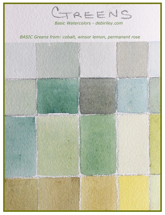
Simple Greens of Nature
What you need:
Cobalt pb28 + Winsor Lemon py175 + Permanent Rose pv19
3 paints + a sense of fun, patience, serenity and keen sense of exploration is all it really takes to mix these greens. I used Saunders Cold Press (100% cotton) for its easy and smoothness of color blending.
Please see Foliage Greens for more green information. Its a great article, informative and very helpful.
Nature’s Environment
I created this small color chart of greens with my local environment in mind, thinking and remembering it.
As I go to paint, I select colors that will mix and create that scene. That remembered color mood and atmosphere.
This is what I’ve always done, its just an automatic response at this stage. Mimi Robinson the design artist is now making more people aware of this type of approach. Letting her groups of followers know about using the colors that are in our local environment. Those shades and hues, in our own natural living habitats.
This is a wonderful calm, natural approach I love. Which is why I so often go on my “zen strolls.” I know I’ve said before, they are not meant to be walks or hikes.
But they’re leisurely strolls to fill the well of my inner creative artist. To take my time. To not rush in this one thing.
To fully engage and be in the moment.
To see.
To breathe deeply in fresh air.
Zen Strolls are life changing. But I digress.
Color Perfection or, Essence
When I paint I don’t get bogged down or overly ‘stressed’ to try to match the exact precise color to perfection.
I like to make sure the tonal values are correct, number one.
Then make sure the message and essence, The Spirit of the land is somehow conveyed.
The Feeling of the Land is a post I think you’d enjoy a quick read through.
Color is … more of a ‘fluid’ living entity though for me. As you perhaps have come to discover in many of my Color posts:
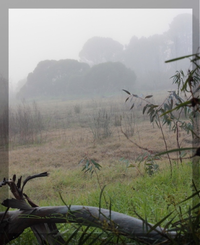
Desaturated Greens in the Fog
This photograph was taken on the rare, blue moon, we saw fog in our local suburb. A one off occurrence in the 8 years we’ve lived here.
It was quite early before the sun emerged.
Chill and damp. Rather bracing. Loved it!!
You may notice, that the angle of the photo is askew.
I’d kneeled down on the wet grass to try for the brighter green in the foreground to give way as the fog took control in the distance. It was so cold, I was shivering!
I think the photo achieved the subtle range of gentle, desaturated greens that I saw. Covered with a thin veil of fog, the colors softened, into greens of tranquility.
I can see the palest grey greens of the shrouded trees in back.
And the blanketed viridian umber meadow is there too. So too is the veiled, lime grass green that is the foreground.
Simple Greens, back to basics. I didn’t need ‘more.’
It was – enough.


I love greens.
LikeLiked by 1 person
thank you Dawnmarie! 🙂
LikeLiked by 1 person
😍
LikeLiked by 1 person
thank you David! 🙂
LikeLiked by 1 person
i really love your simple approach to creating art, Debi! the simplicity of each painting gathers enough strength to make someone pause and look closely, to feel, to connect, to learn. what would be world be is this simplicity is also applied to life in general, i bet we will all be happier and more appreciative.
LikeLiked by 2 people
What a great comment Carrie! Thank you so much!
Simplicity. that is one thing that art really has taught me…. Less. IS more. 🙂
LikeLiked by 1 person
Soothing colour.
LikeLiked by 2 people
thank you Anneli, I’m glad you felt the calmness and serenity of the color and place. 🙂
LikeLiked by 1 person
My favorite color! I’m saving this post for future exploration. Thank you!
LikeLiked by 1 person
hi Deborah, thanks! I’m happy you enjoyed it, and found it useful! That is excellent 🙂 cheers, Debi
LikeLiked by 1 person
Debi, your colors and photograph caused me to want to step in the morning dew of the picture and lie down on the soothing pallet of green in the color squares. Peaceful. Thank you for sharing your vision with us.
LikeLiked by 1 person
Denise, thank you! I loved your comment 🙂 I’m happy to know that the post and the images did manage to convey the mood of peaceful serenity …. even as just those simple blocks of colored shapes. Fantastic! cheers, Debi
LikeLiked by 1 person
Yes!!! lol that is all I have to say….simple 😉
LikeLiked by 1 person
good morning Miss M!! thank you very much 🙂 I think maybe this year I should get simple tattooed on me… ok. well, maybe not!! LOL But, for painting, its going to be a great idea 🙂 have a great rest of the week, with some zen strolls and painting! cheers, YRF
LikeLiked by 1 person
😉 I will! a promise!
LikeLiked by 1 person
I love mixing colours and creating colour charts – I find it very therapeutic! I love the soft pastel colours in your chart… !
LikeLiked by 1 person
Evelyn, you are so right! it is relaxing!! 🙂 and thank you very much, I appreciate your comments. the gentle greens just needed to be done, so it seemed. very calm and peaceful. thanks again! cheers, Debi
LikeLiked by 1 person
Grids are always good.
LikeLiked by 1 person
absolutely! so helpful. and relaxing. and the information learned usually, sinks in so much better than just ‘reading’ about it LOL cheers, and thank you!! Debi
LikeLiked by 1 person
Loved your reminder to do” just this thing.” It is what I strive for and so often do not do.
LikeLiked by 1 person
hi Carol! and thank you for your very kind comments 🙂
It is quite a difficult thing to do for most of us. We have been trained, conditioned, to be busy, busy. Busy! to produce, to accomplish. to ….not rest, or ‘relax’ actually. So, it is with great difficulty, that we begin something that asks of us to be still. To pause, to relax. And – it remains a challenge 🙂 cheers, Debi
LikeLike
I always leave your wonderful posts with a moment of zen. Today it is to remember to pause and feel “the Spirit of the Land”. Thank you 🙂
LikeLiked by 1 person
Andrew, that really is kind of you! Thank You for sharing your thoughts. We all could enjoy a few moments of zen 🙂 Cheers, Debi
LikeLiked by 1 person