
I love the free loose boldness that comes when I create my impressionist landscapes. Especially as color studies.
There seems to be a fresh sense of Life to them that the other ‘worked’ images usually lack.
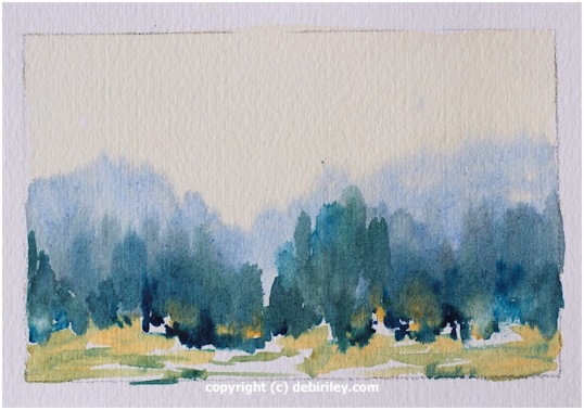
Watercolor Color Studies
And perhaps its the colors, that seem to shimmer in the light. Or the mood was fully captured in that split second.
But I do know, that I always receive more satisfaction, more joy, more LOVE – from my color studies.
Fresh and free. Calm, and energized simultaneously. Every brush stroke filled with purpose. I love that, when it happens. As I’ve stated in prior posts, this doesn’t occur 24-7 every time I pick up the brush! But, it does happen more often, with my impressionist landscape color studies.
Mastering Color
This image was done in conjunction to my Atwell Gallery course, “Mastering Color.” We are focusing on Blue watercolors this term.
Right now we are up to Prussian blue, Phalo blue, Ultramarine blue. With 2 yellows. Winsor Lemon. And the Daniel Smith watercolor Naples Yellow.
My Color Study Steps
1. In the color study, the sky has a lovely warm clear wash of Naples Yellow. Yes, it is an Opaque.
2. But, the secret of this color, is that if I dilute it enough it will thin down beautifully.
3. While the sky area was damp, the Granulating Ultramarine blue was applied. Not too wet, not too dry.
4.Next the Prussian blue mixed with a bit of Naples yellow for a hint of dark, blue green.
5. A couple of dashes of deep dark Phalo blue at the bottom of the tree shrubbery shapes, helped to “anchor” the trees down. ie not to ‘float.’
6. The foreground was a warmer, darker version of Naples yellow, leaving gaps of white paper!!
7. Then some pretty little hints of minty moss green for some lively variations.
Impressions of Place
I can’t say that this was a ‘planned’ painting. Nor was I looking at a photo.
I was however, step by step, retrieving memories of places I’ve been. It just happened the area turned out to be the Hunter Valley, NSW where my good friend lives. Good times!
Without a Photo
I find, that not having a photo is a liberating thing.
Trying to paint from a photo often confines me. It Is very arbitrary.
It causes me to feel, as if, I MUST Obey IT.
(and I know, invariably ….. students also usually will feel that very same compulsion.)
I’m an artist.
Why, would I want to obey it? (a photo)
Why, would I want to stay in a box?
Why, would I want to color within the lines?
We’re all different and unique. We paint and create, for our own reasons.
But if, you’re like me. And paint for that lovely sense of freedom and boldness, for the adventure of stepping out of the ordinary routine box, and the joy of painting the colors as you like ………..
Perhaps
You may like to begin some wonderful watercolor color studies, in your own way and voice. I think, you’ll Love it!


I love this painting, and I love the Impressionists.
LikeLike
Beautiful scene. Could be on Vancouver Island.
LikeLiked by 1 person
you make it look so simple and beautiful – and it is not simple! LOVEly!
LikeLike
It’s lovely! I love the color palette, and how peaceful it looks.
LikeLiked by 1 person
Very nice!
LikeLike
So very, very true, after all the creativity is not to be ‘framed’ or restrained. Have you ever heard of remembered landscapes? Thomas Sgouros was the one who named that particular kind of painting (I think!) What you are talked about here in your post makes me think of remembered landscapes. Anyway, I love your impressionistic painting. Go ahead dare us to walk out of the confines of a photo and walk right into creativity!
LikeLike
Very nice love the looseness!
LikeLike
I like your color studies and little experimentation, Debi 🙂
LikeLike
A lovely watercolour – inspiring… !
LikeLike
love the looseness, love the energy and to some this may look easy to create….splash on color and its done…..but no, this is difficult and one lovingly made from the heart.
LikeLike
A beautiful impressionistic “Landscape from the Imagination” – what could be better 🙂
LikeLiked by 1 person
thank you 🙂
LikeLike
It is wonderful to paint from memory. Love your colors here, Debi and your sense of play! 🙂
LikeLike
thanks Jill, you’re so generous! thank you 🙂 it was Fun to do!
LikeLiked by 1 person