
Glorious Greens.
Wet flowing watercolors. Olive and Lime greens, running off the paper.
Blue-green drips down and splashes, making its own path. Its own mark.
Wild Watercolor Greens
Allowed to run with abandon upon a dampened receptive, willing, surface. They can be so exciting. And they can be so terribly frustrating.
There’s such pleasure to be had in the simple mixing of greens. Its a soothing, serene color.
Yet, I didn’t start out so keen on “mixing greens!” It wasn’t easy, I got mud. Never got the right color, the right tone, the right depth. I wondered what was wrong with me!
Well.
- I was trying to use too many paints!
2. Trying to make color the First priority instead of realizing its actually Tonal Values that is #1 in creating …. Success.
3. I was also using paints that were not great social mixers; they weren’t happy to mix well with the others!
I changed my ways. I decreased the paints I was using, no longer was it a ‘free for all’ in which I had no idea if they’d make mud or not. Then, I made Tonal Value my first priority over ‘matching’ color. (This was very hard for me, a colorist, to do.) Finally, with a lot of study… I figured out which Paints, were happy to mix well with others. And Who were best at playing solo.
My greens began to liven up.
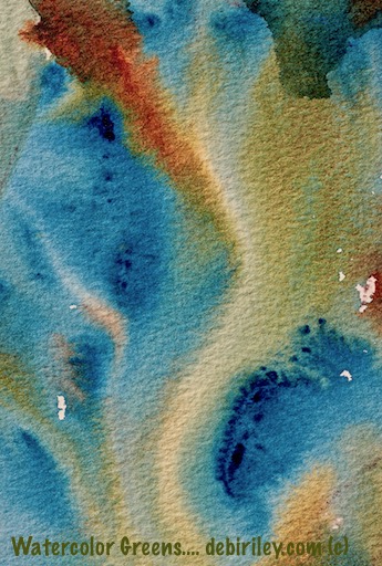
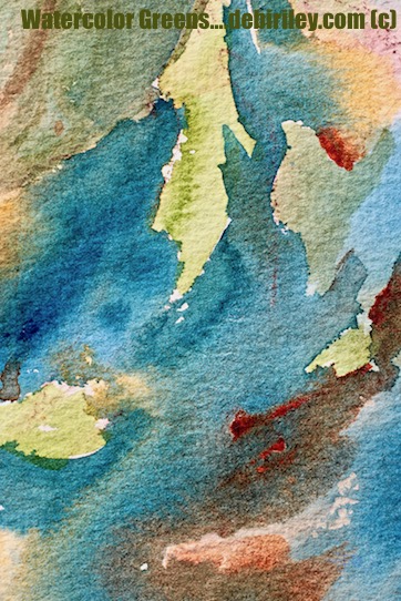
Prussian Blue for Mixing Greens
My secret ingredient for a large portion of my greens – is Prussian Blue pb27. A stainer, it mixes well with most colors. Prussian has the range to give me lovely, deep, bright or subdued greens.
In the images shown today, I’ve mixed Prussian Blue with the Daniel Smith Quinacridone Sienna PO49/PR209.
Quinacridone Sienna is a lively, rich red sienna.
Also a stainer, it is a great mixer. It rarely causes mud. If you used normal Burnt Sienna PBr7 with Prussian, you will still get a green. But it will be less ‘bright and lively’ and a lot more earthy and subtle.
Many paint makers now just make burnt sienna with PR101, a synthetic substitute for the genuine pigment. This is a duller, muddier, more Opaque ingredient – that I don’t find harmonious – with the greens I wish to create.
Watercolor Mixing Method
I used wet in wet technique to allow the Prussian and Q. sienna to mix ‘as they wished.’ I did tilt, the paper a bit to the right and left a couple of times.
But this style of mixing, provides an organic and ‘natural’ feel to the area. Especially, if I were to use this as a background and middleground.
Allowing, the paints to merge as they will gives a much less ‘contrived’ look. Its less stiff, tight, rigid.
It can be scary. At first you feel out of control, that the paints are more in control than you!
However, by creating a plethora of these – For Fun – you begin to learn the quirks of the paper and the paints.
You begin slowly to sense, when the paper has had enough. It takes time. And many, many “paint mixing Investigations.”
By deciding to work with just 1 blue and 1 other color for a few weeks, you become ‘friends’ with them. You learn their secrets. And you don’t forget – because you only have the 2 paints!
I choose to call my efforts ‘Investigations,’ Or experiments.
I’ve learned, that for me, it is a very liberating phrase. I automatically…….. Loosen Up!
For those interested in more watercolor greens, more watercolor tips
Prussian blue color mixing
Quinacridone Sienna Staining paints and pigments
Creating these glorious Watercolor Greens are fun, soothing, relaxing.
One interesting way to think about mixing greens is to imagine you were expanding your ‘library.’ Just, in greens – not books.


Prussian Blue…..yes! love this post….I have been thinking of getting Quin. Sienna. One more for that growing list! I haven’t had the time I need to experiment with PB but hopefully soon.
LikeLiked by 1 person
Glorious color!
LikeLiked by 1 person
hi Susan, thank you so much…. glad you like the greenery (yesterday) ! cheers, Debi
LikeLiked by 1 person
Beautiful colors and abstracts!
LikeLiked by 1 person
thank you, that is lovely! glad you enjoyed this 🙂
LikeLiked by 1 person
thank you for always posting such beautiful and useful, helpful, educational, artistic information!!!
LikeLiked by 1 person
my pleasure Jodi! very happy that you enjoyed the greens today 🙂
LikeLiked by 1 person
I really like those earthy tones and the texture of the paper showing. Prussian Blue can be a handful – you handled it very well here, complete harmony.
LikeLiked by 1 person
thanks Fritz, and you are so right. PBlue can be a real little terror. but… then, you sorta get used to its quirks LOL thanks!
LikeLiked by 1 person
nice colors
LikeLiked by 1 person
the prussian blue, you’d like! I do love playing with mixes, I’d do that all day if I could. LOL
LikeLiked by 1 person
Me, too
LikeLiked by 1 person
thank you Mitza 🙂
LikeLiked by 1 person
My paints are often in more control than me and I have decided just to give in to them as they seem to know what is needed better than I do 🙂 Great post Debi.
LikeLiked by 1 person
thank you Andrew. its great to know that your paints and mine, seem to be in ‘cahoots’ LOL
LikeLiked by 1 person
“Smooth operator” that’s it, that is the expression what I was looking for in my mind! You riding smoothly with your brushes and colors composing beautiful flowing symphonies of colors!
LikeLiked by 1 person
thank you Miss Eva, so much. this was a hard one for many to ‘get’ as its just not Anything representational. I’m glad you enjoyed the colors as they ran and merged 🙂 cheers, Debi
LikeLiked by 1 person