Wonders never cease. Watercolor magic with 2 paints, a skewer, dirty scuffed 15 year old paper…. I’m in for a challenge!
The Wonders of Watercolor
I had some old Hot Press paper that the sizing had gone off; making the paper unreliable. Very Old watercolor sometimes will do that. This was about 15 years old.
The paint would absorb randomly, soak in and blotch in some places while other areas were unaffected. Additionally, the paper was quite scuffed and marked. “Dirty” paper!
I had 3 pieces that had been cut into a 8×8 size and I had no idea of which paper it actually was…most likely Saunders, possibly Arches HP. I do try to remember to initial the paper name on my paper, but apparently I’d been ‘remiss.’
Lets see how I handle the challenge of using ‘absorbent’ and Dirty old paper! yikes
Limited Palette:
A limited palette of the lovely and very versatile prussian blue pb27 and quinacridone gold po49 will work wonders.
This duo creates a wide range of greens. From super dark to the palest tints. Deep forested blue-greens to golden olive tones.
With just these 2 paints, I can mix greens that infer a Background, Middleground, Foreground and Centre of Interest = Depth. This, is going to help me create the illusion of some depth. Hopefully, just enough.
Edges
For the most part, I would like to have a dominance of soft misty edges.
Why? I like how soft edges “invite and welcome” a viewer Into the painting.
I like how softer edges all around the paper’s perimeter, the borders, will help to bring the viewer back in to where my focal point is.
Soft edges are calming, zen, soothing, relaxing…… Serene.
I like zen things. It suits me. Art, watercolors with a ‘zen’ softness is the right path for me.
Changing Perspectives:
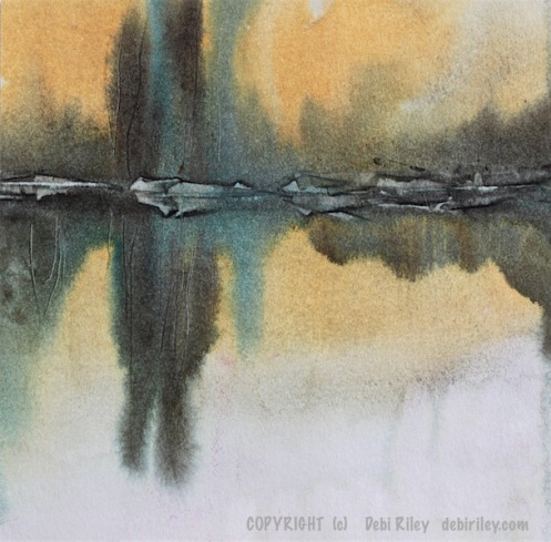
Upside and Downside. When this image was finished, I played some more. Turning it upside down.
Its fun.
When you have certain types of paintings and subjects, you can turn them around. Look at them from another angle.
Use a new Format. Change the Viewpoint from Up or Down – you may see something even more interesting. It often happens.
How we as the artist look and see a thing influences how the viewer might also see them. Try to make the image, the vision “alluring, suggesting, hinting, enticing.”
Try, somehow to encourage the viewer to want to walk into and have a wander through the painting; to sit down at the river’s edge and …breathe.
Tonal Values
I always mention: Light Mid Dark tones as being critical.
And its true, you do need at least those 3 to create a 3 dimensional look.
But really…. by aiming for a range of 9 tonal values I can achieve a more effective and eye pleasing image.
I can easily count 3. then 5. Now…. paying attention, I look and find my 9!
Watercolor Goal
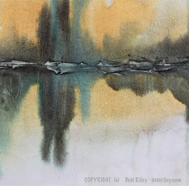
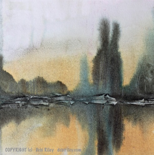
My painting objective was a soft, impression of the Hawkesbury River, NSW Australia as the late summer fades into autumn…. with that gorgeous glow, post sunset.
Hoping. That one of my 3 EFFORTS on this dirty old paper would be a happy one. The first was a mere ‘warm up.’ I discovered the paper’s liabilities.
The next 2 were ok. This one shown is the better of those.
The wonders of watercolor tips:
- limited palette works wonders for getting great Tonal values
- even ‘crusty’ paper can be harnessed
- prussian blue pb27 is such a Delight, a versatile paint
- skewers make wonderful tools to create tree trunks
- hints of blue peeping through adds to the charm
- allowing lots of white space adds grace, elegance
- my focal point was, in a wonderful location
- don’t be afraid, stressed about boo-boos
- fear, is the real enemy
- So Just whack the paint on Anyway!!
I count this experiment as a pretty good success using horrible, old paper most would have trashed. The delights and wonders of watercolor, never cease to amaze me.


A beautiful success indeed. And I love hearing your thought process.
LikeLiked by 2 people
thanks Jodi! and it is really…. a case of win some – lose some.
Papers, are Quirky the best of times so its a gamble and roll of the dice each time.
I never, ever know for sure just what is going to happen. and, I think that right there, is the wonder and magic of Watercolor’s pull on …me!
LikeLiked by 2 people
Beautiful creation indeed!!!!
LikeLiked by 1 person
thanks!! I’m pleased you enjoyed the quietness of this reflection scene! it was a challenge, a risk. I just never know…. that’s the fun part! 🙂
LikeLiked by 2 people
You are a real artist…..
LikeLiked by 1 person
thank you – that is very lovely and kind of you to say so. I appreciate it 🙂 cheers, Debi
LikeLiked by 1 person
My pleasure….
LikeLiked by 1 person
Wow on what you’ve done with the reflections. Amazing.
LikeLiked by 2 people
thank you David, prussian blue is the secret! and just a bit of zen
LikeLiked by 1 person
Beyond Zen Debi…
LikeLiked by 1 person
🙂 thank you
LikeLike
This is a quieting BEAUTY, Debi..Slightly sad mood today;, pulled me into the depth and softness of the river..I will be resting there..all day..
Perhaps, it is the aged paper, that adds tranquility:. Joanne
LikeLiked by 1 person
good morning Joanne, thank you, much appreciate your comment 🙂 I’m glad you too felt that quietness in the scene, soft and peaceful. A place to go, sit and relax by the river’s edge and get restocked. restored. The old, dirty, misbehaving paper did, influence me as to which approach and Technique I used. I just soaked the whole thing!! then painted. lol
LikeLiked by 1 person
Very L o ve ly…♥️
LikeLiked by 1 person
Just 2 colors? That’s amazing!
LikeLiked by 1 person
thank youTeresa, yes! just 2, keeps things easier esp. with ‘cranky pants’ papers LOL
LikeLiked by 1 person
Great post!! Very informative!!
LikeLiked by 1 person
thank you and I’m glad that you found it useful and enjoyable! those 2 paints, work like magic together…. cheers, Debi
LikeLiked by 1 person
Thanks for those magic of colours!! Looking forward to see many more magics from you the magician:) Thank you Debiriley.
LikeLiked by 1 person
thanks Sumith! I’ll give it a go and hope you enjoy the posts! 🙂
LikeLiked by 1 person
Those colours are so pleasing together.
LikeLiked by 1 person
hi Annali, thank you. they are my “go to” recipe Duo as they are Pretty + sooo versatile. cheers, Debi
LikeLiked by 1 person
Beautiful reflection, I like the limited palette, that Prussian blue creates a mood !
LikeLiked by 1 person
thanks Jennifer, I’m with you on the virtues of a limited palette. it can do so many good things for my paintings. and yes, … dreamy Prussian Blue! 🙂
LikeLiked by 1 person
I will be coming back often to analyze and study this post, chock full of gems. I love your painting, soft and perfect. I need to get Prussian Blue, I remember in the past I had bought Antwerp Blue, I think Winsor Newton and I think that the two are one and the same. I loved the mixes I got from it. I will be purchasing it this coming week. Thank you so much Debi for this. I am finding that the DS Aurelian sucks for mixing, it never wants to mix. I always seem to have to coax it and I get so frustrated. I will be buying Hansa Light next! lol it is a never ending quest for me in regards to a pure yellow. geez……anyway, thank you for all your work on this wonderful post.
LikeLiked by 1 person
I used to use antwerp and aureolin, for years. then tried Maimeri Prussian blue and DS Hansa Yellow Light and they suit how I like to mix colors… clean, fast, clear, fresh and lightfast!
and – you’re welcome Margaret; I was really hoping that you, would enjoy this particular post and info. so I’m glad you do!! there will be more on greens, depth, DS paints down the track too. cheers! hey I did get to pin your rivers to my rivers board (after fiddling abit) Your name and website is ON the pin.
LikeLiked by 1 person
Oh very cool! so glad that you able to pin them, I didn’t even go try anything, too busy with all kinds of trouble! 😉 okay so now I have to get both PB and Hansa yellow. looking forward too more 🙂 you are a doll and a half…..maybe two dolls! lol
LikeLiked by 1 person
hehehe… I’ll take that with a smile M!! I think I’m going to come up with a new acronym “BwT” meaning Busy, with Troubles!
its getting alot like that lately, geesh. for everyone.
and I just say… “MORE RIVER!!” LOL
LikeLiked by 1 person
Yes! more river!
LikeLiked by 1 person
amen
LikeLiked by 1 person
Wow….your river board is fantastic! I have to take more time to amble through but I love your collection.
LikeLiked by 1 person
thanks! you saw yours? I’d love to put more of your river art in there too!!
LikeLiked by 1 person
cool…..pin away 🙂
LikeLiked by 1 person
fantastic!
LikeLiked by 1 person
Excellent.
LikeLiked by 1 person
glad that you enjoyed the peace of the river here, Nico!! PC debi
LikeLiked by 1 person
i would never have guessed that this was as you described it to be. it’s absolutely beautiful. i was thinking that if you like prussian blue, you might like paynes gray, that isn’t a gray but a gorgeous blue and transparent. if i remember, prussian is more granular. anyway, how you did this is a wonderful example of never giving up and never getting scared of what shows up on your page. 🙂
LikeLiked by 1 person
thanks!! and you’re right about plain old not giving up. finding… a way. 🙂
I haven’t tried any new paynes gray in the last 4-5 years now as I’d given up on them.
all the many brands I’d tried were drying a bit dull, flat for me. But, I’m game to try one that doesn’t. I normally like paints that are single pigment paints as they tend to mix and behave better than colors with 2-4 pigments in them. What Brand of paynes grey are you using?
LikeLike
You did make me walk in with my eyes, and wander around, looking, searching, feeling and challenging my perception (upside down) of the grounds. It was a rich experience and the best part of it is that there are TWO paintings in one!!! Debi-zen, very clever!
LikeLiked by 1 person
I’m very, happy – ah, zen happy, that you enjoyed this little trickery!! lol
LikeLiked by 1 person