Is “Pretty” good enough? How “Gritty” does it need to be? These questions are what artists might ask themselves as they set out to create.
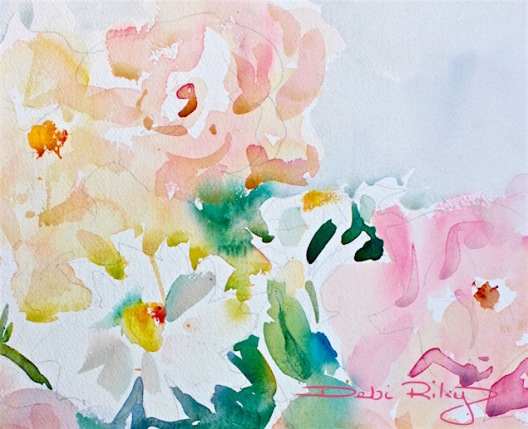
Yes, Its a pretty spring flower painting. But….
Pretty Picture
Merely surface pretty can be just plain vapid. Leaving one hungry for more within a few minutes. Anxious to hurry up and move on to the “next.”
Prettiness does not necessarily always fill the well.
If we’re lucky, it will also have depth and substance. Thats when I know I have succeeded.
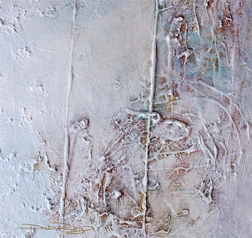

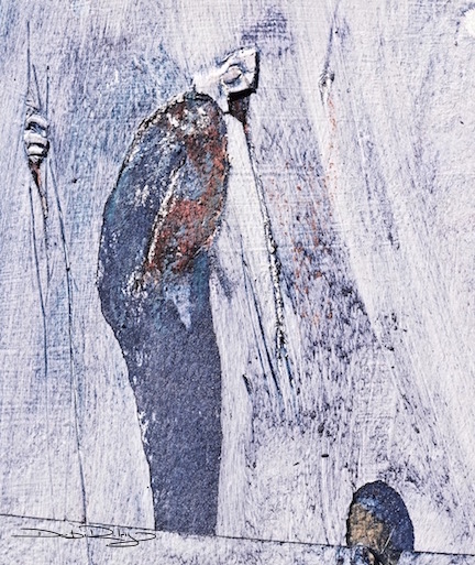
Gritty

On the other side: Gritty.
Unrelieved Stark, Raw emotion can be too painfully confronting and overwhelming, if its in excess.
If it is right in your face with no let up. There is Just Too much tension. We want to run for the hills!
The artist must balance the two (pretty and gritty) on the fine edge of the highwire.
Sometimes when I use the camera to create, I will try to evoke a quieter and reflective mood. But it is with the intent of contemplation.
I aim to draw the viewer in, to stir their imaginations and thoughts.
By camera or by brush.
I try to integrate and infuse my images with something beyond the surface of the subject.
To interject in between these layers a deeper meaning and context, that hopefully the viewers will sense.
I aim to reveal from behind the veil, a vulnerability.
A sensitivity that surface pretty will not show.
I’m not always successful, but, that is nearly always my creative goal.
If I’ve been successful in my objectives, then my image is both pleasing and has some grit.
Good, Enough
Now, to return to a phrase that really isn’t in my teaching vocabulary, nor in my practice vocabulary either.
“Good Enough.”
I don’t use that term.
I use the terms: “Does it meet my criteria,objectives?” ,
“Is it a step in the right direction, does it take me closer to where I’d like to go?”
These are positive and encouraging.
“Good Enough,” has a ring of negativity that infers, it will Never ever be Good Enough.
There will always be a flaw.
I choose optimism and positive reinforcement for my artistic self.
Finally
Definitely, there are days I will choose Pretty Art over Gritty Art.
Because that is what I need, on that day.
But overall, I know that to improve my art, I need to focus on creating art that has some grit to it along with the pretty.


thought provoking 🙂 love the photos and paintings and especially the subject.
LikeLiked by 1 person
Indeed it is!
thank you Margaret! I wondered…. how this post will go. some will dislike , some will like. I think its a sensitive subject actually.
LikeLiked by 1 person
Excellent lesson! It’s another part of the balancing act in art. So much of the creative process is difficult to put into words. You do a very good job of describing elements in ways that are easily understood.
LikeLiked by 1 person
thank you Judith!! a balancing act on the high wire indeed 🙂 I did have a hard time in my early days, as instructors used lingo without descriptions. making me feel a bit ‘inept’….. 🙂
LikeLiked by 1 person
so true, so true 🙂
LikeLiked by 1 person
thanks Andrew 🙂
LikeLike
I like the grey and gritty ones. And you’re so right about “Good enough.” That expression tells that it could have been better.
LikeLiked by 1 person
thanks! I like those grey ones too. strange enough for a color addict! and yes, it is all about Word Choice.
LikeLiked by 1 person
I learn so much every time I read one of your posts! Have I told you lately how grateful i am for the time you put into your posts and the amazing information you share?! Such great stuff Debi! Such…. great…. stuff…
LikeLiked by 1 person
I’m so glad! Its really rewarding to know you gain some insights, bits and pieces from the posts (Jodi)! Thank you for sharing that!!
Especially with the WORLDS of art info out there… the mind just boggles.
LikeLiked by 1 person
Very beautiful. I especially like the Inflections Blue Greys.
LikeLiked by 1 person
thank you Nico, thats done on wood. and has been hammered into and scratched for texture. i.e….. I literally ‘beat’ it up! lol 🙂
LikeLiked by 1 person
It worked beautifully.
LikeLiked by 1 person
Awesome post, Debi!! I love the idea of adding grit to balance the pretty. Adds so much more character. Loved all the photos and paintings you shared!
LikeLiked by 1 person
thank you Charlie, very much. you do that really well, I think. And when you add your stories, It gives the whole creation a unique flavour and character that I find – well, very, Charlie!! 🙂
LikeLiked by 1 person
hehe… aww thanks so much Debi! 😊😃
LikeLiked by 1 person
I always lean toward the gritty Debi. When there’s grit I want to investigate and touch. There is depth and dimension, and I want to ask, how did the artist do that? Great topic, thank you.
LikeLiked by 1 person
I’m really glad that you liked this one Sharon, Thank You! It is a topic that will stir, I’m sure 🙂
LikeLiked by 1 person
Very inspiring post with lots to think about. At the moment, I like the grey and gritty ones. I was reading this morning the write up of Mark Rothko on Wikipedia and saw his 10 ingredients for painting. The first one: “There must be a clear preoccupation with death”. Not really a recipe for Pretty Art, but then the tide goes both ways, doesn’t it?
LikeLiked by 1 person
thanks you for a very thought provoking comment!
and oh my!! his preoccupation…that might have pushed past gritty… to Run for hills! (for me.) But, I must say I adore his work 🙂
LikeLiked by 1 person
Yes, i agree, I love his work but I think his complete devotion to art alone may have let in some demons of the heart.
LikeLiked by 1 person
quite possibly. I’d never cope if the sole thing…. I had… was my painting.
My family, children, work and friends kept me going on more than one occasion in life! 🙂
LikeLiked by 1 person
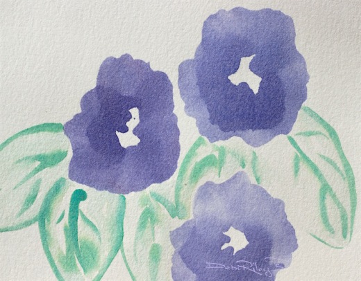
I love the first two paintings a lot, they give a lot of “food” to my “rowdy” imagination. Wonderful colors, I specially like the colors in the first painting, because these are my fav colors. Cheers Mitza
LikeLiked by 1 person
yay!!! very glad you like them 🙂 I figured you’d go for ‘grit’…….
LikeLiked by 1 person
nope
LikeLike
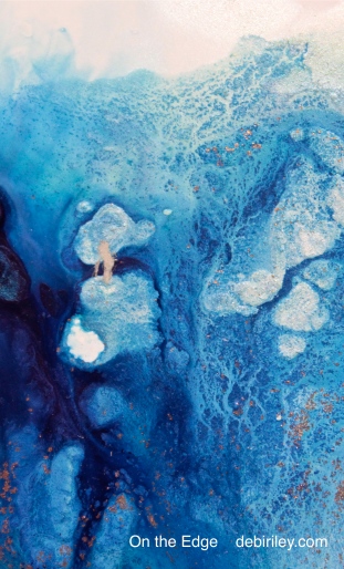
On the edge and Inflections are my favorites. Wow! Love those blues and all the texture you got – I’m guessing that must be acrylics? Gorgeous. Your photos are always wonderful too. You’re very blessed with lots of talent! Thanks always for the info and tips you pass along. Very much appreciated, my friend.
LikeLike
Thought provoking post Debi, so glad I found you. Love your image “Rough Start, Getting Softer in The Back”. Some days pretty works very well and other days gritty is just to much to take. But as usual finding a balance with these objectives works best. I will keep this in mind. 🙂
LikeLiked by 1 person
thank you Beth!! I agree, we do have days we need… just pretty. the gritty has gotten in our eyes too much that day already! LOL
LikeLiked by 1 person
What a great question: pretty or gritty? As a hopeless word-player, I even like the rhyming of it. Yes. Agree that it can be a fine balancing act of pretty and gritty.
LikeLiked by 1 person
Great pick up on the rhyme!! 🙂 thank you for your comment today, I love hearing from people and getting a feel for how the post went that day. And some days…. are just more gritty; or pretty than others. 🙂 Thanks Again, Debi
LikeLiked by 1 person
So true…some days just are more gritty than others. Then there are the pretty ones. Don’t we prefer those, we humans?
LikeLiked by 1 person
yes, I think we all, run from ugliness in its lowest forms. –
but that ‘summer meadow’ seems to fill us with fresh joy and hope.
LikeLiked by 1 person