
Watercolors….Green. Fresh. Lively! Very easy, very basic – in a Debi Riley loose impressionist approach to painting. Sheer Fun!
5 Stems
25 Leaves
Random Splatter….. and that is it.
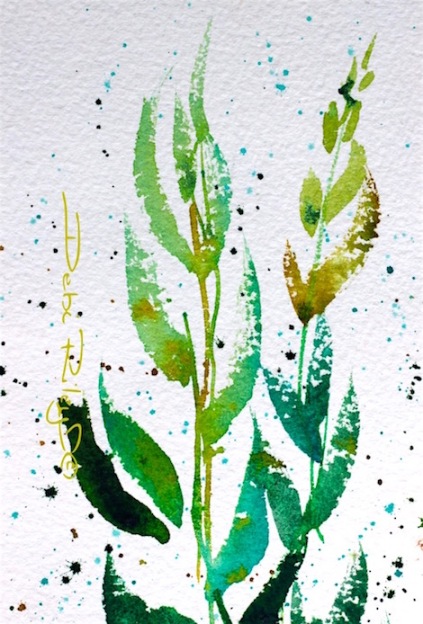
Impressionist Watercolor in Greens
The Watercolor painting, Green Leaves, does have a primary Intent.
Simply, the refreshing colors of green.
In this simple, basic exercise I planned to convey watercolor’s superior translucency and vibrancy – within every leaf.
Many Facets of the color green
- I also wanted to create a rich diversity of green ranges, in all the various leaves.
- An easy exercise that concentrates on creating a myriad of green versions and shades.
- I wasn’t going to be happy with mixing up 2-3 greens and calling it good.
- I needed many greens. Diverse greens to make them come Alive!
Many Tonal Values within the color green
- Very critical to success, was a big range of tonal values of the greens
- I needed light, mids, and darks
- All together I can count 7 tonal values, (9) would be better
- A big range of tonal nuances to add depth and dimension
- when objects look flat… its due to insufficient tonal values
Beginners in Watercolor
If you’re struggling a bit, you might find these tips really Useful.
- counting your brushstrokes;
- limiting the palette;
- painting on white background;
- planning ahead;
- reminding self of Light, Mid, Dark tones
4 Colors Used
Prussian Blue pb27
Cobalt Teal Blue pg50
Winsor Lemon py175
Burnt Sienna PBr7
Other Posts
Green Leaves, Impressionist Watercolor by Debi Riley(c)2016


yep….I realize after the fact that my latest painting has a major lack of value range but then it was a pure exercise in looseness and freedom….values didn’t come to mind or into the mix…until later! Good post Debi 🙂
LikeLiked by 1 person
its really important to slot in days where the whole point, is Looseness and Free Liberation in order to shake loose the chains that bind.
so if it didn’t have all the tones right…. Well, by golly, It sure had the Freedom!!! well done!
LikeLiked by 1 person
exactly….by golly! it shines with a glow that you can’t see in the photo, so on that merit, it works. 🙂
LikeLiked by 1 person
yes!!!
for each painting ‘exercise’ choose 1 aspect you want to WORK, 1 goal. not…. 100. LOL
we, (Me) have to give the self credit for achieving what was Attempted.
i.e. Be Nice To My Self.
LikeLiked by 1 person
yes! exactly! I need to write down these “Debi-isms” lol Another notecard to be written out 🙂
LikeLiked by 1 person
or printed out….. from my nearly 400 pages of articles written LOL
LikeLiked by 1 person
a literal treasure trove!
LikeLiked by 1 person
I hope this image is going on your Society6 store, Debi. Brilliantly painted, your watercolor tips are very good reminders. Thank you.
LikeLiked by 2 people
thats a Wowza compliment Sharon!!
many, thanks. 🙂
Once I get my software programs reinstalled and up and running…. then I’ll add this on to Society 6.
That was a very nice comment which deserves a hug!
LikeLiked by 1 person
Thank you Debi, I’ll take a hug!!
LikeLiked by 1 person
fab – u – lous! (Sharon)
LikeLiked by 1 person
Lovely watercolour Debi…such talent!
LikeLiked by 1 person
hi Frances, thanks so much! I’m pleased that you liked the greens!! cheers, Debi
LikeLiked by 1 person
Stunning!
LikeLiked by 1 person
thank you!
that is such a wonderful comment!! I’m glad that you enjoyed the painting 🙂
LikeLiked by 1 person
It really is gorgeous. The problem I always have with watercolours is using the whiteness of the paper to make the colour glow, as yours does here. Mine tend to look thin. Practice, practice, practiceis what I need to do.
LikeLiked by 2 people
thank you!! practice helps, and a studying a couple of the masters of watercolor – Edward Seago, John Singer Sargent, JW Turner, Edward Wesson, Blamire Young have been GREAT helps to me 🙂
LikeLiked by 1 person
Simply beautiful and I agree with Sharon! This would look great on any number of items! Thanks for the lesson, Debi. One reason I stay away from WC is backgrounds. I hate doing backgrounds in watercolor. The last WC flower I posted last week was on a white background with splatter also but it was Boring. This is how I usually paint in WC. Boring and always with a capital B. Only rarely does the mistress not step on my toes. And then it’s loose but not too loose. I do not like sloppy. Loosely beautiful as your painting is here looks good. So it’s hard for me to find the balance. I tend to err on the side of being too tight because I really dislike sloppy. But maybe what that painting really needed was more tonal values? Maybe that’s what was making it look flat and dead? I’d left a lot of white space on purpose and then when I went to correct it (because it looked weirdly white, too many gaps) I wound up filling in too much of the white. Ok sorry for the long reply but I do love your paintings and I love that you put so many variations of green and even some brownish greens in there. Definitely makes the ordinary extraordinary, adding the interest and the zing to keep the eye in the frame. Thank you as always for sharing and inspiring us!
LikeLiked by 1 person
thank you Laura!! ((LL))
short story – Flat and boring… is gs due to insuff. tones LMD
LikeLiked by 1 person
Ok thank you. I should probably try monochromatic WC if I ever leave the warm cozy acrylic pond again lol. That might help a lot. I am seriously considering continuing this May challenge through June, and incorporating more WC in. Trying to take Jodi into joining in too! Are you interested in going through June too? I think Margaret is definitely in.
LikeLiked by 1 person
I’m interested! I would broaden out to include more photos of my walks. as I’m missing not doing those! and this is the only time – in Perth that I can walk outside due to the heat issues. 🙂
LikeLiked by 1 person
Oh, no doubt. Sounds wonderful – we would really love the photos! I’m so glad you’re interested! It seems to be working out really well! I still need to get into the alarm thing and wake up v early to paint first (in good light) and then go into the other office, instead of the other way around. Would be better in every way if I could just get myself to stop unplugging that clock at 3am lol!
LikeLiked by 1 person
So beautiful dear Debi, you are such an amazing artist, I love your art. Thank you, have a nice weekend, Love, nia
LikeLiked by 1 person
hi Nia, thank you so much for a lovely comment! I’m really happy that you like the painting and appreciate your taking the time to say so!!
I hope you have a wonderful, weekend Nia. cheers, Debi
LikeLiked by 1 person
Beautiful Debi!! Love this one… it’s totally sparkles! Love the colors as well! 😍
LikeLiked by 1 person
hi Charlie, thanks for such a wonderful and lovely comment on the leaves!!
it must be sparkling…. I see you have your sunnies on!! 🙂 cheers, Debi
LikeLiked by 1 person
Your work is like giving the Soul a breath of fresh air. Gorgeous, Debi!!! ❤
LikeLiked by 2 people
thank goodness! I’m so pleased Amy you are enjoying this.
You have the gardener’s touch and so love nature it is really great to hear/read your lovely comments Amy. My Appreciation. 🙂
LikeLiked by 1 person
*smiling*
LikeLike
very nice and springlike post, Debi. Nice design and colors, specially like the teal blue, lol
LikeLiked by 1 person
you a card carrying member now of the CTB club Mitza? …as I slyly smile 🙂
LikeLiked by 1 person
I don’t know this club, you can continue to smile
LikeLiked by 1 person
Cobalt Teal Blue. CTB …………. hehehe
LikeLiked by 1 person
hehehehe, do you know the FFC club? That’s the flipping funny club, heheh
LikeLike
Love the way you painted this, beautiful, serene.
LikeLiked by 1 person
thanks Jennifer, I am pleased you liked the greens, and the green peace of nature shone through!!
LikeLiked by 1 person
Yes and it was lovely! 🌱
LikeLike
These green leaves remind me of this life which will soon vanish willy nilly. It is best for everyone to turn over a new leaf.
LikeLiked by 2 people
Thank You for sharing that! That is a great comment and analogy. I do love it when my paintings can evoke these responses!! I agree, yesterday is just that. Its good to aim at greeting each new day, with a fresh and bright new view. As much as we possibly are able to 🙂
LikeLiked by 1 person
I can’t decide if it’s rain on plants on land or air bubbles in the water around the seaweed. Beautiful either way.
LikeLiked by 1 person
and, what would you ……. like it to BE ?!! hehehe, probably not raccoons, devils or mice! LOL
LikeLiked by 1 person
Seaweed with air bubbles!
LikeLiked by 1 person
sounds beautiful 🙂 greens and blues…
LikeLiked by 1 person
Lovely painting Debi,love the simplicity, yet so effective – and this post reminds me of that saying (can’t remember by who) “value does the work, colour gets the credit”.
LikeLiked by 1 person
wow, Vicki! …. thank you so much for sharing that one!!
I have never heard it before! and, is so worth repeating…… 🙂
What an awesome Quote.
“VALUE does the WORK, Colour gets the Credit.”
LikeLiked by 1 person
Thinking… how can I do this with urban street sketching? Everything is nature… we too, we humans… and what we have made, no less that the weaver bird, or the coral makers… how to see THAT in an urban street scene?
LikeLiked by 1 person
I’m not sure, we all ‘see’ our vision so distinctly. but, perhaps if I were to do a street scene…. I’d block out the ‘noise’ delete the clutter and chaos and simply put in only the bare bones of what called out to me to paint. I don’t do urban scenes, though as a rule. I hope, that might have helped?
LikeLike
Love!
LikeLike
thank you again!
LikeLike