
Inspiration was sparked, by the feeling my Contemplative Photograph collage had evoked. And now, the color green beckoned for more.
The Color Green is Relaxing
Green is a refreshing and cooling color.
Tranquil, peaceful and so relaxing. Perfect for blistering hot summer days, or as a way to relax at the end of your busy day.
And with so many hundreds of watercolor green variations possible, even from mixing with just 3 primary colors – red, blue, yellow –
I never get tired of mixing ie (playing with) my greens!
Artistic Creative Liberties
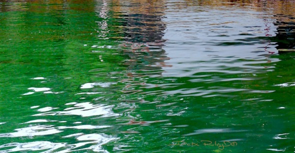
The color green in the photo Emerald Green Sydney Water was a “catalyst.” This Photo, simply ‘stirred’ me to create…. things!
Green is a very creative color. Its very nature is one of growth, development, building, stretching…creating.
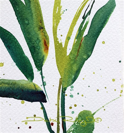
Tropical Flora, a Wednesday Watercolor color study was created and inspired by the color green and simply looking out my window. Seeing the giant Bird of Paradise leaves out in the garden, fresh after a welcome rain. Thats it.
Winsor Lemon, Burnt Sienna and Prussian Blue were the 3 triad color I used to create this painting.
By allowing the leaves go off and out of the paper, allows the mind the freedom to imagine. To imagine and engage the viewer. If I’d have ‘contained’ those leaves, I would have blocked and stopped the viewer from moving and from getting engaged. Drips, splashes that accidently happen… no worries!
Just think Wabi Sabi ! There is much beauty to be found in imperfections around us.
It is a wonderful thing to ….. be a creator, To Create and take artistic license and liberties at will. According to how you see it, how you’d like to see it.
Artistic License
- To be totally Free:
- to alter and enhance,
- to look deeper underneath the surfaces,
- to move things around,
- to change colors and delete as the spirit moves,
- to answer the call within.
- This is exciting and fun!
- No ‘stiff laced soldiers in a row’…. but organic, flowing and zen and Wabi Sabi.
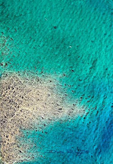
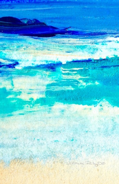
Letting Go. Getting cooled off and refreshed with Sea Greens.
(This was create with the Triad of Prussian Blue mixed with Lunar Black and Phalo Green)
Favorite Green Mixes and Greens
I generally speaking, 80% of the time, will Mix my greens.
From scratch.
Foundation Colors: cobalt pb28, winsor lemon py175, permanent rose pv19
adding
ultramarine pb29 and prussian blue pb27 and burnt sienna pbr7
I find that about 80% of all my greens are created with these for (non – abstract paintings.)
Without having learned to mix my greens from scratch, I would be still making mud. Still wondering what was going amuck.
By making myself, start with few, and slowly add along the way….. I got better at mixing my greens. It makes sense!
Other Greens of Interest ……….
- cobalt teal blue pg50 is a lovely green blue color
- “zoisite” Daniel Smith watercolor, is absolutely exquisite granulator, lovely sage green
- perylene green is a wonderfully full bodied deep range of tones, a very cool green color
- green earth is a soft, gentle dull mint green that is versatile, mixes well, but is pale
- cascade green by Daniel Smith, is a mysterious, 3 chromed color in one. so intriguing.
- phalo green can be useful upon a rare occasion
(I do already have plenty of posts and information on CTB cobalt teal blue; but currently, also working on a Series of Green Colors, which will include the zoisite and perylene, amongst some other goodies too.)
on very Rare occasions I’ve used viridian, phalo green, sap green, hookers green, etc… and when I have, I mute them down.
I tone them down with white or umber or naples yellow…. or something! In order to ‘soften them up’ a bit, so they don’t look so loud and ‘shouty’ in the painting.
unless, of course…. I am wanting the artwork to Be “SHOUTY” !!
But, for me mostly, when I paint…. I prefer a softer look.
Posts of Interest
Cobalt Teal Fresh Spring
Cobalt Teal Trees’ Reflections
Green Earth Prussian Blue Umber making your own paint
Prussian Blue mixing ideas
Lunar Black Watercolor, Daniel Smith, mixing ideas
websites
Cheap Joes art shop online, Watercolors, Daniel Smith brand
danielsmith.com


Excellent article, green is a peaceful color .
LikeLiked by 1 person
Thank you Andy! I’m happy that you enjoyed reading the post and found some of the linked posts of interest as well!
I’m loving the greens more here in Perth for some reason lol
LikeLike
I love Daniel Smith watercolors, my only “go to” tubes of pure fun! I love this post and I want to study this further and study your posts. They are study worthy! thank you for inspiring me once again. I need to think Wabi-Sabi more because I rather have the imperfection and supposed accidents than trying to over control such a lovely medium.
LikeLiked by 1 person
thanks Margaret! hope you have fun having a wander and a read thru some of the post linked 🙂
I know there’s other brands out there! but for some specific colors DS leads the way, imo. and yes, I had to sneak in “Wabi Sabi” 🙂
LikeLike
Blues & greens are my wheelhouse…
LikeLiked by 1 person
they are such wonderful delightful colors, Nancie, I can see why!
LikeLiked by 1 person
I love your talented use of colour
LikeLiked by 1 person
thank you Maureen, that is so lovely 🙂
LikeLiked by 1 person
and true…
LikeLiked by 1 person
Double Smile!! 🙂
LikeLiked by 1 person
If I didn’t already have too many hobbies I’d try picking up paintbrushes again. Your colours are so lovely!
LikeLiked by 1 person
thank you so much!!!
LikeLiked by 1 person
Green is the healing color, thank you for showing so many samples and suggestions. The Soft Green Wave painting is glorious. As always Debi, I leave your blog with more knowledge, thank you for taking the time to share your painting expertise.
LikeLiked by 1 person
thank you Sharon… now having second thoughts, 8 pics was too many- may take some out. I am glad that there was something new/useful for you Sharon!!
LikeLiked by 1 person
Great info on greens and I absolutely adore (ok am swooning over) the tropical leaves painting. You take simplicity to exquisite like no other Debi!!!!!
LikeLiked by 1 person
thank you very much Jodi! I’m lucky, very lucky to have these guys growing in Our gardens 🙂
LikeLiked by 1 person
The soft green waves draws me the most, but I agree with Jodi about those leaves! And I love how you explain the thinking behind it, because my first thought is that you’re taking the eye right out of the painting but I see what you’re doing is really engaging the viewer’s imagination! It is making much more sense to me now. This post took me awhile to read and understand. I found it interesting that you use permanent rose to mix your greens as well as blues and yellows! I was thinking of trying to spend most of one of the weekend days coming up just resting…..would be so nice to spend some time right here soaking up tons of information and inspiration! As Sharon said, Debi, thank you so much for sharing so much with us and really for mentoring and encouraging all of us! We love and appreciate you so much! 💜💜💜
LikeLiked by 1 person
thank YOU!!
fast tip…. those shapes will draw the eyes In.
IF, they are larger on the perimeter and become narrower …ie arrowing In … as they lean in towards the center of the painting.
check and see. 🙂
LikeLiked by 1 person
Thank you back!
LikeLiked by 1 person
your post is really calming and lets me forget the …… weather outside. You taught me to like teal blue and it became a warm color to me, even though it is a cold one, but with a little rum in my tea, everything gets warm, lol
LikeLiked by 1 person
Mitza, … you make me smile. where would I be without you?! I do so look forward to seeing You, your comments! thank you.
LikeLiked by 1 person
I sometimes dream about seeing some of my really good “buddies” from wordpress all over the world, but would be a bit too expensive to fly around the world.
LikeLiked by 1 person
it would be so lovely. if…
but, we are lucky to have this 🙂
LikeLiked by 1 person
so you will stay my virtual Debi, sigh
LikeLiked by 1 person
for now…
LikeLiked by 1 person
Love the shades of green, it is refreshing and reminds me of the outdoors. Bright green adorns my walls at home.
LikeLiked by 1 person
bright green, that would be great Jennifer! good for perk me ups 🙂 love it!!
LikeLiked by 1 person
Debi….I totally, totally love your posts. So, when I want to purchase a new color, I always come here to your blog and see what I can find and then I go make a purchase! You should be an affiliate with Daniel Smith! just saying. So, my decision is to get Cascade Green! awesome! I have a dot of it sent to me and I mixed it with BS, FUB, Lunar Blue, Burnt Tiger’s Eye, Aurelian, Quin Red. and they are all gorgeous! I appreciate you so much! peace as Laura would say. 🙂
LikeLiked by 1 person
thank you, thank you. thank YOU!!! you are too kind!
cascade green is cool in that dilute, it has a triad of colors within it.
I really need to do an update on DS wc and my special mixes and why I like a color…. yep. on my List. long list. lol
LikeLiked by 1 person
That would be awesome…..like I said, your blog is my “go-to” guide on DS color. 🙂
LikeLiked by 1 person
Oh I forgot to mention….Dick Blick has soft press Fab! isn’t that just Fabulous?!!! I still want to go to that store in the city but I ordered some today to try it out. I think I bought the 140# to at least try it. I wanted to first find out how it is before I spend more $ for the weight I love. Can’t wait to get it!
LikeLiked by 1 person
smart thinking!! esp. if you hated the stuff 🙂
LikeLiked by 1 person
no I stand corrected I did buy the 300# soft press…. are you keeping up with my posts? I get a little excited about these things…..lol
LikeLiked by 1 person
well, there you! go for the good stuff straight away! lol way to go M 🙂
LikeLiked by 1 person