
Gorgeous and glittering greens in watercolor.
Deep Jade, emerald, teal, sage, moss green, olive, aquamarine, viridian. All of these wonderful variations, are just so lovely.
And, the process of mixing and creating your own watercolor greens is a rewarding, exciting roller coaster ride. But, we don’t always have to mix our own paint!
Viridian Green Watercolor
Viridian watercolor pg18 – Identification.
This number “PG18” found on the side of the tube, it lets you know that the paint color is Pigment Green 18.
That is is The genuine pigment for viridian.
This lovely green watercolor paint is a transparent, its not a stainer. So it is ‘softer’ and less intense and ‘shouty’ in a painting than Phalo green, Sap green, Hookers green, etc. are.
As a Watercolor Beginner, I learned the hard way, to look closer at my tubes of paint.
I discovered I had about 5 tubes of prussian blue, 4 brands of phalo blue, and several tubes I ‘thought’ were cobalt that were not! They were cobalt ‘hues’ ie ultramarine or phalo blue. I wasn’t really overly happy at the waste of expense.
So now, I look at the label on the tube before I buy to double check. Its been a slow, long process, learning the paints.
But I just made it easy at first and wrote down 2 to remember.
Then a couple weeks later 2 more, and so on. Easy Peasy.
I found books by Michael Wilcox and Hilary Page very insightful. The Daniel Smith art store online information was also was a help.
Amazon has Michael Wilcox’s Guide to Watercolors book
and Hilary Page’s Watercolor Guide
Ways to Use Viridian Green
A Transparent paint, Viridian pg18 makes a great glazing color due to its clarity and freshness. It really rarely makes mud. Its easy to remove off the paper when you need to, in case of oops!
It is a cool green and pairs up brilliantly with salmon pinks, lilacs, violets.
The green and violet duo is a favorite cool and refreshing match up, that I love using.
Viridian and Color Mixing
If I’m trying to paint a more representation subject, say a landscape – then I wouldn’t use viridian straight out of the tube.
Its best, looks more ‘natural’ if the viridian is tamed.
Tone it down with an earth color:
- raw umber
- raw sienna
- burnt sienna
- raw umber, with ultramarine and viridian makes Delightful soft green hills
- These are my usual “go to’s” with viridian green watercolor mixes
Having said that, I definitely do not need to be quite as vigorous with the taming when I use Viridian as when I use Phalo green, Hookers, or Sap green!
With those wild childs of green, I really have to whack in to the earth colors to tone them down to get a more subtle effect.
More Green Watercolor Posts…..
Depth: Background Middleground Foreground
Watercolor Materials Paints Getting Started
Summary
Viridian, pg18 is my pick over phalo green or sap green as the more versatile, useful color – for me, generally speaking. I do paint a lot of impressionist landscapes, flowers and find it more amenable.
With abstracts I can…. and will, uncap the loud, the brave, the shouters. And roll the dice!


I like the transparent idea. Isn’t it amazing how different mixtures of elements, minerals (whatever they put in paints) behave in different ways? BTW, that last painting could be the area between Mulege and Loreto on the Baja Peninsula of Mexico. I have a photograph somewhere that is almost the same scene.
LikeLiked by 1 person
thanks!! thats amazing too, how paintings can take us back to other places and other times… 🙂
LikeLiked by 1 person
I love this lesson and now I need to do more research. Are all of Daniel Smith’s watercolors pure pigment, let’s say the Cobalt? I feel like I just asked a stupid question but hey, someone has to ask! I think that I need to dig in and pay more attention. Thank you Debi once again for “opening my eyes”.
LikeLiked by 1 person
by the way your link “depth in watercolor” is not a viable link. I check out most of them and they link right up to the right page except for that one. I tried at least 5 times….
LikeLiked by 1 person
i will fix it right now. Thank you!
LikeLiked by 1 person
cobalt blue pb28 is pure cobalt. but, not all of DS paints are 1 pigment paints.
nor are they all lightfast either! opera rose….. ugh! fades!! as does alizarin crimson. but if its Permanent Alizarin Crimson it won’t.
perhaps i will do a post for the esoterically curious! lol
LikeLiked by 1 person
Thank goodness I pay attention on the permanence and other details, I love the brightness of opera rose but haven’t bought it in years, probably because of the fading issue. Oh…more posts yes! lol
LikeLiked by 1 person
thank you Margaret! I just fixed the link! good call 🙂 Not alot of people, painters want the info on pigment numbers and traits it seems. but,
it was the single thing that Ignited my imagination in watercolors.
LikeLiked by 1 person
So important especially with watercolors understanding trans. semi-t and permanence, so forth and so on. One of the first things I tackled except for the pigment (hues and etc.) issues that you brought up. I think it was too confusing at the time. I will tackle that one thanks to you! 🙂
LikeLiked by 1 person
you’re ahead of the game on that, to have the categories figured out and permanence too! thats hard enough of to keep track of. sigh.
and you are welcome, of course, I love sharing this information!
LikeLiked by 1 person
I don’t know my paints that well Debi, so thanks for the info. Really appreciate it.
Just picked my brushes up last week again, after 4 years. Hooray!
Your paintings are wonderful and show an experienced hand and eye 😀 Thanks as always for inspiring us!
LikeLiked by 1 person
4 years! wow! watercolors? this is exciting Robyn 🙂
with your eye for design and edges and tones…… your style would be really lovely.!!
LikeLiked by 1 person
Oh you know just the right thing to say. Thank you Debi 😀
Yes watercolours and very much a WIP! 4 years is a long time – I know…I do love it!
LikeLiked by 1 person
well, you know we’d love to see how you go. When, you feel like it. 🙂
LikeLiked by 1 person
Thanks Debi – yes I’ll be posting as my blog is my online journal 😀 It’s good to look back too and see how you’ve (hopefully) improved! 😛
LikeLiked by 1 person
yes, WP is great for that! in many, ways. lol
LikeLiked by 1 person
😃😃
LikeLiked by 1 person
Dear Debi, what a visual treat today. Thank you for posting your variety of different methods.
LikeLiked by 1 person
thank you Sharon, I’m happy you enjoyed it.
I always like “options” Plan A, B, C, D, etc. hence…. these variety of Options that may come in handy! 🙂
LikeLiked by 1 person
I just used viridian this week (on claybord, what a ride that was!) – I’m off to check it’s a p18 though! It is a beautiful colour, and not being a watercolourist, was fascinated to read how you use it…..your paintings are so vibrant yet ethereal.
LikeLiked by 1 person
it is lovely to use and the clayboard, wow! that is so much fun!! can’t get it over here in OZ bummer. thank you for your lovely comment too 🙂 I forgot, ? to say P is for pigment G is for Green and 18 is the ID# of the pigment….. cheers, and have more fun 🙂
LikeLike
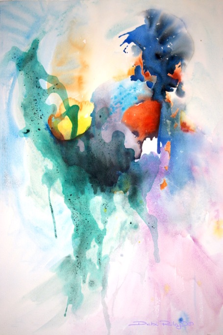
Gorgeous works!! That first one if phenomenal!! I just can’t stop looking at it!! 😍😍
LikeLiked by 1 person
hehehe put the sunnies on!
thank you so much Charlie 🙂
LikeLiked by 1 person
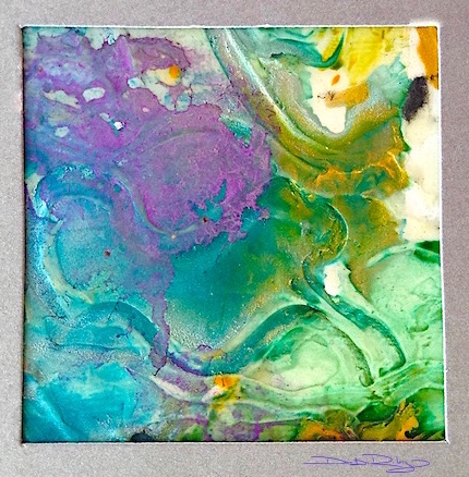
Oh the magic your create Debi!!!!!! Those abstracts are STUNNING! I wish I would discipline myself to learn more about transparents and stainers and what makes mud with what. I just get so excited to PAINT when I have time… Thoughts Ms Teacher for helping me control that??!?!?!!? 🙂
LikeLiked by 1 person
Jodi, I get excited myself! lol
the only thing I do tho, is make sure I have 3-5 papers right there waiting for me.
it helps me hurry up with one, so i can do the Next one.
Those green leaves you liked Earlier- I stuck on the society 6 and am pretty happy with them. thanks for saying you liked them 🙂
LikeLiked by 1 person
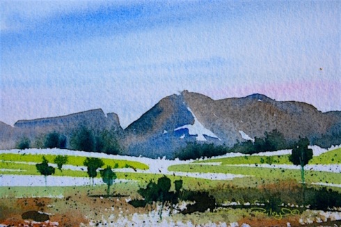
I’m sure that thiel blue is sold out in Sydney, Debi, hehe. But I love all of your paintings, specially the landscape which would be a good illustration for a book cover. I could imagine it with some nice design writing. Cheers Mitza – by the way, today it is one degree warmer, so I drank my tea without rum, hehe
LikeLiked by 1 person
thank you Mitza!! very lovely complement 🙂 and no rum…just vodka hehehe
LikeLiked by 1 person
I’m not Russian, Debi, I’m half Greek and I take ouzo. I remember I read a short story from Chechov once which started like this: “we were drunk like 7 pigs…” That seems to be very common there, lol
LikeLiked by 1 person
🙂
LikeLike
This is great information and things I was unaware of! Thank you for passing on the tip and I will definitely be following your blog.
LikeLiked by 1 person
thank you so Much Ranae! I am really glad you like it and found it helpful! 🙂 cheers, Debi
LikeLiked by 1 person
Debi, your abstracts in watercolor are gorgeous! I should be checking your blog more often (still learning to be present here) 🙂
LikeLike
Oh these wonderful paitnings are so inspiring! I definitely need to play a round with colours more often like you do. I love the free-flowingness of your work. The landscape is really sweet too though 🙂
LikeLiked by 1 person
Antje, that is so kind and thoughtful, thank you very much!! I’m glad you enjoyed these 🙂 cheers, Debi
LikeLike