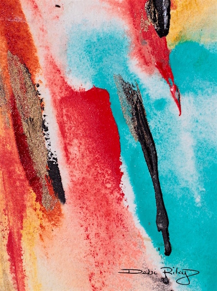
Cobalt teal blue splashes onto the paper in my efforts for a cooler, refreshing ambience.

The palette knife loaded with Acrylic paint slides on the wet paper in a brief fleeting kiss. Perfect for creating smooth applications of color in my abstract painting today.
More palette knife posts are The Delightful Palette Knife and Watercolour with Knife and my page … Watercolor Basic Tips has plenty of great new information on color, tone, mixing and techniques.
Scarlet red orange symbolises the summer’s heat wave.
The cobalt teal blue, a wonderful cooling oasis… all in my imagination of course.
As many of you know now, cobalt teal blue pg50 has been making a fairly consistent appearance in my paintings lately.
Its such a great Cooling color to splash around the canvas or the paper, I can’t resist the beguiling cobalt teal.
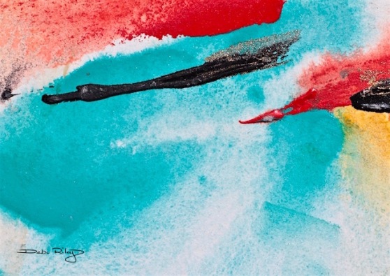
One final thought…. Even though I went a bit Color Happy, have a very close look at the tonal values in these.
Check, to see if you can clearly see my Light (near white) tones; my Mid Tones; and my Deep Darks (near/Black) tones.
With Abstract Art – its even more important, to get all those tones very clear and not muddled up.


The colours and angles have a real dynamism about them – the horizontal shapes conveying calmness, whereas the top picture with more vertical shapes is energetic and stirring. Lovely! 🙂
LikeLiked by 1 person
thank you Patricia! What a thoughtful, and spot on comment, you’ve said it exactly! Thank you for stopping by and for your feedback – I always like to hear what you’re thinking about the posts. 🙂 Cheers, Debi
LikeLiked by 1 person
Cool cobalt contrasting with scarlet orange. Magic colora
LikeLiked by 2 people
Meaning colors not colors!
LikeLiked by 1 person
iphones and ipads are wicked !
LikeLiked by 1 person
now I am smiling 🙂 Many kind thanks David. cheers, Debi
LikeLiked by 1 person
This is wonderful.
LikeLiked by 1 person
thank you Nico. wishing you a great weekend, and Valentines Day. 🙂
LikeLiked by 1 person
Happy Valentines Day Debi!
LikeLiked by 1 person
thank you Nico 🙂
LikeLiked by 1 person
Brilliant! Beautiful! Yep- swooning! 😝
LikeLiked by 1 person
Jodi…. where, would I be – without your SWOONING ? I can now rate/gauge my posts, simply by … no swoon, lower case swoon, swoon in Caps, swoon with exclamation, and double swoons.
yes, this is my new rating system. amazing how famous You’ll be when word gets out, that you invented the ‘Swoon Poll Rating’ Method, Jodi.
LikeLiked by 1 person
LOL! Love this rating system – but now I’ll feel bad if I don’t give the top SWOON! 🙂 the jodi swoon ❤
LikeLiked by 1 person
I know, its a super great system you created! and gosh, you MUST be honest, straight from the heart…ya’ know what I mean!! how else can I gauge the post???
besides, I only get snarly when I don’t have my AM coffee. LOL
LikeLike
love it!
LikeLiked by 1 person
hi Anyuska, thank you! I’m thinking I need to buy a case of Cobalt Teal, …smiling.
LikeLiked by 1 person
if it makes you smile, go and do it 🙂
LikeLiked by 1 person
well said! 🙂
LikeLiked by 1 person
You’re showing summer heat very well and I love the splash of cool water to cool us off!
LikeLiked by 1 person
thanks Laura! hopefully, the 100 – 110 degree days are done. We’ll have more 95 but just til mid March. Then… rubbing my hands with glee – cool down! 80’s here we come. ahhh. 75 is better, but beggars can’t be choosers my grandmother used to say. hehe
LikeLiked by 1 person
I’d be melted by now! Which would be good if I were made of chocolate. 75 does sound glorious – to us both!
LikeLiked by 1 person
you and me both, “I’m Melting!” as we ooze into pools of goo. chocolate sounds better. YUM. guess, not for breakfast though. What temps at your place lately? I always looked for March, when I lived in Seattle area. It meant Spring was soon coming.
LikeLiked by 1 person
Right now, it’s about 13F. Pretty chilly! I do think I prefer 13 to 100, though (or even 90). Very windy and bitter.
LikeLiked by 1 person
13 is way too cold. but, with central heat over there, its sort of ok. til you get in the car.
LikeLiked by 1 person
No doubt! 😀 Do you have aircon?
LikeLiked by 1 person
no. not the american kind. we have 2 fan units in 2 rooms is all, so it does nothing for the main house. Hence, I’m a bit sluggish in summer. 🙂
Next house, will have American AC. we were told “Perth doesn’t need it, with the cool breezes coming thru and ‘Dry’ heat” what a crock. of saurkraut.
LikeLiked by 1 person
LOL maybe not if you’re from there. I thought Perth was the warmer side of Oz?
LikeLiked by 1 person
it certainly IS.
salespeople were born here, so apparently they don’t feel the 100+ degrees hehehe
LikeLiked by 1 person
Beautiful clean color!
LikeLiked by 1 person
thank you, that is a lovely comment!
yes, I’m a big Fan, of clean pure colors…. doesn’t always work, but I do give it a shot 🙂
LikeLike
quick in the artist’s eye
is an eternity for me 🙂
LikeLiked by 1 person
smiling! but I do have many, ‘not yet resolved images’ ie those that are in hiding, lying under the bed, Ashamed! lol
LikeLike
wonderful compositions, love the colors, Debi, have a nice weekend, kind regards from cold Hamburg, Mitza
LikeLiked by 1 person
when its autumn here, spring there – temps will be closer together… being in Perth, has made me choose Autumn as my fav time. Glad you liked the colors, that red orange is a bit stroppy (loud/ in the face) rough. But, that is how I feel about this heat!
Thanks Mitza, have a great weekend!
LikeLiked by 1 person
I wonder how autumn is in Oz. I have no idea about it. Would be nice if we already had spring, but we still have winter, it snowed this morning and afterwards rained all day long, but I had to go outside twice for biking (sh..t). Sent you the recipes again yesterday. My email name starts with a. Take a look, kind regards Mitza
LikeLiked by 1 person
will do again… and your winter is a bit rougher than SEattle winters were. but, cold, wet, grey, dreary. and Long. very long. Autumn here, is like … Seattle Summer! very pleasant to warm. but, here its Mostly – SUN.
LikeLiked by 1 person
I could live without winter. Maybe I move to Oz, hehe
LikeLiked by 1 person
yes, Sydney is pretty good.
LikeLiked by 1 person
I’ll move, hehe
LikeLiked by 1 person
Sydney! remember its Sydney 🙂
LikeLiked by 1 person
okay, Sydney, sorry to all Ozzies, Sidney maybe is a male name? Maybe my subconsciousness has outwitted me. It’s a real pity that I cannot write a mail to you, Debi 😦
LikeLiked by 1 person
do you have facebook by chance?
LikeLiked by 1 person
no, I’m not into such medias, I don’t even have a mobile phone, I still drum when I want to meet with my girlfriend, hehe
LikeLiked by 1 person
I call people on my landline. period. FB is for my overseas family 🙂
LikeLike
I usually call on my landline, too, but now I started to skype with my friends and relatives in Greece. Must buy a camera so they can see me. 🙂
LikeLiked by 1 person
my husband is very adept with Skype… me, not yet.
LikeLiked by 1 person
I’m nearly a computer “expert” in comparison with my husband. He doesn’t do anything at the computer except banking. 🙂
LikeLiked by 1 person
well, he can log on then! 🙂
LikeLiked by 1 person
he just logged out and drove back to Berlin where he works, hehe
LikeLiked by 1 person
I do love that teal blue! But what caught my eye was the “black” thin stripe running down through the blue. When you turn the painting to be horizontal, I see a cormorant and another waterfowl-type (the reddish one) swimming along. Very lovely colours and a picture that invites the imagination to go exploring. I would proudly hang that in my living room if I owned it.
LikeLiked by 1 person
You have a Great Eye!! I love your imagination and seeing into the image. That is the enchanting part of art, esp. the abstractions… is inviting others to engage. Cool.
Thank you so much for your wonderful comment, feedback and compliments!
when I get my shop up…. later, I may include this image perhaps the original or as a print.
Thanks Again, Cheers, Debi
LikeLiked by 1 person
Thanks, Debi. I really admire your work.
LikeLiked by 1 person
that is Lovely, and a Happy Valentine’s Day to you
we are 1 day ahead here 🙂
LikeLiked by 1 person
Oh, so you’re already celebrating all that gushy stuff. 😉
LikeLiked by 1 person
yup, a bit G rated. lunch out yesterday, with a trip to see the grandkids! 🙂
LikeLiked by 1 person
Your poetic wording of this post Debi, is almost as good as your artwork! 🙂
LikeLiked by 1 person
excellent! I must have been on a roll, thankfully I’d had enough coffee. smiling 🙂 Thank You very much for that lovely compliment!! cheers, Debi
LikeLiked by 1 person
Lol! About the coffee!! And you’re welcome Debi 🙂
LikeLiked by 1 person
Very nice.
LikeLiked by 1 person
Thank you Mike, glad you enjoyed those warm well, hot, summer colors! wishing you a lovely weekend, and valentines day 🙂
LikeLiked by 1 person
WOWZA! Love these colors together! I also like that you mentioned tonal values – yes, this does make your work SING – sometimes it is difficult knowing when to stop – but you did it perfectly here!
LikeLiked by 1 person
thanks Jill!! Singing….. love it when that happens 🙂 great word you chose there!
LikeLiked by 1 person
Your splashes of color thrill me! They are so organic and free. Thanks for sharing Debi.
LikeLiked by 1 person
what a lovely compliment Sharon!! I’m thrilled that you’re thrilled 🙂
LikeLiked by 1 person
What a treat for today Debi. Wonderful colours, perfectly balanced. Happy Valentine’s Day 🙂
LikeLike
Quick splash you might say but I love the dynamics on both paintings, they appear to have a purposeful, continuous movement, a conscious direction and the colors you choose perfectly reinforce the direction. But then again abstracts are always opened to discussion and I love that!
Happy Valentine’s Day 🙂
LikeLike
Very peaceful and beautiful!
LikeLike
Lovely! Like looking down on the gulf from a rusty piling.
LikeLiked by 1 person
thank you! Glad you enjoy this abstract image and the colors – it was quite fun to do. relaxing…. Thanks, cheers, Debi
LikeLike
Oh that color is fabulous together, it is energizing! Make me want to incorporate teal in my house!
LikeLike