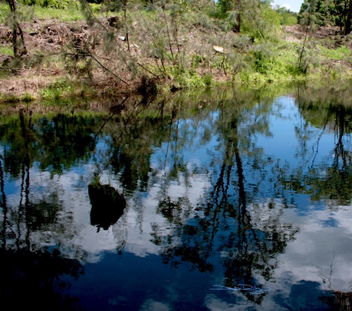
Water reflections: a source photo and a painting in a soft and soothing impressionist approach. Comparing the reference photo and the painting created, there are quite a few obvious differences. Colors, Tones, Details!
A small rivulet in New South Wales, Australia. Page’s River served as my inspiration for more than a dozen photos in the charming town of Murrurrundi, just south of Tamworth.
The photo is quite clearly more intense yellow green and a near black blue, with distinctive tree branches and foliage seen in the water.
Whereas, to obtain a more Impressionist look… some alterations were needed.

Water Reflections
Colors Used for Water Reflection Painting
I used a limited palette. This was to help me achieve a zen like harmony.
Naples Yellow and Prussian Blue in acrylics.
I like Naples Yellow, and felt it would sit in the painting much better than a bright and loud yellow green would.
Prussian blue is my ‘go to’ blue, its perfect for this type of subject. It provides a full range of tone from the palest blush of baby blue to to a near black – blue.
By limiting my palette so dramatically, I help myself achieve better tone throughout the painting. I avoid mud. I create harmony, unification…. that would not exist if I’d used 8 zillion colors.
I like to make things easier for myself.
Techniques Used To Enhance Impressionist Vibe
The beginning was a gelli plate print with the two colors softly merging. And while still ‘hot off the press’ and wet, I worked into the painting to fine tune the areas I wanted just a little more focus on.
There was some skewers being used in this as well, I drew into the damp acrylic paint in some areas to define a few trees.
Impressionist – Not a Photo Replica
Even though I’d singled out a reference source, my goal was to create an impression of the subject.
I simply wanted to try to convey a feeling, a mood….. a sense of coolness and water.
Basically to elicit emotion, rather than record the exact latitude and longitude of the geographical location.
Summary
This Image is slightly, underdone.
Perhaps, to finish this piece I could think about……
cropping the sides in just a little and then add white into the main focus tree trunk, ever so judiciously and lightly.


I love how you went from the photo to the painting!
LikeLiked by 1 person
thank you so much! that’s a lovely comment and I’m glad you enjoyed this post! cheers, Debi
LikeLiked by 1 person
I absolutely LOVVVVEEE it!!!
LikeLiked by 1 person
hi Jodi, thank you! Glad you liked them!! with 800 photos, I’ll being featuring a ‘few’ Sydney and New South Wales area landscapes for a while…lol
LikeLiked by 1 person
NICE!!!! Just beautiful!
LikeLiked by 1 person
Thank you so much Amy, very kind!! many smiles now 🙂 cheers, Debi
LikeLiked by 1 person
Really gorgeous!!! We could learn so much from you, Debi!!! Thank you!
LikeLiked by 1 person
thank you Laura! I couldn’t decide which to image to post… the photo. or the painting. so, I did both. Thinking someone…. YOU, might ask – what might have been my thought process behind it. lol
LikeLiked by 1 person
I love reflections like this! Very beautiful.
LikeLiked by 1 person
thanks Nico, I’m glad you like the images! even if they are so different! being one is a photo, and one is a painting lol cheers, Debi
LikeLiked by 1 person
I loved both. I love the photo, and you probably don’t know this but I love Impressionist paintings. This one is excellent!
LikeLiked by 1 person
that did surprise me 🙂 and made my day!
LikeLiked by 1 person
Love how you filtered out the basics from the photo and applied it to the painting. Wonderful skills, actually amazing skills! Your paintings always speak to my senses each and every time. You’re a true artist who knows how to make us feel what we see! Lovely, delightful and most beautiful indeed.
LikeLiked by 2 people
Eva, that is so generous and thoughtful a comment; it really made me smile!! I’m pleased that you enjoyed this and ‘got it’ – its difficult to explain to others about the feeling aspect being more important. Thanks Eva 🙂
LikeLiked by 1 person
🙂
LikeLike
Wow, thought it was a photo. Amazing.
LikeLiked by 1 person
hi David…well actually, 1 of the images is!! the other is the Impressionist painting. 🙂
LikeLiked by 1 person
RED FACED. I liked the “painting” so much better!
LikeLiked by 1 person
no worries!
I liked both, just for different reasons. Which is one reason they both were included. Thank you, David 🙂
Cheers – Debi
LikeLike
Love the reflection affect on the water you achieved! I just ordered these 2 acrylic paint colors. I like that you limited your palette and didn’t overwork it. I hadn’t thought to play with the paint while it was still wet after printing it with the gelli plate. Thanks for the tip! 🙂
LikeLiked by 1 person
hi Jill, you Are a sweetie! thank you 🙂 yes, keeping to 2 colors = safe(r) from mud, LOL. Do you have a gelli plate? or did you make your own?
LikeLiked by 1 person
I used to make my own before they created one. A little less mess with the manufactured one. Really love making prints! 💖💕🎨
LikeLiked by 1 person
they are fun 🙂
LikeLiked by 1 person
Love impressionism, reflections, lakes and rivers … a truly beautiful painting.
LikeLiked by 1 person
Thank You!! glad that you liked the soft moodiness of the painting 🙂 cheers, Debi
LikeLike
skillfully artistic
result & evaluation 🙂
LikeLiked by 1 person
many kind thank you’s SmileCalm! loved your website, gorgeous photos and posts! liked the Hopi elder post, and the snow,… 🙂 Cheers, Debi
LikeLike
humble thanks for your kind words and views, Debi!
while my blog posts no more than once weekly
i look forward to viewing your creativity, david 🙂
LikeLiked by 1 person
hi David, you’re welcome! I think you have a great idea with posts of once a week – sounds lovely, not too busy. Just about right!
LikeLike
More than like!!
LikeLiked by 1 person
COOL! Thank you very much Elaine 🙂
LikeLike
Beautiful interpretation. I love the softness and blurriness of impressionism. It can’t help but be infused with feeling. I look forward to all your posts – each and every one a visual treat! Xx
LikeLiked by 1 person
that is such a wonderful compliment Kerry, thank you! 🙂 cheers, Debi
LikeLike
Prussian Blue and Naples yellow, a classic combination and one of my favourites too! A staple for any palette in my opinion!
LikeLiked by 1 person
hi Ian! Definitely a staple 🙂
LikeLiked by 1 person
I like your painting even more than your photo, Debi. Just wonderful. Cheers, Mitza
LikeLiked by 1 person
thanks Mitza! THAT is really lovely to hear, 🙂 Thanks again! ps …. stay Warm!
LikeLiked by 1 person
yes, it has become nearly 17 degrees warmer than last week, but rainy
LikeLike
Have you tried mixing acrylics with pva glue and creating a print on a glass plate? I’ll dig out an example ….
LikeLiked by 1 person
sort of! watercolors, inks, oils, acrylics on a glass plate, but not mixed with glue. thanks for that Idea!!
LikeLike
PS – https://drawingstone.wordpress.com/2016/01/26/the-house-in-the-woods/ – I’d not come across gelliprints before – liked your results!
LikeLiked by 1 person
hi Nexi, thanks for sharing that link and will check it out to see the glue aspect and how that works. Thank You!! cheers, Debi
LikeLike
The warm Naples yellow is perfect. There is a mysterious quality about this painting. The way you have overlapped your tones of blue has me seeing faint images that I’m not sure of. Your depth pulls me into the painting. There is so much to take in I will be viewing your painting for sometime. Thank you Debi.
LikeLiked by 1 person
thanks Sharon, for such a thought full and lovely comment!! I love your summarisation of the piece 🙂 cheers! Debi
LikeLiked by 1 person
Thanks so much… From the ❤️
LikeLike
Love your work Debi and this painting is now one of my favorites. Beautiful!
LikeLiked by 1 person
wow! thank you Mary! Debi
LikeLiked by 1 person
Your descriptions of your process are so enlightening for me…fabulous 💕
LikeLike
Beautiful, dear Debi! Thank you! 😉
LikeLiked by 1 person
Fabio, you’re very kind to say so! I appreciate that 🙂
LikeLiked by 1 person
Thanks so much, Debi! 😉
LikeLiked by 1 person
🙂
LikeLiked by 1 person