Grey…. Sometimes just the word, “grey” is enough to trigger thoughts of somber dark wintery dullness. When it comes to painting, we often transfer those same feelings, into how we mix our greys. The results can make or break our paintings.

I was a person who lived for summer and summer’s bright warm colors.
I intensely, disliked greys. The weather I lived in, being 300+ days of cloudy grey skies may have had some part in that, Perhaps.
Versions of Grey
I decided I needed to develop new ways to think about greys. New ways to define greys. New ways to see them and then mix them.
I started with my ‘labels’ for grey.
I made it a challenge to come up with phrases like: dove’s wing grey, warm charcoal, ash grey, asphalt, grulla grey, Toledo steel grey, light mist grey, etc.
Basically, I was observing and classifying the greys.
At that point, my inflection, perspective and interpretation of Grey changed.
Interpretation
We will all see color slightly different.
How I interpret color is dramatically different to the family. Mr. sees the carpet as ‘brown’ whereas I see it as pale cream, with flecks of silver, green, rust. Green, to him may be turquoise to me.
We are unique.
Greys became alive in my mind, and it transferred over into my paintings.
The greys had much more inflection, spark and nuance than before when I was just using dull neutral tints, etc. to get my greys.
Greys have a wide latitude
No longer dull, but with a wide latitude and open to personal interpretation, I now find Grey a color of great beauty.
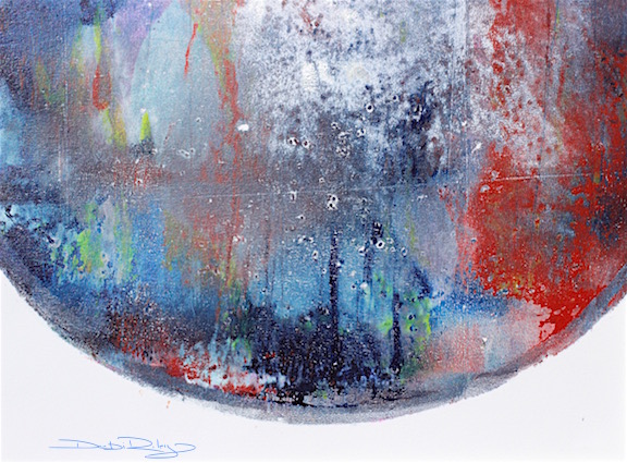
Greys can be rose grey, sage grey green, blue grey, slate grey, grey brown, grey violet…. with many variations in between.
Greys do not need to be dead flat, neutral. But will help the painting more by leaning into and towards, the direction of a specific color.
Greys ‘should’ have a color bias.
Remembering that opposites, mixed together create versions of grey will help me obtain more color bias, and therefore more life spark into my paintings.
In the past, when I was first starting, I used paynes’ grey, neutral tint, black, etc. Premade.
But frustratingly – the flatness, dullness kept deadening my paintings. Back then, I wasn’t sure what was wrong with my greys, with my shadows, with my mixes.
But, after changing to other methods of mixing greys – I was far less frustrated.
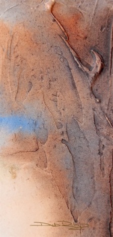
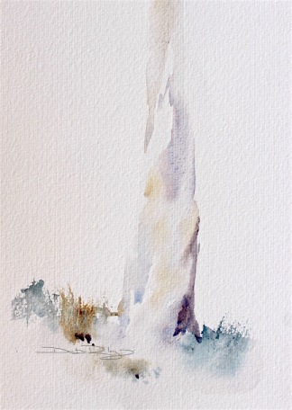
The tree trunk, Above, has some lovely grey lavender mixes that are flowing down through the trunk.
Tomorrow’s post, Moet’s Monday, Greys I will continue and provide some of my color mixing recipes and tips that I’ve been happy with and can recommend.
In the meantime, have a browse over at Watercolour Tips or my Gallery for more ideas and info!
My deepest apologies in advance!
For the next week, I’ll be on a very limited access to computers.
I will do my best to post.
Comments, might take a few days for me to be able to respond. Thanks!


Debi, another beautiful, inspirational, info-packed post! M. With gorgeous paintings! Thank you for sharing and enjoy your time away. 🖌❤️
LikeLiked by 1 person
thank you Laura!! will do 🙂
LikeLiked by 1 person
Awesome!
LikeLiked by 1 person
Oh Debi. Ooooos and aaaahs. Blown away again with your magnificent beautiful art! So love it!!!!
LikeLiked by 1 person
thank you Jodi! 🙂
LikeLike
Each one of your samples are so inspiring, I just love the texture. I agree that greys come alive when mixed with blue, greens, roses, lavenders. Thank you for taking the time Debi and presenting greys in an exciting way.
LikeLiked by 1 person
hi Sharon, I’m glad you liked the post! thank you!! cheers, Debi 🙂
LikeLike
well, Debi, this looks like 49 shades of grey, hehe. Wonderful examples of your craftsmanship, love all of them, as usual, have a lovely day, kind regards Mitza
LikeLiked by 1 person
Thanks!! you have a lovely day too 🙂
LikeLiked by 1 person
Bravo Debi, love this post. I’m a lover of greys and enjoyed your discussion immensely.
LikeLiked by 1 person
thanks mary!! 🙂
LikeLiked by 1 person
Thanks for sharing! so much you can do with the color. My living room walls are charcoal.
LikeLiked by 1 person
Deb, this makes me rethink my grays. I do mix them, but usually end up with the same color mix. I need to expand my horizons and see if I can add some, as you say, “spark” to my grays. Thanks for this wonderful tutorial and your thoughts on making gray lively.
LikeLiked by 1 person
My pleasure! and thank you for your comments, which are very much appreciated 🙂 Grey used to be my least favourite color, now …. its kind of fun to see what I can come up with that is ‘pretty’. Again, thank you for your feedback, cheers! Debi
LikeLike