Flinging paint with a Twist! This past year’s fun adventures in Watercolor with a Twist course is over. The course is under renovation. Out with the old, in with the new!

Abstract Painting Design
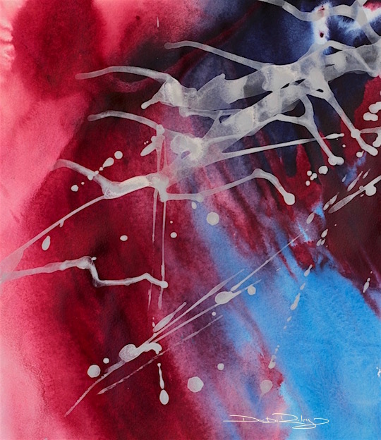
The painting has an abstracted design with a strong dominating arched curve. This ‘twist’ curves radically from top right to lower right guiding the viewers’ eyes in that direction.
There is plenty of movement.
Through the flinging of the pale buff titanium as the final touch; through the softer paler blue on the lower right corner – leading upwards; and through the Twisting design itself.
Acrylic Paint Colors
I’ve used Permanent Alizarin Crimson, Indanthrone Blue and Buff Titanium.
Alizarin and Indanthrone are ‘Stainers’ and the Buff Titanium is an Opaque paint category. I’ve been a steadfast huge fan of genuine, Indanthrone Blue.
Real Indanthrone is spendy, but a dab goes a long way and it is exquisite. Extremely Versatile, makes the cost very acceptable.
And these days I do not willy nilly just go buy whatever takes my fancy, but thoroughly do a ‘cost justification’ analysis.
Genuine Indanthrone Blue PB 60 passed my criteria.
Abstract Twist Technique and Approach
For this painting I chose to use a watercolor approach.
I wanted the acrylic paints to run, to shoot forth, and to create variations in their tones. So, I needed to dampen the paper ahead of time, in order to prepare it to do so.
This was on a full sheet of 100% cotton 300 gsm Cold Press Arches paper. A full sheet size is 22 x 30 inches.
Pitfalls and How I Sidestepped them
Acrylics are notorious…
for becoming way too dark, all over, when not enough white paint is mixed in with the colors as you go. With the final result being flat, depthless, too dark.
By using a lot of water, and a watercolor approach, I can eliminate that problem. Or if I was using the acrylics with a knife, in a thicker more impasto method, I would need to use a lot of white mixed in with nearly all my colors used.
A good rule of thumb for acrylics is about 3:1 in other words 3 times more white is used than the 1 part of color. Acrylics are that powerfully Dark!
Paintings will fail, if you do not have a clear, evident sufficiency of tonal values: Light tone, Mid tone, and dark tone.
In the painting featured… I sidestepped the problem, by using a watercolor technique wet into wet.
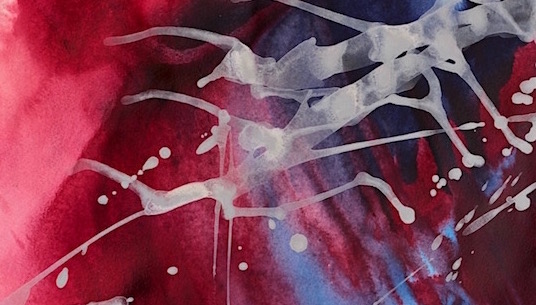
This Detail, illustrates the intensity of acrylics. The image was Salvaged, rescued with the use of the flinging of the Lighter, pale Buff Titanium to provide the required ratio of Light, Mid, Dark tones.
News Alert, Readers!
I’ve been working on some Fabulous art sites on Pinterest – head to pinterest.com/debijriley for a look at an eclectic range of stunning art showcasing encaustics, photography, creative drawing ideas, printmaking ideas, Australian art, watercolors, plus more. Quite a number of the images are mine, but the site is appropriately balanced with others work.


You have the touch. You work is getting active distribution around our household.
LikeLiked by 1 person
Thank you David for sharing the images, that is very kind! 🙂
LikeLiked by 1 person
Yay! I love this!
LikeLiked by 1 person
hi Nico, thank you very much, I’m glad that you enjoyed it !
LikeLiked by 1 person
The Buff Titanium floats nicely over the cool blues–3D effect.
Layering is another way to lighten acrylics, transparent glazes over impasto white applied with a palate knife. Yes, to the importance of tonal contrasts. I was getting too little contrast until I began to consciously work on it. A good test for W.I.P., is to take a photo, and in Picasso or your photo program of choice, look at it in black & white.
Another cool way to use that… is to view in reverse colors. Sometimes enough to get an idea for another painting–using that color array.
LikeLiked by 1 person
great ideas Jacob! Photoshop is fun to play with 🙂
LikeLike
Blues? Did I say, floating over the cool blues? Ha
LikeLiked by 1 person
… whoops… didn’t mean to end that comment. That was a clear retinal after-image effect! I SAW that image, closing my eyes, as buff over blues… reinforced by the idea that, of course, the cool colors would recede. But no… you make the warm reds recede! How did I forget that this was about Aliz Crimson?
LikeLiked by 1 person
The added white shows off the depth of your abstract by its translucence. Thank you Debi, for your always informative lessons.
LikeLiked by 1 person
my pleasure Sharon – I’m still chuckling over your owls …. 🙂
LikeLiked by 1 person
😍
LikeLiked by 1 person
Love! and thanks for sharing your Pinterest boards! Cannot wait to explore! 🙂
LikeLiked by 1 person
hi Jodi, thank you for now following my “Pinterest” art boards!!!!!!!
LikeLiked by 1 person
that’s wonderful with the white “insects” crawling on scarlet crimson, Debi, cheers Mitza
LikeLiked by 1 person
great thinking, and imagination Mitza ! love it 🙂
LikeLiked by 1 person
Beautiful and eye-catching as always, Debi!
LikeLiked by 1 person
dear Laura, thank you so much! I must tell you, it is so nice to ‘hear’ your comments again. so upbeat! Thanks!! 🙂
LikeLiked by 1 person
Thank you for sharing your process and giving is a little peek behind the curtains.
LikeLiked by 1 person
hi Jay, my pleasure; and thank you for stopping in and for your feedback on the painting! It is always great to hear others thoughts on the processes and their feelings evoked! cheers, Debi
LikeLike
Beautiful, Debi!!! I dabble in abstracts when I paint with my pastels, so my pull to what you showed here is automatic. Really a great job!!! ❤
LikeLiked by 1 person
Thank you Amy! I’ve decided this year to do more abstracts, which is my real love. Not as much trying to balance out ‘the representational’ with my abstracts. Abstracts are a niche – I know this. So thank you Amy for your timely, comment 🙂
LikeLiked by 1 person
You are so welcome. You’ve encouraged me to pick up my pastels again. So I thank YOU! ❤
LikeLiked by 1 person
well, That is exciting!! makes me Smile 🙂
LikeLiked by 1 person
I was just thinking today and discussing with another fellow blogger about using acrylics in a watercolor approach….you were looking over the fence listening to our conversation! so funny!
LikeLiked by 1 person
my ears ARE growing…. age does that. LOL
LikeLiked by 1 person
lol…..it helps especially when you have an added generation to keep an “ear” tuned onto. 😉
LikeLiked by 1 person
yes! 🙂
LikeLiked by 1 person