The beauty of watercolor is often in the speed in which I can get the colors onto the paper. When an idea is so fleeting, it merely brushes across my mind in a micro minute – the colors must be captured then and there; else it’s completely lost.

Watercolor Painting Processes and Color Ideas
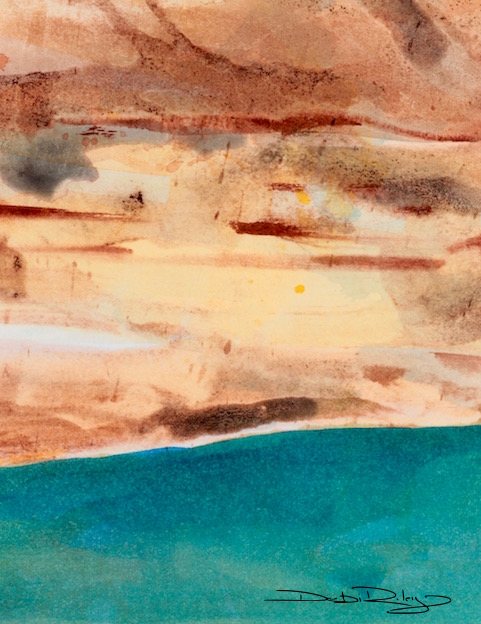
Such was the case with this water pool. Only a fragmented momentary idea went through my mind. So briefly, nothing but the colors were retained from the transient thought.
Just a brilliant viridian and emerald green pool below a topaz golden escarpment.
That was it.
For the love of color, I grabbed onto that idea and the paints and whacked them on!
Splashing and drizzling the colors with speed. Trying to not lose sight of that memory. I needed to return to the image twice upon drying to reglaze and sharpen tones and color intensity. Fine tuning.
I love the color combination. The pairing of emerald green with the sunburnt terracotta is a delicious combination that I’m quite pleased with.
The Watercolor paints I used: winsor lemon, phalo blue = green burnt umber, burnt sienna mixed with winsor lemon. I avoided Opaques, using mainly Transparents and Stainers. For additional watercolor information on palette choice, mixing, avoiding mud, etc. a good place to start is my new Watercolour Tips page.
NT Gorge
NT Gorge, this second watercolor landscape painting with its escarpments in rusts, earth browns and emerald jade green waters was a slower process. Much more time intensive than the first image, as can be seen from the additional details.
I’d referred to a photo on this one whereas I had not with the prior image. NT Gorge was near Jim Jim Falls, Australia. We were hiking in on a hot day, trying to stay cool, take photos, and get to the falls to swim. A memorable adventure.
NT Gorge painting does keep to the same color combination of emerald jade greens, topaz, terracotta and brown earth.
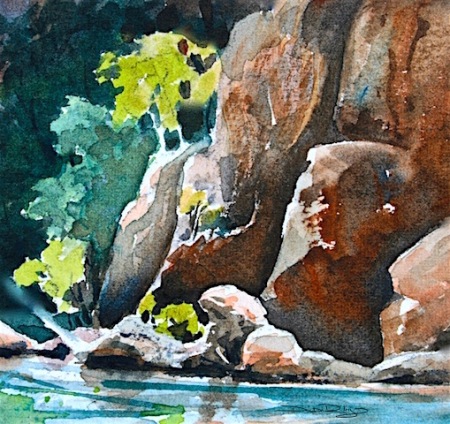
The colors used in NT Gorge were burnt sienna, prussian blue, ultramarine blue, white, winsor lemon.
Summary
The experience of color, was fully expressed best in For Love of Color (the top image) even though there is far less detail and information.
It is a more soothing image. And it answered the call that was being made at the time.
Sometimes, more stuff, more detail, more ‘froo-froo’ isn’t really what we need!


Beautiful! Blessings, Emma
LikeLiked by 2 people
hi Emma, Thank You!! that was lovely to hear, and I’m so glad you enjoyed it 🙂 have a wonderful weekend! cheers, Debi
LikeLiked by 2 people
You too! : 0 )
LikeLiked by 2 people
Both are beautiful Debi, and I can understand why you like the spontaneity of the first piece, but personally I prefer (in fact adore) the NT Gorge!!! I love the vibrancy of the colours, especially the contrasts of the vegetation with the rocks and water 🙂
LikeLiked by 2 people
thank you, that is a great comment, and I love hearing what others enjoy. and why. Your explanation was so well thought out, I started to think I should like that one better as well… LOL made me smile!
LikeLiked by 1 person
You’re welcome Debi 🙂 I’ve found that on wordpress, since I’ve been posting, that often my favourite photo most folk have ignored, and the one I least like becomes the most popular!! Lol! It’s just as well we all have differing tastes (and of course, as the photographer/artist, we know what went into the creation of the image – the viewer just sees the end product), otherwise the world would be a very boring place! 🙂
LikeLiked by 1 person
absolutely! my brother’s art is radically, different to mine. my sisters are enamoured with Thomas Kincaid.It would be empty and flat if we all like the same thing.
LikeLiked by 1 person
It certainly would be a horrible place if everything was the same!!! my wife is a Thomas Kincaid fan, personally I find his work a bit too fiddly and Christmas cardy, if you know what I mean! 🙂
LikeLiked by 1 person
yes,…. I do. 🙂
LikeLiked by 1 person
Oh Debi! One of these days I am going to find time to TRY to watercolor like you do! Until then, I am going to read and try every day to absorb the amazing images and tips you so graciously share! THANK YOU for the beauty! Thank you for your generosity! Oh how I wish we lived closer! 🙂
LikeLiked by 1 person
Jodi, thank you for such an enthused response! It would be fantastic to be within a short distance for some ‘watercolor paint outs!’ Maybe I can get over to the States for a visit…… I ‘m so glad that you’re really enjoying the articles I write, thanks Jodi.
LikeLiked by 1 person
Omg. That would be so awesome!!!
LikeLiked by 1 person
family lives near Seattle and I’d wanted to see them 2016 if possible 🙂 depends on how much more the Aus. dollar falls though… we were above the US $, now 70 ish. sigh. But, I could always let you know if I did get to go over!
LikeLiked by 1 person
Absolutely.
LikeLiked by 1 person
Love the depth of your paintings
LikeLiked by 1 person
hi Maureen, many thanks!! 🙂 wishing you a most lovely weekend – cheers, Debi
LikeLiked by 1 person
You also Debi
LikeLike
Love seeing your paintings Debi. The first one with the emerald water reminds of a lake in Nevada surrounded by a lot of sand stone, just as yours here. And the last two are stunning in depth and vivid color.
LikeLiked by 1 person
you’re most kind, Mary, Thank You! I like hearing what you have to say about the paintings… what or where it reminds you of. It makes the painting – have more dialogue I think. 🙂 Thanks!
LikeLiked by 1 person
Simply beautiful!
LikeLiked by 1 person
hi Maria, thank you so much! Thats very sweet to say! wishing you a great weekend 🙂 cheers, Debi
LikeLike
Dear Debi, yesterday I saw your post come to my email, but I decided to wait until this morning to fully enjoy what surprise was ahead. I’m sitting here with my coffee absorbing your words and the inspiring and beautiful paintings. Thank you for sharing your artistic gift.
LikeLiked by 2 people
good morning Sharon… there’s nothing that beats a good morning cup of coffee! sheer delight 🙂 Thank you so much for your wonderful uplifting light filled words. Very kind. and I appreciate your regular presence Sharon. many smiles, Debi
LikeLiked by 1 person
Hi Debi, my pleasure, it’s a wonderful gift that we can all share our passions for art and with such diversity. I love it all!
LikeLiked by 1 person
yes it is 🙂
LikeLike
wonderful and beautiful colors, Debi, I always see something in these pictures that I know, a Greek beach, etc. have a nice weekend, regards Mitza
LikeLiked by 1 person
you ‘see’ from your mind’s eye and your heart! I love it!! 🙂
LikeLiked by 1 person
I have so much fantasy that I always see much more things than others, I’m a very visual person. I’m happy you like it, cheers Mitza
LikeLiked by 1 person
indeed! imagination is the beginning of creations. I think Albert Einstein has a quote or two about imagination 🙂
LikeLiked by 1 person
I like them both, but the spontaneity of the first one and the simplicity and contrast of the colors really grabs me! No froo froo! Woo! :)))
LikeLiked by 1 person
thats cute! Thank you so much Laura, …the simplicity was refreshing; led to the water! 🙂 have a wonderful weekend!
LikeLiked by 1 person
You too Debi!
LikeLiked by 1 person
I love the spontaneity of the first one…..the brilliant colour of the water….against the earth colours….the philosophy of lest is best is what sings to me in this lovely painting….thanks Debi …
Enjoy the rest of your weekend…
LikeLiked by 1 person
thank you so much Tricia! I’m glad you enjoyed the post, I love hearing what you and other readers are thinking about with the images and posts. So Thank You, for sharing! 🙂 Debi
LikeLike
So true!! Beautiful work Debi!~Rita
LikeLiked by 1 person
hi Rita, thank you!! is it snowing there yet?!
LikeLike
No Debi, not only no snow, but temperatures in the high 50’s. Bizarre!!
LikeLiked by 1 person
that is wild! wow. balmy Christmas?
LikeLiked by 1 person
yep 🙂
LikeLiked by 1 person
I love this!!! You are very talented!
LikeLiked by 1 person
Oh, you have two of my favourite colour combinations here. How beautiful.
LikeLiked by 1 person
thank you! and I’m glad you enjoyed this pairing 🙂 Debi
LikeLike
Delightful!
LikeLiked by 1 person
thank you, I’m glad you liked the post and the colors! wishing you a lovely holiday 🙂 Debi
LikeLike
Windsor lemon is a cool yellow, should I have a warm yellow on my palette as well? what is your opinion?
LikeLiked by 1 person
no! not in My opinion. (pastels, yes.) no in wc… you mix… your warm yellow. ratio is about 96% WLemon to 4% Perm. Rose = nice, transparent, clean, fresh, lively Sunflower type yellow. 🙂 works like a Charm.
LikeLiked by 1 person
hehe…..of course! silly me, I think I was picking apart what you said, something I should know……thank you!
LikeLike