Wednesday watercolours Again!?…..hope you aren’t getting bored! Ultramarine Blue Pb29, unbeatable and unexpectedly versatile, has 7 fabulous traits and assets that make it an artist’s perfect ‘go to’ colour.
Ultramarine Blue Pb29 watercolour 7 tips
Ultramarine Blue is a luxurious warm blue with almost endless possibilities. It is a very easy colour to get hooked on and over use due to its ‘prettiness.’
But if it is altered i.e. mixed in with other colours, that overuse problem is much less apparent. So I have found.
Ultramarine Blue Pb29 (P is for Pigment and the b is for Blue) the 29 is the identifier number that states loud and clear, precisely what this tube of paint is made from. 29 is the Ultramarine ground pigment. When in doubt what a colour is, just ask Google!
Also, you might check out Watercolour Tips page for additional watercolour information.
What Ultramarine Blue Can Do For You
Ultramarine Blue is full of lovely surprises and handy little things it can do. This blue will mix exceeding well with other Granulators, with Transparents and with Stainers. It isn’t as fabulous with Opaques.
But, then… Opaque paint pigments are Lone Rangers and do not mix well with others regardless. (This is predominantly the case for beginners; but even so, I generally 90% of the time will not mix Opaques with anything!)
- As a Granulating paint pigment it will excel at creating textural effects for soil, foregrounds, trees, beaches, bark, pebbles, roads, etc.
- As a strong Granulating paint, when mixed with others it will cause the resulting colour mix to also become somewhat of a textural paint as well. Ie 80% Ultramarine 20% rose = Granulating purple (as long as the Water ratio is high enough)
- As a Warm Blue it will make a fabulous tropical ocean blue.
- Ultramarine can help you with aerial perspective, depth, toning down, subduing background areas, for glazes if applied thinly.
- Its very useful for stormy skies, vases, flowers, such as …delphiniums, iris,etc.
- It is brilliant when mixed with burnt sienna/umber for mountains,hills, and escarpments.
- Ultramarine when mixed with raw umber, winsor lemon, quinacridone gold will create a beautiful and full range of foliage greens that look harmonious in the natural environment.
Gorgeous Colour Mixes With Ultramarine Blue
My Favorite Colour mixes using ultramarine blue pb29
- Mix with permanent alizarin crimson to make a spectacular and stunning purples
- Use with quinacridone gold creates a delicious harmony of greens from bright yellow gold greens to rich dark blue greens… just fabulous
- Use with burnt sienna pbr7 makes a superior grey/charcoal/black. Much better than tube colours
- Use with phalo blue creates a deeper, intense blue that retains the warmth of ultramarine and some of its granulating properties.
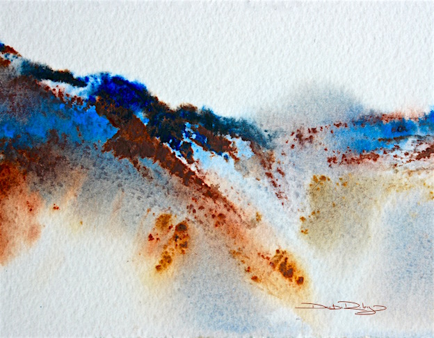
Ultramarine Blue With a Palette Knife
The featured watercolour mountain painting was created with a palette knife, Pk1008. I used Arches 100% cotton paper, as I normally do…. its so just in case I have some boo-boos that need fixing up… this paper “helps” me with my corrections. I like that!
- I chose my colours: Ultramarine Blue, Quinacridone Gold, Burnt Sienna. 3 Tubes of Paint, a very nice triad of blue, yellow, red/brown. A twist on the cobalt, rose and winsor lemon triad.
- By using the burnt sienna with ultramarine, I’m able to achieve a multitude of very subtle nuances of greys and browns that transition into the landscape quite naturally.
- Using a light touch, of quinacridone gold, there will be a slight hint, an inference of grey green into the mountain. Unless, I go overboard with the quinacridone gold!
- Then, oops. Time for Plan B. Always a great thing to have in mind with watercolours, a Backup Plan. Plus a spirit and attitude of going with the flow. Let it go, let it Be.
- Once my colours were chosen, I thoroughly dampened the paper. Loaded the knife with both ultramarine and burnt sienna and slid across the dampness in a “mountain -like” stroke. Try practicing this in mid air – first.
- Then reload the knife with a new batch of differing colours and go again. I try to count the amount of strokes I use. Or else I end up with 10 too many….. you know what I mean?
- I also have a small spray mister right at hand, to help gravity flow a bit if needed. Gently. Lightly.
Then I move on to the next paper that awaits me.


I like this piece. I am working on creating an Artist’s and Writer’s blog. I was wanting to know if I could use this picture on the Website. It would remain your property and I will link to your site and plus include a bio of you if you like.
LikeLiked by 1 person
Thank you for asking me. I’m fine with you using it for your Artist’s blog -and thank you for linking it back to my website. Cheers, Debi
LikeLiked by 1 person
Oh Debi – once again – I am in awe! thanks for the tips – I have never tried using a palette knife.
LikeLike
What a gorgeous painting Debi – from the top of the mountain range right down to the rutted down slopes. Really enjoy your tips on painting with watercolor and using one of m favorite colors, ultramarine blue – your tips are invaluable and something I’ll keep for future use.
LikeLiked by 1 person
hi Mary, Thank you. Very much! for letting me know that the information is of use to you. I appreciate that!!
LikeLiked by 1 person
Debi once again Thankyou for sharing the joy & tips of the magical Ultramarine….only wish I lived closer to come to your courses….hopefully can do your workshop @ Atwell in January. I Have to thank my beautiful friend Teresa for introducing me to your Art. Keep this brushes singing…
LikeLiked by 1 person
Great post Debi. Adding a little Paynes Grey in with the Burnt or Raw Umber and Ultramarine I have found also gives a rich looking black substitute. Warmest 🙂
LikeLiked by 1 person
I have a hard time finding a paynes grey that is just 2 pigments: ultramarine and black pigments… most have phalo added, Old Holland used to and it was alright to use.
LikeLiked by 1 person
Wonderful information Debi, your students must love your courses. Magical paintings. Thanks for sharing your knowledge.
LikeLiked by 1 person
thank you Sharon, hoping that the info I’m passing on is useful 🙂
LikeLike
wonderful mountains, Debi and good tips – as usual – , kind regards Mitza
LikeLiked by 1 person
most appreciated, I hope you see the Prince. or Prince. LOL have a wonderful day!
LikeLiked by 1 person
I’m just listening to “Purple Rain”, hehe
LikeLiked by 1 person
made me smile !
LikeLiked by 1 person
I never get bored with your posts! It is always insightful when I finish reading. Oh lovely painting of the mountain scape.
LikeLiked by 1 person
Glad to hear that!
I try. to Not be boring. But I’m sure at times the ‘teacher comes out’ …. lol
LikeLiked by 1 person