Craggy rough knolls and indented valleys that you can touch and feel, but wait, I’m using watercolour paints! How, can I achieve such sculptural, tactile effects with watercolours?

Watercolour Technique For Texture
- This approach uses acrylic molding paste to create a rough craggy surface to paint on once it was thoroughly dry.
- The molding paste dries white. It acts a bit like fresco. It absorbs some paint in when you paint on it.
- Your colour vibrancy is lessens about 10% or so. Not too much, but I notice it. And, for some things I love this and exploit this characteristic.
TECHNIQUE: STEP BY STEP
- The First step is to prime a wood board.
- Then apply acrylic molding paste on the board with a palette knife in wide sweeping movements that are merely suggestive of hills and valleys.
- Do several at a time. Some may not be as successful as one would hope for, I’ve discovered. But, they might be great for forest scenes, or beach, ocean, or florals. They’ll be good for something!
- Let the paste dry completely.
- It is ok to use heavy watercolour paper. I’ve had success doing so; but, I needed to be more light handed with the molding paste. Easy does it.
- Once it is dry, ascertain areas of sky, mountain and foreground. And apply your colours to those areas, in the correct tonal values. Use a brush, use a wet in wet technique or pour the paint slowly ….onto designated areas and let them merge together. Fun!
You could get really creative and sculpt & build these up. Layer by layer, for a fascinating tactile experience. Mountains in watercolours… thats just the tip of the iceberg of what you could do.
Watercolour materials needed
primed gessoed wood board, paints, brush, palette knife, spray mister, molding paste
To prepare the board, simply apply about 3 coats of gesso onto it.
Make make sure that each coat is thoroughly dried – before you apply the next coat. It will ‘peel’ off and not provide a suitable grip for the molding paste or the paint, otherwise.
watercolour palette choice colours
The first several I do, I choose to work in a limited palette, of just 2-3 colours.
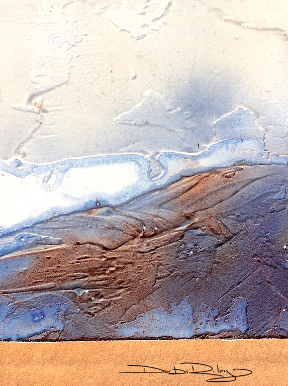
In Touching The Mountain, I used Daniel Smith Indanthrone blue Pb60 paired with burnt sienna PBr7.
With a Limited palette, its a great way to create a unified watercolour painting. Its wonderful for me as a warm up, its ‘easier’ and less things to think about.
Then as I continue to do more …then I start ad libbing with more colours as the session progresses. Steady. Progressive. This approach works best for me.
watercolour deptH In the mountain
I need a background, middle ground and foreground.
In each area, the correct tones, edges, details, contrasts, warmth/coolness, line use must be correctly placed to create enough depth in the landscape.
watercolour tonal values
- The painting succeeds or fails …… based on the evidence of Light, Mid, Dark tones throughout the image. If its muddled, unclear, inadequate lights – the painting will not be a successful image.
- The minimum you can scrape by with – Light, Mid and Dark tones are necessary in order to have the painting be a balanced piece.
- I don’t want it to be too heavy on the dark side i.e. 95% dark 4% mid tones 1% light. That creates imbalance.
- The ratio I usually, prefer is roughly about …. 55% light 35% mid and 10% dark or somewhere in the range.

This photo gives an idea of the memories I was working from when creating my painting, Touching The Mountain. Mountain Mist Murrurrundi, NSW was taken in the hometown of my dear friend – her lovely gardens featuring in the post Waiting On A Friend.
Touching The Mountain in watercolours was a fun, fast image using novel, out of the box tools and ideas.
It gave me the sculptural feel that I love, combined with the loose fluidity of watercolours – gorgeous.


What a cool idea. I never would have thought of something like that. There are so many things that you can do with the addition of texture. Great job!
LikeLiked by 1 person
thank you for your thoughtful comments! much appreciated 🙂 I love doing those and getting a good tactile feel! maybe, I should have been a sculptor …lol
LikeLiked by 1 person
Wow, isn’t this a lovely one! I really like the sculptural effect you have achieved, and with the beauty of the watercolor, its just stunning. I love the feel of sculpting with paint… that tactile experience is just great. Thanks for sharing this piece and your process. Its always a treat to read your posts. ~Rita
LikeLiked by 1 person
hi Rita, thank you for your artistic and positive feedback!! I always look forward to hearing your comments, so thanks for sharing. This was a very FUN process! Highly recommend for all media to try!! 🙂 cheers, Debi
LikeLiked by 1 person
I may just give it a try myself sometime! It DOES look like fun! ~Rita
LikeLiked by 1 person
well if you do Rita, I’d love to see !
LikeLiked by 1 person
I agree with Rita’s comments. I do want to reach and touch your painting. Thank you Debi for the in depth instructions. This technique will be a fun experience.
LikeLiked by 1 person
hi Sharon, thank you! and I hope you and others will be inspired to try this technique… its just so, Enjoyable 🙂
LikeLike
Absolutely amazing. As always blown away by your art!!!
LikeLiked by 1 person
hello Jodi, thanking you for your comments 🙂 I did like this one; there were others, that just aren’t ‘resolved yet’ so I didn’t show them! more like In Hiding. lol
LikeLiked by 1 person
makes me feel better that you have those too! some day I want to be you! 🙂
LikeLiked by 1 person
and I’ll take a big dollop of JODI while you’re at it ! you’ve got such boundless energy, creative ideas, photo skills 🙂
LikeLiked by 1 person
oh dear – you give me much too much credit! I look at so many other creative people and am so blown away! I will look at it as inspiration and not be hard on myself though! 🙂
LikeLike
fantastic idea, Debi, wonderful colors and good explanations. Have a nice day, regards Mitza
LikeLiked by 1 person
hi Mitza, thank you very much for your thoughtful comments. always good to hear how the post fared. cheers! Debi
LikeLiked by 1 person
Excellent results 🙂
LikeLiked by 1 person
Hi Laura, thank you for your kind comment! Glad that you enjoyed this 🙂 cheers, Debi
LikeLike
Gorgeous indeed 🙂
LikeLiked by 1 person
thank you Andrew, that is very kind!! I did have much fun creating this one 🙂
LikeLiked by 1 person
I appreciate this post so much and I think that I struggle with getting that balance of light, mid and dark tones. I focus so much on the motif itself that my balance often is out of whack. Would you look at this painting by Alice Ravenel Huger Smith https://www.pinterest.com/pin/428475352031191153/. I love her paintings and in this particular painting, that balance leans more towards the dark with snatches of light and mid tones. Why does this painting work so well even though the balance is different?
LikeLike