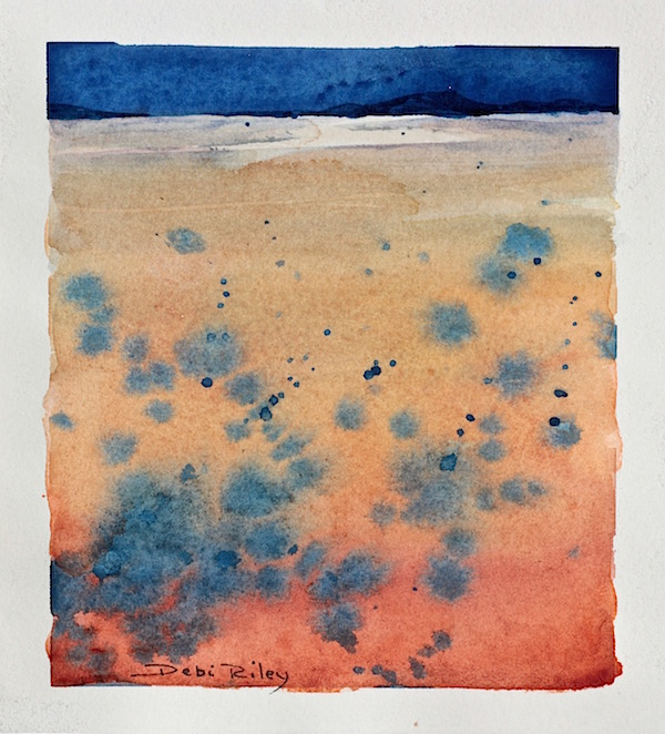
DRAMA in the Outback. The dark blue of an impending storm creates a sense of unease as we are led from the dry arid land in the foreground straight into the path of the coming storm.

Watercolour Landscape using Opposites
This little impressionist landscape was inspired by the harsh condition of the Australian Outback.
I chose blue and orange, a complementary pair (opposites) to dominate the scene. Its the perfect choice for the rough and dry landscapes of the outback.
Creative and Artistic Freedom
The scene was a combination of various factors and sources. Based on my frequent outback adventures, my numerous bush walks, my ‘plump’ photograph reference library and my feeling for the land.
With these and a brush in hand, I was ready!
My impression of the subject and interpretation, remains for me a primary objective. I just love loose watercolour landscapes that express the artist’s authentic feeling for that place.
Indeed, I think I can sense a little Fred Williams and John Olsen trying to escape from within. These artists are such great inspirations.
Specific Paints Used
Burnt Sienna PBr7, Permanent Rose Pv19, Winsor Lemon Py175, Cerulean BluePb35, French Ultramarine and Prussian Blue Pb27.
By using these, I was fairly sure I would not have any mud problems. For ‘mud’ information and several ways how to avoid it, see the post linked on mud.
I mixed the Ultramarine, Cerulean, Prussian to create the stormy sky colour.
I used cerulean with a dash of ultramarine blue pb29 for the foreground sage like shrubbery.
The landscape’s foreground mix was burnt sienna, permanent rose, winsor lemon; cooled off at the back with cerulean + water.
I’d created my Orange: mainly the rose and yellow, but a dash of burnt sienna right in the front. I needed correct Aerial Perspective, warm colours in the foreground and cooler colours into the background. And this is where blue and orange paint mixes come into play – orange in front, blue behind. Perfect.
Techniques used in the Watercolour Landscape
The watercolour landscape’s foreground was a variegated wash. The shrubbery foliage was splatter technique using an old toothbrush. The sky was a flat wash. Basically, 3 steps.
But, timing, as you know – is critical. A little like Goldilocks is our watercolours. It can’t be too wet, nor too dry. It has to be “just right.”
The Blue and Orange painting finished
I finished up with this one I liked. Of course, I hid the others that didn’t work out so well. I’m not alone in this habit, I’m sure of it!
Overall, the deep blue of the ultramarine mix and the orange mix marry well together and give it a vibrancy and impact that a more subtle choice wouldn’t have carried off.
Keeping the watercolour landscape loose provides relief for the eyes, as the drama of that deep dark intense blue is almost…too jarring, too dramatic.
As I intended. Storm’s comin’


Love!
LikeLiked by 1 person
much appreciation on that David!!
LikeLike
very nice, Debi
LikeLiked by 1 person
🙂 thank you Mitza very much!
LikeLiked by 1 person
Such great tips. I was away this weekend and now catching up. Wish you lived closer and I could work with you. 😊
LikeLiked by 1 person
you know, I would love that!! 🙂 If ever I get back over to the US, we can have coffee. yup, at 5am. Strong coffee. LOL with Chuckling Charlie.
LikeLiked by 1 person
Yahoo!
LikeLiked by 1 person
🙂
LikeLike