Do you think colour can be too bright, too bold, too distracting? Sometimes it is! Bright glaring red, yellow, black and orange colours shout in nature “Stay away, I’m Dangerous!”

Bright Colours can be too loud
Generally, when painting I like to neutralise and subdue my ‘brights’ so they stop their shouting. I’d like a little peace and quiet, thank you.
How about you? Do you like the bright, loud, Hawaiian style print motif or a calmer, laid back pattern?
Of course, it does depend on the person and on the mood.
Sometimes, I’m in the mood to break loose. Be liberated. To get bright, happy, carefree and use all those youthful colours with abandon. Then, I tone it back down after I’ve expended that energy.
We’re all different with different moods, in different seasons. It certainly, keeps things from being boring.
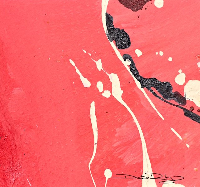
When you look at the Bright Orange Abstract, take note of the simplicity and plainness of design.
Have a look at the calmness ratio to ‘busy’ ratio. I’ve deliberately eased off the busy, in order to calm the whole image down. So it shouts Less.
Generally, my ratio is about 2/3 calm to about 1/3 busy. Roughly. When I use Bright Loud colours like Orange, I will try to increase that ratio to maybe 80% calm or so, to offset the Vividness.
When you look at the Ink monochrome, see how I have increased my ‘busy’ ratio? That is to compensate for the lack of colour.
I need more detail, more textures in order to keep the viewers engaged. To keep the image from being too boring, too monotonous.

Monochromes and Neutrals tend to be calmer
Ink Landscape was created in a monochromatic approach, using no distracting colour to interfere with the design.
Below, I’ve taken a black and white photo of a congenial butterfly to compare with the full colour photograph.

Comparison of Colour and Black and White
This friendly and cooperative butterfly paused long enough for several photos.
I’d accidentally had my camera mode on black and white for the first group of shots.
Wasn’t happy at all.
Then, I thought it would be a great article expose. To contrast a butterfly without colour and then with colour. How Fortuitous.
My shoot wasn’t ruined after all. I was happy again. It doesn’t take much. I’m so lucky!

Orange and Brown Colours
Orange and golden brown orange with a deep red orange bordering on burgundy adorn this fabulous model. Looking at her…. close up, I didn’t find her colours distracting.
She posed gracefully, and tirelessly next to her ultramarine violet prop. I’m sure she knew how to best accent her features. She looked like she’d modeled before.
At any rate, she was delightful and was gorgeous.

I enjoyed my outing with the butterfly, painting with bright orange and with monochrome ink. I think I’ll call it a day.
What do you think?
Is colour distracting your eye from the tonal contrasts and details? Are you finding that Colour can be distracting or not at all?


in general, being distracted is not necessarily a bad thing – in your “Bright Orange” painting, I think colour and composition are equally striking, actually. with strong contrasts, and some detail to ‘relax the eye’ – so there’s still balance, despite the powerful colour choice.
with the butterfly, I’m surprised to find that I actually enjoy the black and white version more – and this time because seeing it in b&w reveals what usually remains in the background. which turns it around, doesn’t it? from colour being distracting to b&w being revealing… always depends on what you want the focus to be 🙂
LikeLiked by 2 people
what an marvellous insightful comment! well said! I so agree that the b/w reveals. I too, was a bit surprised that I quite enjoyed BW. I love colour 🙂 your comments on design and balance and the Focal Point, are right on! Thank you for such a thoughtful comment here 🙂 cheers, Debi
LikeLike
Very inspiring post!
LikeLiked by 1 person
Thanks! Glad you enjoyed it John 🙂
LikeLike
I’m very drawn to the ink landscape. I can rest my eyes and take in all of the detail. The brightly colored Orange painting is beautiful, but I do tire from the color quickly. A very good experiment.
LikeLiked by 1 person
thanks Sharon! You’re so right, an Overload of orange can become downright exhausting. 🙂
LikeLiked by 1 person
even though I don’t like orange, I like your first painting a lot, even though I’m not really a fan of abstract things, but it’s a wonderful composition. The butterfly in color is wonderful and makes me like the combination of orange and brown which looks very calming. By the way, some time ago I bought a wonderful book called “night visions – the secret designs of moths” . The beauty of these moths was overwhelming. These compositions of colors and designs nature has made, really incredible. I’m sure you would love this book. Regards Mitza
LikeLiked by 1 person
Thank you! I do get books and such just to look at their patterns – they’re gorgeous aren’t they! so inspiring. I’ll have a look at the library for night visions too. thanks 🙂 I’m wondering, if the flatness, calmness of the orange abstract – ‘helped’ neutralize it down enough that you enjoyed it even tho it was abstract & orange.
LikeLiked by 1 person
On the photo it wasn’t that “shouting” orange I dislike, it was a bit more magenta which I like. Have a lovely week-end, regards Mitza
LikeLiked by 1 person
Thank you Mitza, for your thoughts on orange and I absolutely agree about shouting screaming colours 🙂
Magenta is, tamed down a tad bit with a blue bias, which does help.
Beginners often splash in everywhere, ‘willy nilly’ screaming brights… without any calming neutrals to rest the eyes.
Our eyes Need, & search for balance, for calm in the midst of all the clamouring.
LikeLiked by 1 person
yes, that’s true, Debi, I’m more this kind of pastel-colored person and only wear pastel-colors or black. Try to find this book about moths. It’s one of the most beautiful books I have ever seen and gives a lot of inspiration. Have a wonderful week-end, regards Mitza
LikeLiked by 1 person
thank you Mitza, hope you’re enjoying your weekend too? I’ll look for it at my library! it sounds great 🙂
LikeLiked by 1 person
🙂
LikeLike
I find the orange alone, without accent and subtle contrast from adjacent and near colors–an accent from a near compliment, is less bright… dull, even. Calm & busy are my contrasts… what I enjoy is the invitation to explore, to move my eyes around the visual field of the work: simplicity is ‘calm,’ as moving slowly is ‘calm,’ but intricate detail can be calming too, inviting your eye to slow down and explore it in depth. Overly representational I find boring–I want more than recognition (Oh, that’s an X)… leave the thing named behind and dissolve into the purely visual. It’s those subtle blues in the butterfly that do that for me. Where did those come from? — I want to ask, and begin to seek for answers in the patterns, in the contrasting colors, in the negative spaces around the subject. Calm is complicated idea, translated into the visual. “Distracting” for me… would be what shuts down my interest — bores me, like those awful pencil-photo-realist drawings that are something of a fad on the web lately.
LikeLiked by 1 person
I’m personally, not into the style, of photorealism at all. It fails to express the inner artist within me. just …IMO.
Yes, I agree with your view of Simplicity!
Art is a marvellously diverse, and rather complicated thing – we’re all so different 🙂
LikeLike
Interesting too, that in your painting, the cool blues are both, brighter, and leap forward, while the warm oranges recede.
LikeLiked by 1 person
very good to pick up on that! its a good method of relaxing one colour by making the tone of the other so much Darker! Thanks Jacob 🙂
LikeLike
I am a fan of colour and find BW can be a bit drab.Colour and form are of equal importance to me.But yes! Too much loud colour can be overwhelming. I agree with your rule of incorporating 1/3 of one and 2/3’s of another, it works well in a painting
LikeLiked by 1 person
thanks Gigi, love hearing your thoughts and insights on this topic! I’m with you on Colour 🙂 art wouldn’t be art for me, if they took ‘my crayons away’ LOL
LikeLiked by 1 person
I really like strong colour, but only in big flat non-jagged expanses. I find too much texture makes my skin crawl. Looking at it feels like eating tangled hair mixed with dirt and dust. I suspect that this is an autistic response. That said I sometimes see textural pieces of art which really move me but I can never work out why some textures are such a problem and others are beautiful.
It’s really interesting what you say about colour. Even though I really like strong, high chroma colour, I prefer these bright colours within the context of a limited palette so that it doesn’t get too much. That said, I find black and white / greyscale pictures and photos very restful to look at – they seem to work effortlessly. Lovely photos!
LikeLiked by 1 person
Jo, I agree! flat planes of colour and monochromatic spaces of very bright colour all help to gentle the colour to our eyes. thank you Jo for your comment 🙂
LikeLiked by 1 person
Wow such great insight from you and all the great comments!
LikeLiked by 1 person
it is very fascinating to see and hear the creative working thoughts of other artists. its reassuring, and reaffirming both. all great comments and Thank you Jodi for all of yours to my website too. 🙂
LikeLiked by 1 person
I think depending on the subject matter or the idea I envisioned determines my color palette. I like to use bright vivid colors with a black and white or muted piece if I need a pop or to enhance an area. Not to distract but for a surprise or definition!
LikeLiked by 1 person
great insight into how your artist mind works! Isn’t it fascinating to hear how others work/create?! Thank you Jennifer, very much for responding with your thoughts 🙂 cheers, Debi
LikeLiked by 1 person
Your welcome. Thanks for inspiring posts!
LikeLike
I’m having this colour debate with myself at the moment – you can probably tell
LikeLiked by 1 person
I needed to do this post for a class I’m teaching actually. As Bright colours willy nilly, everywhere, is not… pleasant.
LikeLiked by 1 person
Willy nilly is such great expression – its so polite – my translation of bright colours everywhere would be “you’ve got to be shitting me?” but I’m sure my husband would prefer me to say willy nilly – I might give it a go just to see the expression on his face 🙂 I wish I could be at your class on this – I would be cheering in the stalls.
LikeLiked by 1 person
indeed. perhaps inside my head I may be thinking along those lines at times…. and so, “Willy Nilly; HALT!! & Judicious! ” have been used hmmm overused by me many times. 🙂
LikeLiked by 1 person