I’m Happy today!! It is Milestone Post #200
What Colour do you associate with the word “Happy?” Me, you can “Colour Me Happy” with sunny, warm cheery Orange.

Apparently, advertisers know my secret weakness.
Have you noticed so many of the ads seem to be draped in those sunny warm oranges? There’s a reason…. the colour Orange ‘helps’ people want to buy!
It creates a warm confident and enthusiastic mood that just radiates. Burns with energy. Energy to …. well, try those new products, make that new purchase. Thats right, “just helping you madam”.. or “sir.” Helping alright, to lighten our wallets.

Orange: A Colour of Warmth
Orange is renowned for its warm, enthusiastic, sunny demeanour. We habitually gravitate to the lovely tropical mango orange sunsets, to bright orange Autumn leaves, to the vibrantly cheerful orange-yellow sunflowers standing tall against the summer cobalt skies.
Orange is the colour of Happy.
It is a sociable colour, filled with positivity, optimistic outlook, creative flair, self confidence, spontaneity, independence. It is stimulating. In between the very dominating Red, and the more mellow Yellow, Orange is a sunny confident happy colour that loves company.
We are feeling positive, confident, spontaneous.
We are stimulated to take action when we are viewing the colour orange.
(This of course, depends on individuals, and is a generality based on many marketing research studies. Not all will respond to orange in the typical fashion. )
Did you know that in the study Impact of Color on Marketing researchers discovered that up to 90% of snap judgement may be based on Colour!? Researchers also found people took about 90 seconds to make a judgement on a person or product, on average.

debiriley.com
The Story of Indian Yellow Paint
Indian Yellow PY153 in full strength is a lovely warm Orange-yellow, whereas when diluted with plenty of water it appears nearly butter yellow pale. When I use it, I generally prefer to use the Winsor and Newton brand or the Australian brand Art Spectrum.
The origins of the Indian Yellow watercolour has been shrouded in colourful rumours and mystery for many years, with no one actually knowing the real truth behind it. The story goes that Indian Yellow was originally made from cow’s urine.
Wait, are you still there?
This does get interesting you know! Supposedly, the colour was first produced around the 15th century in Moghyr, India. A purree was created from earth and a cow’s urine product, this was produced apparently by feeding the cows on mango leaves and withholding water from them. Hmmm, I do not think the cows would be very happy in hot India being dehydrated.
As there are no hard facts nor written evidence to support this story its been relegated to the land of dubious art myths and fairytales. Rumours do persist, and I find myself considering whether there is some substance of truth to the story.
Orange paint colours and mixes

Orange Chart Above …. A Beginners’ Easy Way to mix Orange is to simply use Permanent Rose Pv19 and Winsor Lemon Py175; veering slightly to the warmer blush of red side to create the Orange you are after. This is an excellent, tried and true method, no nonsense way of getting a great Orange with a minimum of paints.
Beautiful Orange paints that I love using to make various tints and versions of orange include: quinacridone burnt sienna, quinacridone burnt orange, lunar earth, indian yellow, naples yellow, cadmium yellow deep, perinone orange, permanent orange, pyrrol scarlet, pyrrol orange, cadmium red light, winsor orange, and then is ….
Benzimidazolone Orange PO62 What a Trouble maker!!
Can you say that, well, I can’t…. “ben – zimi – dazo – lone” THERE! what a mouth full. Why, can’t the manufacturer just come up with an abbreviated name? Geesh, this sounds like a prescription drug, for heaven’s sake, not a pretty colour I’d want to buy. Or, have to try to actually Ask For!
The manufacturer could come up with names like: BS. Dazo? Dazzle Alone, or even Dazzle Orange, even? Yes, I think I quite like that name. So, Dazzle Orange, is a lovely brilliant orange, fabulous mixing with other colours, glorious alone too.
Lunar Earth is another sensational orange-yellow paint with a twist. It granulates wildly with nearly anything you mix in with it. In this sample, I’d added a dash of quinacridone burnt scarlet and permanent rose in with the lunar earth. The intricate textural effects this paint gives is fan- tastic. I love it.

The Naples Yellow that I prefer, is the Daniel Smith watercolours brand. It leans strongly to the Orange side. When washed out in very thin, diluted washes it will lose some of its brighter red/orange colouration and appear more yellow than orange.
Naples Yellow mixed with Prussian Blue Pb27 creates a range of greens that are quite easy on the eyes. With a higher ratio of Naples Yellow, the green is frosty, creamy and soft. Its gorgeous.
Using a higher ratio of the Prussian blue the resulting greens will be sharper, darker, green/blue with a high contrast factor in them.
Perinone Orange PO43 mixes superbly with Burnt Umber PBr7 for pleasant and subtle earthy brown-oranges, great for landscape subjects. When mixed with French Ultramarine Perinone Orange softens and greys off beautifully into a nice neutral.
Toxicities
The older Orange-based paints, Vermilon, Chrome Orange, Naples Yellow, were notorious for having toxic chemicals in them and so many were taken off the market with substitute colours made. Today, you still can find Cadmium paints including Cadmium Orange which have a toxicity to them. They are being phased out slowly.
Have a look at what you purchase and where it was made. Check paints you have at home, especially all older paints. These may have lead, mercury, manganese, etc. in them. These chemicals are unsafe to breathe, ingest, or if they are absorbed into your skin.
Be alert to your paints. Check their safety, look online for references and information. This painters.edu.au website may be useful to some, especially those that like to use house paints to paint with. I know many people who regularly do so and thought this website was a good resource.
Refererence Sources
David Myers blog great info on paints
ncbi.nim.nin.com Cadmium Confusion: Do Consumers Need Protection?
Hilary Page’s Guide to Watercolor Paints, Watson-Guptill Publications ISBN 0832022617
Michael Wilcox Guide to the Best Watercolor Paints, The School of Colour Publications ISBN 0891344098
Colour me happy with all the brilliant, cheerful, sunny Orange paints!


Hello Debi : I am learning at a snail’ s pace, from Prussian Blue to these lovely Oranges tonight!!..Wow, I never knew there was so much wealth of colour out there, But I am seeing it all in your artwork, and detailed teachings. Colour me excited .. And delighted to follow your posts. I have too many questions?? ( smile ) But that is normal!!.. So for tonight , Sign me grateful learner Joanne Wighton
LikeLiked by 2 people
“Colour Me Excited”.. wow, I love your words, Joanne!!
Thank you, very much, for your beautiful compliment.
art is An Apprenticeship, not with a person/teacher but With Your Materials. slowly we get there. Cheers, Debi 🙂
LikeLike
Yes.
LikeLiked by 1 person
Thanks David!
LikeLike
THANK YOU Debi! Perfect timing!! I was painting poppies, I was struggling with Colour Me Happy – orange! Now I am a happy vegemite. Many thanks for sharing.
LikeLiked by 1 person
hi Teresa! I’m very glad oh..yeah, Happy, lol that this post on Orange was a help to you today! cheers, Debi 🙂
LikeLike
What a happy post! So cheerful and So INFORMATIVE. Thank you for sharing. You should write a book with all your great knowledge ! I would buy it!
LikeLiked by 2 people
OK!! you Jodi, darling are my 1st book buyer! I must confess, it won’t be Soon 🙂 I seem to a. be rather slow these days b. tend to put things off til I can do it better i.e. it means ‘never’ c. oh, what was I saying? LOL cheers, and Thanks Jodi!!
LikeLiked by 1 person
😝
LikeLike
Love your gorgeous images and the info about orange in this post, Debi! Thank you!
LikeLiked by 1 person
hi Laura, thank you again for your positive comments. Very nice of you 🙂 I’m glad you enjoyed it!
LikeLiked by 1 person
Bring on the Orange! Thank you for this informative narrative about Orange. I’m very excited to get to my paints today!
Your photography and painting is stunning.
LikeLiked by 1 person
ok Sharon! lets see what you get up to!? love to see the brush do its “orange happy dance” for you 🙂 Thank you Sharon for your lovely comment, very sweet!
LikeLiked by 1 person
I’ll get to work on it, something Orange will happen soon!🌅
LikeLiked by 1 person
your first painting remembers me of the milky-way and I love the photo from the sunset. That’s so peaceful and beautiful in colors. I always feel so good at the sea. Unfortunately, I don’t really like orange. But your post was wonderful – as usual. Congrats for No. 200, regards Mitza
LikeLiked by 1 person
thank you !! a big smile here 🙂 I love the sea too, when its gentle and calm. you are not alone in the not so fond of orange crowd! Orange can be very strident and stroppy. Like Red.
LikeLiked by 1 person
I would prefer salmon. That’s kind of my favorite color regarding my home. But I never in my long life had anything that was orange! Funny, isn’t it? Orange is shouting at me. I love dove-blue, that’s rather silent, hehe 😉
LikeLiked by 1 person
I love salmon 🙂 orange, was a ‘surprise’ colour for me to do a series on actually. But, thats what Popped Out! so going to go with the flow 🙂
LikeLiked by 1 person
Thank you Debi! Your blog posts are very informative and interesting.Orange is indeed a happy colour for me too
LikeLiked by 1 person
HI Gigi, You’re quite welcome! I’m very Happy you like Orange as well 🙂 Thank you for writing in with your comments, I appreciate it cheers ! Debi
LikeLike
Beautiful color indeed. Make me joyful and happy, I found orange stimulates creativity. Always fond of vermilion and naples yellow .. Nice read on the history, thanks for sharing!
LikeLiked by 1 person
hi Jennifer, thank you so much! btw, great post on your self portrait – loved it! 🙂
LikeLiked by 1 person
🌞 I’m glad you liked it. Thank you!!!! 🌞
LikeLike
Congratulations on the 200th Debi; definitely a milestone glowing in an orange light 🙂
LikeLiked by 1 person
thank you Andrew, much appreciated! Next on my list, to get to the 12 month mark of posting… 🙂
LikeLiked by 1 person
Your posts are not only lovely, but there’s always something to learn.
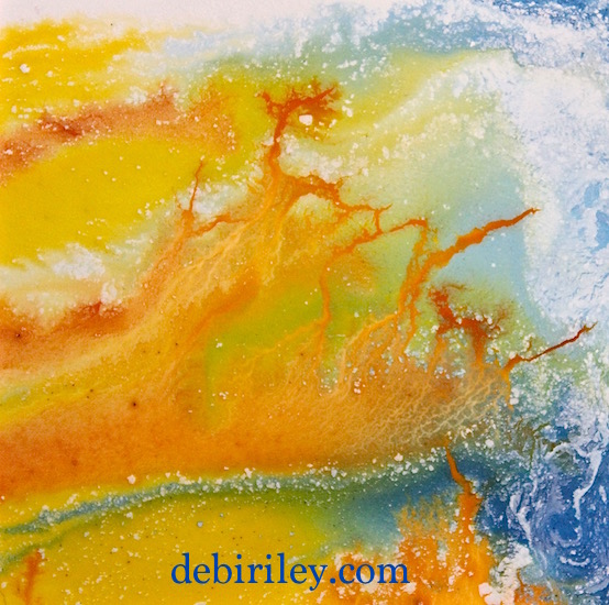
Emotional response to colors can vary, we know that –especially with weird people, like me! Orange is my ANXIETY COLOR! I like the liquidy piece at the top of the post.
LikeLiked by 1 person
thank you very much Jacob, that’s lovely of you to say so 🙂 Orange – especially when hot and bright can trigger a sensitive reaction in people. I don’t mind it so much, if its been neutralised a bit. Not keen on Fluoro.
LikeLike
I wonder, if there’s any truth to the Indian Yellow story, if it might have had more to do with the earth it was mixed with–the cow urine would have resonated with a sense of sacred, if you were Hindu, and mangoes–full of sensual associations. In a story of origins, the poetic does have a tendency to nudge material reality to the side.
LikeLiked by 1 person
research I’ve looked at is inconclusive… but, maybe so.
LikeLike
Be good if you mentioned, in your pigment recommendations, what the medium is. Oil… acrylic… water color? Makes a difference. Naples Yellow, in oil (maybe this isn’t true now–I haven’t used oils in almost 50 years), dominates, super opaque, doesn’t blend well. Really have to know how to use it.
LikeLiked by 1 person
good idea! I should be clear when I say a specific colour, what the Pigment # is. Which is the same for w/c oils, acrylics. If, it is indeed that #.
LikeLike