Sweet, the lovely enchantment of paintings in blue! Crystal clear and calming. Refreshing. Mysterious. Deep. Let’s dive into the mysteries of blue paints: Ultramarine, cerulean, cobalt teal blue, indanthrone, prussian, cobalt, phalo and manganese.

Unravelling the Mystery of Blue Paints
The beginner needs to dive headlong into the refreshing diversity and beauty of blue paints!
The new beginner painter does not have enough blue paints.
What! not enough blues? Don’t I need to buy greens, purples, browns, greys, blacks? I hear these voices ask. No, not in my head… real voices. From students. (Just so you are crystal clear on that one!)
But isn’t it easier to just buy the tube of green and use it? Easy yes, wise… debatable. How so? Range, diversity, naturalness, smooth fluid transitions, and warmth/coolness temperature control. “Control” of depth and perspective is increased at least 75% by mixing your own greens, browns, greys, purples.
Which Blue Paints and Why
Cobalt blue pb28
Cobalt pb28 is my staple blue that is first on my list to get. Especially for beginners watercolour painting. It mixes beautifully with just about everything I throw at it, creating a lovely range of foliage greens, browns, greys, mauves. Cobalt pb28 is a clean, Transparent blue paint colour that is great for glazes. This artist quality blue paint is the perfect blue for a sunny blue sky day. Used for foliage, ocean, sky, hills, trees, still life, just about everything.. Brilliant!
You don’t want to be fooled into buying a cobalt blue hue… it will be made from phalo or ultramarine blue with white.
Ultramarine blue pb29
Ultramarine pb29 is a stunning warm blue that is a Granulating pigment, creating beautiful textural effects on the surface of the paper naturally. Sensational for mountains, hills, foliage and shrubbery. I love to add it into my ocean scenes, as it gives a nice touch of warmth to the waters. I usually prefer the French Ultramarine, its a bit finer and warmer, but its also more expensive. So, I have both.
Easy RECIPE for Grey: Ultramarine blue + Burnt Sienna = grey (at a ratio of est. 50-50)
Stunningly Vibrant Purple: Ultramarine + “Permanent” Alizarin Crimson = vivid purple

Phalo blue pb15
Phalo blue pb15 can be quite tricky to use, as it is very ‘nuclear’! Its power, is amazing. Just one little drop can spoil a whole painting, so test it rigorously. It is a Stainer, there will be no textural effects, it dries smooth, flat. Great to glaze with.
Mixes well with others. Very lovely when diluted liberally with white, into soft creamy pale tints of ethereal blues. It will create a strong green turquoise when mixed with phalo green. Then, if you add white to this, it will soften off into an exquisite frosted aqua. Phalo blue when handled with care can be a most useful blue; and very handy for ocean, water, foliage.
Prussian blue pb27
Prussian blue pb27 is a very easy blue paint to use, it mixes great with most colours and is a perfect accessory to the landscape artist. It is a Stainer, it won’t lift off 100% its quite powerful very deep and dark; plus, will creep and spread in delightful ways that all Staining pigments will do.
Prussian is fabulous for foliage greenery. Mixed with winsor lemon creates nice spring yellow greens; mixed with burnt umber – a darker cooler forest pine green. Sometimes I will add a slash of it into my ocean waters, to provide a hint of deep dark greeny blue to draw the eye.
Cobalt Teal blue pg50
Cobalt Teal blue pg50 This blue/green even though it is an Opaque, and not a good mixer, remains one of my favourite colours. I love this colour! Ideal for water, perfect to cool down areas in a painting, or to act as little accents here and there.

Cerulean blue pb35
Cerulean blue pb35 is my runner up replacement for Manganese blue. Cerulean is both an Opaque and a Granulator, however it does mix considerably better than most other Opaques.
Cerulean is lovely for winter skies, providing a nice cool touch to the horizon. It creates delicate foliage greens, gorgeous rock pools, rivers, lakes. Beautifully cool and refreshing. The textural effects it gives makes it a great choice for soil, foreground, bark.
Cobalt Violet OR … Rose madder genuine + cerulean = Delicate pale lavender
Indanthrone blue pb60
Indanthrone blue pb60 WOW, what a blue! I wouldn’t be without it. There is a brand variance in colour intensity, thus, I prefer the beautifully fully saturated richness of the Daniel Smith Indanthrone blue. This gorgeous blue is a near black at full intensity with a peek of violet red undertone for warmth.
When I want an inky black-blue, THIS is the blue I reach for. Its perfect. A Stainer, it mixes well with others and makes great glazes. Night skies, deep ocean currents, eggplants, delphiniums… and so on.

Manganese blue pb33
Manganese blue pb33 has been discontinued some time ago due to its toxicity. I understand the health issues involved made it no longer viable for the manufacturers and the public. But, this blue was divine in its versatility and softness and mood. I still look for it at garage sales and once in a blue moon, score an old Winsor and Newton Manganese Blue.
This blue was delicate. Perfect for flowers, leaves, foliage, rockery, portraits, pets, skies, mountains, hills. It could create a mood and ambience all on its own. If you are an old time painter, and actually have a tube or 2, lucky you! Just be aware to use with caution. Wash your hands etc. Gloves would be a good idea and no drinking/eating while painting.
I’ve been careful to include not just the name of the blue paint, but its PB number i.e. its Pigment Blue # That way, when you see it on the tube of paint before you buy, you know it is the right colour that will mix and behave the right way! Those manufacturers can name their paints whatever they like. But, once they put the pb# on then we can tell if it really is the colour they have ‘named’ it. This Pigment # is the identifier I’ve used now for some years, in order to stop buying cheap ‘hues’ and to stop duplicating my colours. It works.
A Blue Paints Chart with Cobalt, Ultramarine, Cerulean, Indanthrone, Prussian blues


Hi Debi, Thank you for this in depth and valuable study of so many different hues of blues. It’s time I added a few more to my palette. I’m so grateful to have an iPad so I can zoom in and study your awe inspiring artwork. I’m so intrigued with your layers and textures of color. Thanks again for your generosity.
LikeLiked by 1 person
Hello Sharon 🙂 I was indeed hoping that you and a few others might find this one Usefull!! Glad that it pleased you and inspired 🙂
LikeLiked by 1 person
Thank Debi for thinking of me. Art is always a learning process.
LikeLike
The first is absolutely breath taking
LikeLiked by 1 person
thank you- very much ! what a lovely comment. I appreciate your stopping in, and your having a look. Glad you enjoyed it 🙂 cheers, Debi
LikeLike
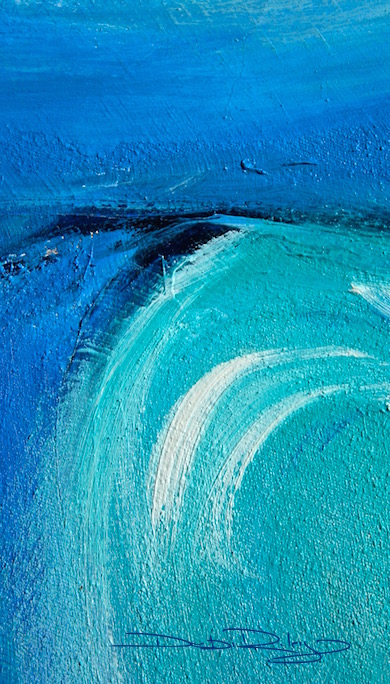
I love the paintings in this post, especially the first, Cobalt Teal Blue. The blue hue magic has certainly captivating me ;)…
LikeLiked by 1 person
Thank you so much for that kind comment 🙂 The first one you liked Cobalt Teal Blue was an oil painting, but the colour effects are the same. I used the teal, the indanthrone, and cobalt. (you know I mix up my media! one week its watercolours, next its acrylics, then inks, then oils… ) well, its never dull that way. LOL
LikeLiked by 1 person
definitely, it’s the best way to stay inspired 🙂
LikeLike
Or, in correct grammar, it is captivating me ;)…
LikeLike
I think what I love about it is how the different hues come alive together, but I do have a soft spot for cobalt especially (pb28)
LikeLiked by 1 person
cobalt is a beauty 🙂 very useful, a super workhorse! I forgot to mention….. another thing I enjoy doing with the blues is to mix them (3-4) together and create a new dynamic blue for the specific image I’m working on.
LikeLiked by 1 person
no end to the possibilities 🙂
LikeLike
Oh you have so much to teach us. Thank you Deb – I wish I could absorb it all. Thank you for sharing this wise advice. I want to go by every shade of blue paint right now – haha! I so appreciate your posts.
LikeLike
Thank you again, Debi, for sharing your wisdom. I should print this off as I’ll never remember it. And goodness, I thought a couple of those paintings were photos, then I went back and realized they weren’t. Holy gamoly! Rock on, lady!
LikeLike
I’m printing this out for the studio; so helpful. Thank you 🙂
LikeLiked by 1 person
hi Andrew, that’s Excellent, glad you’ve found it useful 🙂
LikeLiked by 1 person
Extremely helpful and comes at the perfect time. Love the post Debi, thank you!
LikeLiked by 1 person
hi Mary, glad it was a helpful one!!
LikeLiked by 1 person
I enjoy painting with shades of blue always been my favorite. Nice to read more about the shades
LikeLiked by 1 person
thanks Jennifer, nice to know I’m not the only Blue fan out there! I have 10x more tubes of blue paints, than all the other colours. 🙂
LikeLiked by 1 person
Sounds perfect!
LikeLiked by 1 person
I need to make a purchase, and two of them will be cobalt and fr. ultramarine which will always be on that forever list!
LikeLike
great Staples, that won’t steer you wrong 🙂
LikeLiked by 1 person
I’ll be so bold to say a silly phrase but it is what came to mind…..”from here to infinity”! yep I love those two blues and mixing them with other colors brings magic to the end of the brush. 😀
LikeLiked by 1 person
Margaret, that is perfectly lovely! I like it!
LikeLiked by 1 person