The Power of the Monochromatic palette is amazing. What impact can be had with one colour! Photographs, Oils, Acrylics, Inks, Watercolours – monochromes are relevant, contemporary and beautiful. The freedom exploring the full range of tonal nuances is too often ignored with our preoccupation with colour.

Monochrome: mono (one) chrome (colour)
A monochromatic image is created by choosing one colour, whether it is purple or brown, or blue and then creating as many tonal variations (shades) as needed for the particular subject and mood.
Sensational monochromes can create nuances of light and shadow conveying a mood and telling a story. All without the fuss and bother of being overloaded with way too many colours.
Cattails Faded In Winter photograph, I just took yesterday. Yes, with my new prime lens, I’m practicing, diligently!
At any rate, I love this photo. the soft blurred edges of the background coming into sharper focus into the foreground really give it depth. The fact that its all monochromatic dull sienna browns adds to the winter is here effect. And by being monochromatic, we don’t lose sight of the sharp threads of fluff that are just on the verge of spinning free on the wind. My colour photos of cattails, from a few weeks ago….. do not even come close to have this same feeling and impact.

Palm Bark Threads … come to life in this monochromatic palette, good contrasts and detail show up nicely against the deeper darks.

Monochromes are simply a fantastic technique for Beginners to gain more depth, mystery, intrigue with much less stress and can be more evocative than the full spectrum of colour.
Monochrome on Rice Paper, has a loose and sensitive style. I was aiming to convey the feel of the place as opposed to the place itself. And in this context, perhaps in a slight way, I think reminiscent of Claude Lorrain.
The French artist, Claude Lorrain had a fluid, loose and expressive way of working that was really delightful. Lorain had a real way with conveying the feeling of the place! He used the monochromatic technique brilliantly, especially in The Tiber from Monte Mario which is a featured painting in my book, Tate Watercolour Manual Lessons from the Great Masters, see the recent related post Delacroix to Klee: Great Art Books. Many of the workshop landscape themes at Atwell Gallery are based on the loose and free style of these great masters.


9 tonal values monochromatic image debiriley.com
Prussian Blue Monotype is a very good example of a wide range of tonal values and nuances, having at least 9 tones. From nearly white, progressing all the down to a velvety blue black!
6 Reasons I like Monochromes
- I can create my sufficiency of tonal values without being DISTRACTED by ‘colours’
- I can focus on mood, feeling, applying the tonal nuances with …Sensitivity
- I can say More, with Less i.e. its easier and Easy is good!
- I can choose which colour to use for my Monochrome, it does not have to be black and white all the time
- I can explore and try new techniques with a bit more confidence, knowing I only have Tones to deal with, not Colour too
- I can focus on creating betting depth in my backgrounds, middle grounds, and foregrounds through my placement of tones


Debi, thank you for this very informative and inspirational post. Question: when you choose one color (I work in watercolor mostly now), do you mean say Prussian blue vs blue in any shade? And then the other question is do you get your various values by only mixing water in, or are you using ochre, sienna, etc to get your lights and darks. Thanks much for your help.
LikeLiked by 1 person
you’re welcome, glad to help!
I like to be able to mix up my blues…. cerulean + prussian + ultramarine + indanthrone… if that’s what I feel like! I’d use water (or white) to lighten the tone. But not any ochres or siennas.
I feel that as long as I’m using the one Colour,
whether its a blue, brown, green, etc. there’s some room to play with a variety of types of those specific hues. Cheers 🙂 Debi
LikeLiked by 1 person
Sounds wonderful (and beautiful)! Thanks as always Debi.
LikeLike
I like monochromes, too. You can create such wonderful paintings and photos to describe everything. It’s always such a joy to look at your posts, regards Mitza
LikeLiked by 1 person
thank you so much Mitza 🙂 art is a joyful experience, isn’t it!!
LikeLiked by 1 person
yes, that’s true, Debi. The only thing that makes me really content. I send you another link from Horst Jansses first teacher. http://www.google.de/search?q=paul+wunderlich&biw=1413&bih=901&tbm=isch&tbo=u&source=univ&sa=X&ei=3d2CVcvDI8OSsgGR0LnADQ&sqi=2&ved=0CLMBEIke&dpr=1.13
His second teacher had more influence in his work. Regards Mitza
LikeLike
You certainly are very talented!. Congrats… And by the way, I nominated you for a 💫Creative Blogger Award💫 . If you are interested, check it out by the end of this post: http://wp.me/p60vo-4lv Best wishes! Aquileana ⭐
LikeLiked by 1 person
Thank You! wow, that is so kind! I will go see the link , thank you 🙂
LikeLiked by 1 person
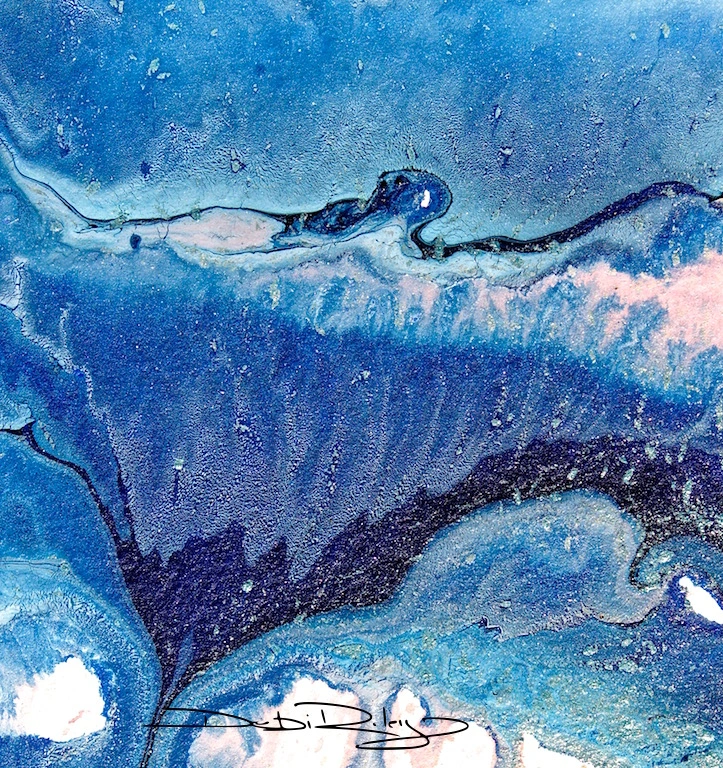
Love your work. The blue monochrome is especially compelling.
LikeLiked by 1 person
thanks Kitt! you ever tried pouring in acrylics? its great fun and easy – all you need is White and Indigo blue 🙂 I love doing it just to …play………..
LikeLiked by 1 person
I haven’t painted at all in quite some time. Your site just might inspire me to do so.
LikeLiked by 1 person
I don’t paint nearly as much as I’d like to, but when I do…. I really extract every drop of fun out of it I can!! Hopefully you do see things here to inspire, and enthuse you to do some art 🙂
LikeLiked by 1 person