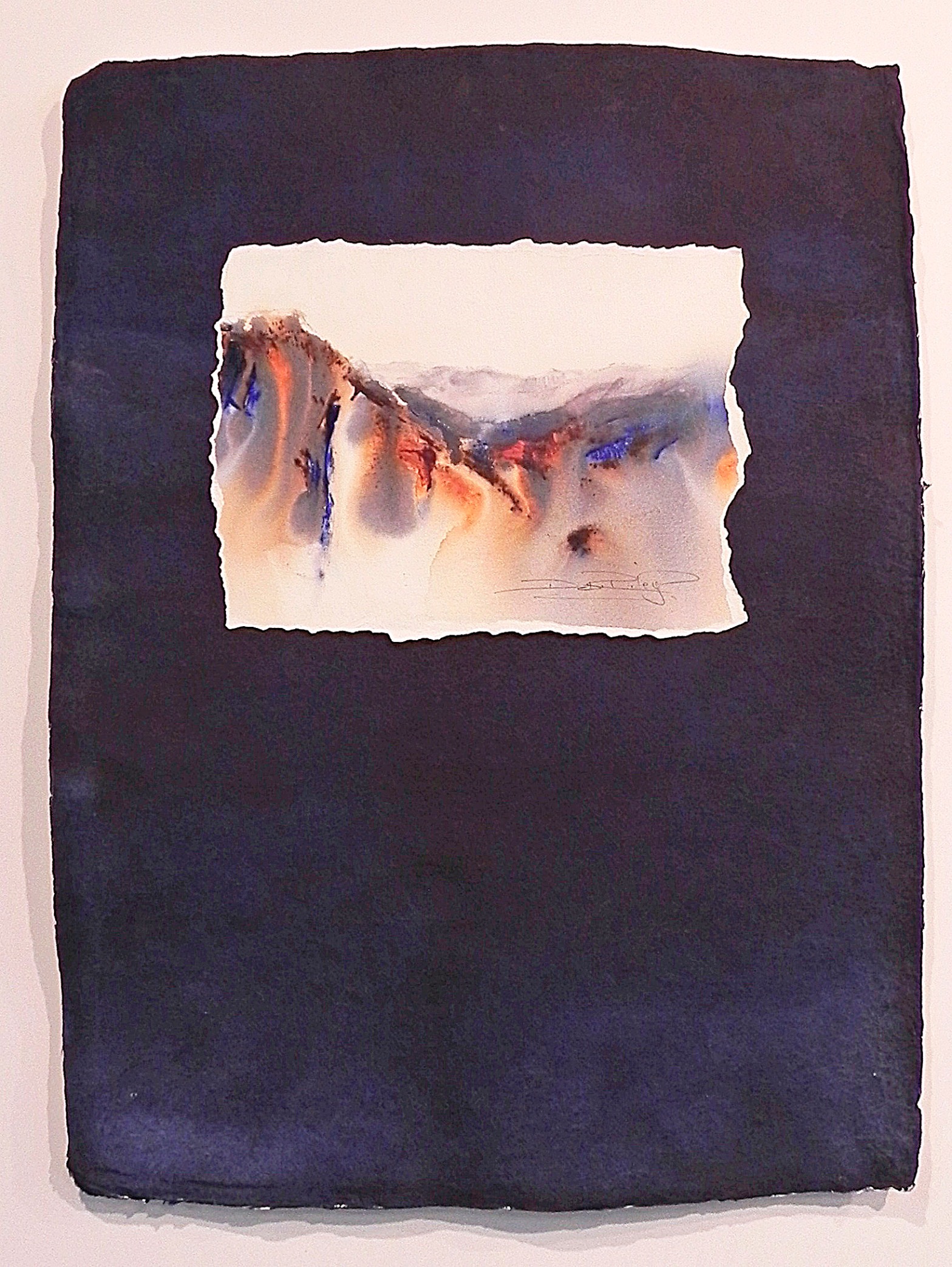
More contrast, more texture, more visual interest? They were the objectives I set out to accomplish! Using Indigo, Rough Indian Village paper, torn deckled edges, unframed “viewer touchable” artwork …… I experimented using some creative techniques with this watercolour landscape.

The paper I chose was a full sheet 22x 30 inch Indian Village 100% cotton rag with thick textured rough surface that would entice viewers to touch and feel the image.
For Dark Contrast choose Indigo with PB60
For a deep dark contrast, I used Daniel Smith Indigo plus Indanthrone to create a rich blue black. Other indigo paints, imo, fail. They are flat because they are not made from PB60. PB60 (Indanthrone a brilliant Stainer) is the key to a fabulous Indigo!
For the Landscape mountains I used French Ultramarine and Burnt Sienna with a drop of Indigo, wet in wet dripping down in soft edges. The paper’s borders were left quite white for maximum contrast against the deep dark Indigo of the Indian Village paper.
I then carefully deckled the edges, tearing along the four sides. Again, to help provide an increased sense of texture and depth.
Once this was dry, I adhered it to a piece of foam about 1 inch thick and glued it to the Indigo Indian Village paper. I placed it higher on the Indian Village paper to help create a sense of looking upwards at the mountains.
At this point I adhered the Indian Village paper to a large off white mount board with pieces of thick foam of about 1.5 inches thick, for an upraised sculptural effect.
For more Texture, deckle and tear paper edges and raise up the image off the mount.
Both parts of this entire painting were raised up. The mountain scene is set up off the Indian Village paper and the Indian Village paper itself is raised up off the white mount board.
The entire method of Presentation was planned to maximise the paper’s texture, the paper’s Edges.
This gives an overall sculptural quality not usual to watercolours. It also provided the viewer a visual stimuli to touch and feel the art work, which I specifically designed the artwork for.
I wanted a ‘hands on’ viewer participation. Probably because, so many times I see art works at galleries that are so gorgeous, so rich and layered and Textural I feel compelled to touch them….. but am not allowed!
I am not worried or anxious about displaying my work like this. I use acid free artist quality paper 100% cotton and Lightfast paints. I just don’t hang them outdoors, or in the kitchen, thats all!
Good materials are usually pretty robust. Student grade materials need special care and aren’t anywhere near reliable enough to pull off this type of use.


Really interesting post. I know what you mean about wanting to touch museum paintings. I love the idea that you are inviting the viewer into a tactile world. Wish I could see this in person! Lovely work. ~Rita
LikeLiked by 3 people
Rita, thanks!! Sometimes its hard Not to touch them.
When I view your paintings, it really makes me want to trot over & go walk your woods & paint with you – Thats a rare gift you have!
LikeLiked by 1 person
I wish you could paint with me! I would enjoy that!
Thank you for such a lovely compliment. It means so much to me. ~Rita
LikeLiked by 1 person
🙂
LikeLiked by 1 person
Facinating
LikeLiked by 1 person
different isn’t it!!?
LikeLike
I love the torn edges and used them all the time in my journal. Love the colors in this piece, the dark moody background to the light of the mountains with the orange and blue highlights; sensational!
LikeLiked by 2 people
thanks Andrew. indigo and ultramarine and b.sienna seem to make a pleasing combo!
LikeLike
Beautiful! Your paintings just get better and better.
LikeLiked by 1 person
Thank you very much! I appreciate that 🙂
LikeLike
beautiful, Debi. I usually draw on dark blue paper, too.
LikeLiked by 1 person
🙂 its such a alluring colour!
LikeLiked by 1 person
very nice
LikeLiked by 1 person
Your painting and the way you present it is so beautiful….that landscape is top drawer! imho 🙂 Where did you end up putting it? Also I wished that I could see it up close, simply gorgeous
LikeLiked by 1 person
Thank you Margaret! I really enjoyed this one, it was so Different. It was in my exhibition and, now its in my art studio 🙂
LikeLiked by 1 person