Landscape Foliage Greens. Most paintings generally will have 3 divisions of space: background, middle ground and foreground.They will also typically need one single, Focal Point. This Focal Point will have the Most contrast and the Most details of my entire painting.

Everything I do in my paintings – hinges on the techniques and the knowledge of: Background, middle ground, foreground, and The Focal Point. Plus, ‘remembering’ these!
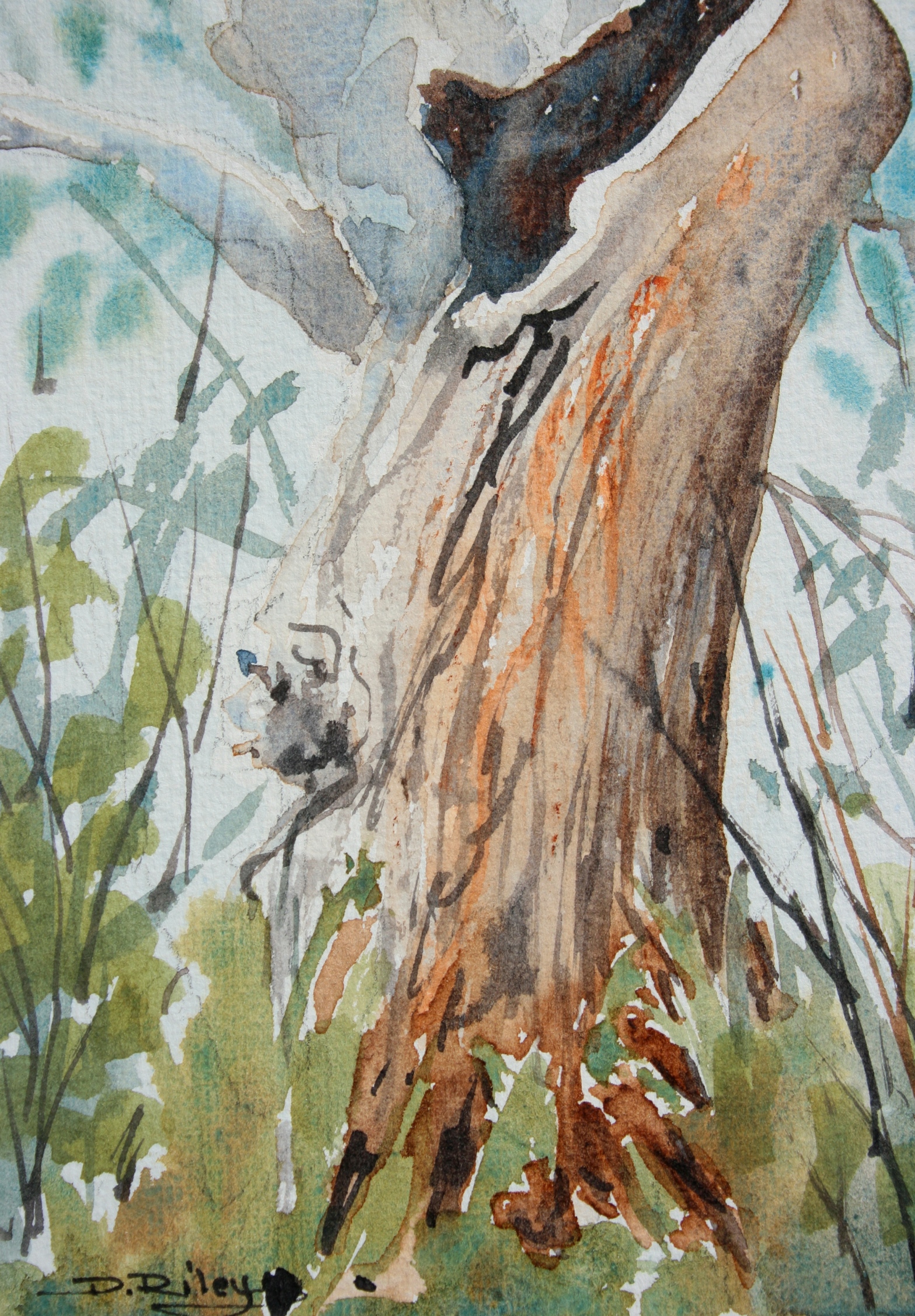
Choosing, mixing and placing the foliage greens in the correct matching area is critical for the successful creation of ‘depth’ in the painting.
I generally need to have the warmest greens in the foreground. I want the transition from warm in front to cooler/grey-green in back, to be a very subtle and very smooth, imperceptible change.
My goal is for a seamless transition. Which requires – mixing up quite a few variations of foliage greens, ….. usually 7-9 or more!
What I had to do – once I knew about these art basics, was to write them down on a post card and tape it up to my painting board! This way, every single time I went to paint anything, it stared me in the face. For months. It made a big impact in a very short time.
My guidelines, tips, are not concrete Rules…….
But more like “Beginner Guideposts” to help beginners learn where and how to get started. I’m prefacing the 10 Tips with my standard, “Generally Speaking……” For those exceptions that DO happen!
- 1 background foliage is paler and lighter in tonal values than middle ground, or foreground
- 2 foreground foliage is deeper, stronger, darker tones
- 3 yellow, yellow green, green-yellow are placed in foreground vs background areas
- 4 always create & mix your own greens for the most natural looking foliage greenery
- 5 green out of the tube looks very man made, Fake, not ‘organic’ and you lose the naturalness of foliage greenery
- 6 foliage in the foreground/focal point benefits from white paper or white paint (oils/acrylics)
- 7 using the 3 Tubes of paint (cobalt, winsor lemon, permanent rose) to create your foliage greens creates beautiful harmony
- 8 warm greens are best placed in foregrounds (olive greens, yellow greens)
- 9 mid greens can go in the middle ground (mid/grass green, green-blue)
- 10 cool greens are best placed in the backgrounds (blue-green, greyed greens)
Based on the 3 tubes of paint mixing the greens is fairly simple to create a minimum of 5 Different variations of greens for a painting to have enough depth through out its 3 areas of space… background, middle ground, foreground.
warm olive green Foreground: py175 winsor lemon + tiny tad perm. rose pv19 for a warm yellow, marigold yellow; then add just enough cobalt blue pb28 to turn it olive. Practice this one quite a few times til you get the feel of it.
yellow green just in Back of the olive green: easy mix 90% yellow and 10% blue …roughly
mid/grass green placed in back of yellow green, its about in the Middleground of the painting: about 50%yellow and 50% blue
green-blue placed in back of grass green: a rough estimate is 35% yellow and 65% blue Test it out to see for yourself.
grey-green placed into the background, behind green-blue: take your “green-blue” mix and add tiny, micron red. add water. TEST it.

When you decide to move on to new Colours, a fantastic Blue to add that lends itself to a vibrant and deep range of bushland and floral greens is Prussian Blue pb27.
Prussian is a staining pigment, extremely deep and rich, very powerful and dark. Yet it can be lightened up considerably, to quite a soft delicate blue with a just the tiniest hint of green in it.
It is one of my “staples” for when I’m painting foliage with my normal palette. It is quite a powerhouse. So it takes a little getting used to and learning how to adjust its intensity for what you require at the time.
Prussian Blue is useful mixed with
a. winsor lemon b. raw sienna c. burnt sienna d. raw umber These all create really lovely array of natural looking foliage greens that settle perfectly into your landscapes.


Thank you so much for this valuable information. I need to print this out and tape it on my wall!
LikeLiked by 1 person
you’re welcome! I had post it notes on my easel all the time 🙂 for ages!!
LikeLiked by 1 person
Oh, I want to thank you, too, for giving the pigment numbers. Now that I’m learning about paints and pigments, the information is very helpful. And, yes, I’ve already printed out your 10 tips for beginners. Green and I haven’t been getting along well, so this is exactly what I needed.
LikeLiked by 1 person
great! I’m glad the info is helping !! Michael Wilcox and Hilary Page have books (if you pursue this further) that are really great. cheers, Debi
LikeLiked by 1 person
Thank you for the book recommendations. I will check them out!
LikeLiked by 1 person
you’re welcome! 🙂
LikeLike